|
|
|
Showing 1081 - 1090 of ~2785 |
| Image |
Comment |
| 06/08/2003 11:55:17 PM | Flashby RefractedComment: *Critique Club*
Love the way the weld light glows like that. I think this is perfect for this challenge. The overall darkness matches really really well with the bright light.
The angle and framing/cropping is great in my opinion. I really like how you have gotten all of him in the photo. The rigt edge is darkened enough, that you haven't actually chopped off the elbow, but rather it is lost in the darkness, which is nice.
Focus and clarity are really great as well. I love the detail in the hands, the patch on the uniform, and just the overall shot.
I think that the item in the back by his head is a slight bit of a distraction, however, not really that bad, as the main focus is the light really, and the hands, and had I not been TRYING to look at the entire image, I might not have even noticed it. So I don't really think it's a huge deal. LoL at the pepsi ad. You may have to edit those out if you use this in a company flyer. I see so many things where people bleep out the brand names on things because of advertizing issues. Anyway. Great shot.
~Heather~ |  Photographer found comment helpful. Photographer found comment helpful. |
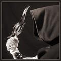
| 06/08/2003 11:34:39 PM | Looks Can Killby magnusComment: *Critique Club*
There really isn't much I can offer in the way of suggestions for improvement here. This is just a really wonderful image.
If I HAD to be picky picky, I'd suggest trying to remove some more lint from the hood. There are a few straggling pieces on there.
Otherwise, Not really much I can say.
The angle and framing/cropping is perfect. I love how you have caught the part of the face in the reflection. This is what really makes the shot for me.
Focus and clarity are great. Awesome detail in the hood, and the knife and the reflection.
I like how you have the person to the right and the knife to the left. I think that this makes for a really great visual appeal.
The duotones work perfectly here as well. I do not think that color would have worked as nicely. The reflection would seem odd if had been in color, I think.
Nothing more to add. Simply Great.
~Heather~ | | Photographer found comment helpful. |
| 06/08/2003 10:59:50 PM | Above The Rimby greenem2Comment: *Critique Club*
Your focus and clarity here are amazing. I rally think that you show us detail here that is simply wonderful. The tiny imperfections in the metal show up wonderfully and really add a nice touch to this shot.
The angle and framing/cropping are interesting, and without the title, I wouldn't ever have begun to recognize this. I think it's good that you got the curved bars in front of some straight lines. This makes for an interesting composition, and gives us something to look at.
For me, an abstract feeling photo either needs lots of color, or lots of detail to really catch my eye. You succeed in catching my eye with the detail.
The lighting is good. Even though it seems like it's almost too bright on the left/upper sides of the curved bars, it's not. It stands out really nicely on the sky, and on the section where it lays over the back of the backboard. I like the brightness of this area of the bars.
Perfect use of black and white. I think this helps to enhance the detail.
Nice find.
~Heather~ | | Photographer found comment helpful. |
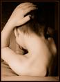
| 06/08/2003 10:42:29 PM | Study in Form and Toneby GeneralEComment: *Critique Club*
I will say, that when I first read the description, I was quite put off by this. I know that Isaac is quite young, and reading "cliche nude pose" really set me back a few inches. HOWEVER, after than initial shock, my eyes opened up to read the "modification" part, and actually look at the photo, and see that "cliche nude pose" really doesn't fit into the description much at all. This is tastefully done. Had it reminded me of the 'cliche nude pose' I might have looked differently at this. However, it does not.
Ok, that being said. I'm running around trying to find a crisp focus here. I have a feeling that it's on the flat part of his back, which you really can't tell if it's sharp or not due to the simple plainness of it. The next part I see that looks more crisply focussed is the hair on the back of his head. I think I'd prefer his entire back and hand/arm to actually be in focus here.
As I look at this, my eye really is drawn through the hole created by his arm and right down onto the foot, which is perfectly positioned in that hole. It's kind of like a spiral effect. From his back, to his head, down his arm, from hand to shoulder, and then into the center where the foot is. lol
The lighting is nice dramatic lighting, however, a bit harsh on his ear and shoulder. I like the darkness on the one side, and think that it's quite effectively used to create some nice shadow there. I wish you could have spread the shadow onto the area of floral carpet we can see in the background. :) Otherwise, the light cloth works great.
I have never tried using PMS in my favor while editing shots. LOL But that's a whole different discussion. I think that the sepia-ish tones work here. i'd be curious to see this in black and white also.
~Heather~ | | Photographer found comment helpful. |
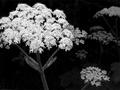
| 06/08/2003 10:19:34 PM | whites in the May duskby kenboComment: *Critique Club*
What I notice first, is how bright the main bunch of flowers is. It's texture in combination with the brightness kind of makes the individual little flowers just blend in with each other making one large blob. This looks like what we call "Queen Anne's Lace".
What I notice next howeve, is that the bright bunch is still actually greyish, so lessening the brightness would make it even greyer and leaving this a really grey image. I'm not really sure what can be done to help fix this problem, with the issue of the brightness and greyness. I'd rather have the brightness, than the greyness.
The next thing I notice is the way each little flower puff is a different shade, and one is darker than the next. I like how this creates depth within the photo. As the photo fades into darkness, so do the flowers. I find this really visually appealing.
Your focus and DOF are really good. The focus of the main flower in the front, on the stem is really clear. Probably clear on the flower part also, but the brightness making is all blend together makes determining focus of that section difficult. Then, as the DOF fades into the background, with the darkening of the flower puffs is really looks good.
I wonder how it would effect the impact had the entire main flower been in the frame. You have cut off a small portion of it, which doesn't seem to effect it much, if at all. Curious to see if it has an impact being all in the frame.
I think it's nice. That brightness does effect it though in a negative way. Had not been for this, this would be a VERY nice shot.
~Heather~ | | Photographer found comment helpful. |
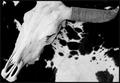
| 06/08/2003 01:32:25 PM | Texas Steerby GallatinComment: *Critique Club*
I do like the choice of black and white here. I think that it enhances the whole 'cow' theme.
Your focus and clarity are right on. Really nice crisp lines on the skull especially around the eyes, and nose area. It really shows up a lot of detail there.
I like how the skull rests mostly on the black area of the cloth. This is nice. This would be hilarious had it been shot against the body of a real cow...lol
Anyway, It appears as if you have cut the tip of the horn off to the right. Looks like another 5 pixels and you could have had the entire horn in the frame. I have to wonder why you did it this way. The rest of the framing/cropping looks fine to me. I like the angle at which this is taken, the angled skull really makes for something nice to look at, and having it to the left of the photo, with the horn poking over to the right is also very visually appealing.
Lighting looks great. The tonal range goes from nice white whites, to nice black blacks. Great use of black and white here.
Overall a really great shot. Congrats.
~Heather~ | | Photographer found comment helpful. |
| 06/07/2003 01:52:16 PM | Black & Copper Baroqueby amonteforteComment: *Critique Club*
From what I know, this is not considered Duotone.
As for the image itself, i think it's a nice image.
The angle and framing/cropping are good. I like how you have placed her at the right edge of the frame, rather than in the middle. I wonder if the left side of the frame might have worked as well. Actually, I wonder if it might have worked a bit better. The way we are seeing this, the right arm (our left) is kind of the center of focus as it is nearer the center of the photo. This arm is quite smudged. If she had been placed on the other side of the frame, then the arm that is not smudged would be nearest the center of the photo and then would be the main focus in my opinion.
This might make it look a bit neater. As is, the first thing I notice is the very smudged arm.
The focus and clarity are good. I like the way her hair falls over her face. The detail shown in the texture of her arms is really good. I expecially like the detail in the arm that is painted blck. The lighting on that arm really brings out the texture.
I tink that the lighting is good, but maybe a little harsh on the left forarm (our right). There is a bit of a glare there which doesn't really fit with the rest of the photo.
Overall, a nice image, but in my opinion does not fit the challenge at all.
~Heather~ |
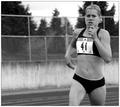
| 06/07/2003 12:31:52 PM | For The Lineby jimmythefishComment: *Critique Club*
Focus and clarity are really good here. I think that you captured a lot of detail in this woman, including tiny moles and muscle flexing. You have done a great job showing us the expression on her face.
I wonder though if she looks angry at you. lol Had she not been looking directly into the camera, I think that opinion would be totally different. I think that she looks annoyed with her eye brows scrunched up like that. However, it could be concentration on what she's doing.
The tones are really great. I think you got nice white, nice blacks, and everything in between. This does actually work well in black and white, cause I think that the background colors probably distracted from the runner.
I tink that the angle and framing/cropping are good. I think that having her to the right is the better choice. Wouldn't work the same if she were in the center, or to the left. If HER angle were different though, then it might need a different crop, but it isn't, so it dont.
A really nice job in my opinion. Super focus for a fast moving subject.
~Heather~ | | Photographer found comment helpful. |
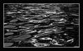
| 06/06/2003 06:47:57 PM | Water Sculptureby wayne9232Comment: *Critique Club*
I will have to admit that this doesn't really appeal to me much. The lines here seem to be a bit soft. It makes me think that this appears out of focus.
The pattern is neat. I think that it's a good setup. The waves in the water make for an interesting pattern, and the lighting really does make the pattern stand out a lot.
There really isn't much else to add. I think that the angle and framing/cropping is good, I like how the subject fills the entire frame, and there really are no distractions.
It's just not really my thing.
~Heather~ | | Photographer found comment helpful. |
| 06/06/2003 02:28:44 PM | Photographic Journeyby DougPazComment: *Critique Club*
What bothers me most about this shot is that I can't read what it says behind the glasses. It's sitting there like it could be important, very bold, very obvious, but the glasses are blocking from actually being able to read it.
Otherwise, I think that this is a difficult photo. On one hand, I think that a darker table would help to enhance the feeling of old, and also helps the photos to stand out more, but then it would make the camera blend in too much, and I think you'd lose detail there.
I think you probably went with a lighter table on purpose, which is really the way it looks like it has to be. BUT, a darker table would definately be interesting if it would look right.
The angle and framing/cropping is good. I wonder if you could have taken the strap off the camera? I think that it appears as if the cameara is just falling out of the photo with the strap being so darkk, and going out of the frame.
The focus and clarity are really good. Nice detail in the photos and the camera. All except for on the strap, which kind of blends in to one mush.
Overall a nice image. I like the feel of the photo, and I like the setup, with the photos and the camera. Looks nice in these sepia colors as well.
~Heather~ | | Photographer found comment helpful. |
|
Showing 1081 - 1090 of ~2785 |
Home -
Challenges -
Community -
League -
Photos -
Cameras -
Lenses -
Learn -
Help -
Terms of Use -
Privacy -
Top ^
DPChallenge, and website content and design, Copyright © 2001-2026 Challenging Technologies, LLC.
All digital photo copyrights belong to the photographers and may not be used without permission.
Current Server Time: 07/24/2026 10:20:44 AM EDT.
|