|
|
|
Showing 1061 - 1070 of ~2785 |
| Image |
Comment |
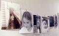
| 06/10/2003 11:02:14 AM | my home my wall my kids my photosby jbruno1397Comment: *Critique Club*
I really like this setup. I think it's a great way to display your photos!
There are 2 things that stand out to me in this shot.
First are the yellow spots. they seem to be on the wall and on the photos. I'm not really sure what's causing this, so I can't really make any suggestions on how to fix it.
The other thing I'm noticing is the glare on the first photo to the left. To the top of that photo, there is a really bright area. I can't tell if this is on the actual photo, or if it's a result of the bright lighting in THIS photo.
The lighting seems just a little bright, but I like the shadows, so I probably wouldn't change that at all.
Focus and clarity look good to me as well. We can see into the photos, and we do get some nice detail out of them as well. They almost tell us a story about your Home Sweet Home.
The angle really draws us into the photo. Takes us down the line one by one seeing into your home life.
A very nice display.
~Heather~ |
| 06/10/2003 10:24:25 AM | Entrance to Home...by Chris ParrishComment: *Critique Club*
I think your focus and clarity really make this shot for me. I like the smooth texture of the lock against the grain of the wood. Really creates some visual impact there. Also the detail shown in the chain is great as well.
The lighting for the most part is good, a little bright in a couple places, but still a very nice photo.
The angle and framing/cropping is good. Everything looks lined up nicely. The lock being off center is visually appealing here as well. I don't think it would work as well had it been dead center. The chain going across the top, the the way the 2 pieces of wood meet at an angle like that really balance out the photo.
As for meeting the challenge, I'm up to any suggestion cause if it makes YOU think of your home, then who am I to say any different?
I think it's an excellent shot.
~Heather~ |
| 06/10/2003 10:13:19 AM | Waiting..by YuliyaGComment: *Critique Club*
The framing/cropping seems strange here. I would like to have seen this as a vertical crop, with less space on the right, and have their tails showing. The angle is super. This is actually kind of creepy. Reminds me of those movies where some weird scientist controls the minds of animals. Still a nice shot though.
I think that the focus and clarity are good. Looks clearer on the cat in the back than on the white cat though. But this could be a side effect of the bright light on the white fur.
I think that the lighting is great, but maybe just a little bright on the white cat. Not really sure if there is a solution other than post processing to fix that.
I think this says Home Sweet Home to me. It's in your home, and the animals are in your home. Heck, you actual House is in the pic, don't see how this could say anything BUT home sweet home. Good find. Photograph your home and be creative. You have done just that.
~Heather~ |
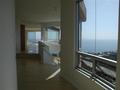
| 06/10/2003 10:05:24 AM | my home 2 beby gecutsComment: *Critique Club*
First off, congrats. Beautiful view, and looking like a nice home too.
I notice a few things that I'd like to see differently regarding the photo. The house is perfect! lol
First, the focus seems to be a bit soft on the interior of the house. A bit sharper lines would really help to bring out the beauty here. The sharpest focus seems to be on the window to the right, where most of the light is coming in.
The lighting is probably the reason for the soft focus inside. With Low lighting, ANY camera shake will screw with the focus. It could have helped to either have some extra lighting, or to set the camera down on something. Also, if your camera has a timer, you could use the timer as well to eliminate camera shake from pressing the button.
I see you thought this out nicely. You have leveled your horizon very nicely, which is a really big pet peeve of mine. Dramatic angles don't bother me, but if it's off just enough to notice, I go crazy. You did a wonderful job there.
I think that the angle and framing/cropping are good. I like that you have the windows and doors open, creating a friendly open environment.
Overall, a little focus, and a little extra lighting would make this a surpurb photo.
~Heather~ |
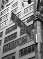
| 06/10/2003 09:55:01 AM | My Cornerby olegComment: *Critique Club*
I like this, especially in black and white. I think you did an excellent job with the tones.
The lighting is good. I like how the light fades down the building from light to darker at the bottom. This makes for a nice visual effect. The weather appears to have been cooperating with you this day. love it when that happens.
The angle and framing/cropping are good. The only thing that stands out to me, and this is totally not your fault, is that the sign post is tilted, but Maddison doesn't line up with the windows on the building, making it look all crooked. NOT something I'd expect you to be able to get lined up, but something that would be really cool if it did.
I agree with the fact that madison kind of blends in with the building, which then it's probably a good thing that the sign doesn't line up perfect with the windows, cause then it would probably blend in worse. still not a huge deal, we can clearly see the difference in the sign and building, just looks like it almost belongs there.
The focus and clarity are perfect in my opinion. WE can see lots of detail in the building, and we can also see nice crisp lines in the lettering of the sign. I like how there are little Statue Of Liberty's on the signs.
I wish the "no standing" sign couldn't be seen, but now I'm getting real picky.
Great shot.
~Heather~ |  Photographer found comment helpful. Photographer found comment helpful. |
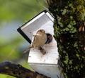
| 06/10/2003 09:47:00 AM | Sparrow Nestby ladpupmoeComment: *Critique Club*
I see 2 major things that stand out to me right away.
First is the focus. It really seems quite soft. We can't get much detail out of the bird in the house, and the bird out of the house is really fuzzy. The house itself isn't real sharp either. Not really sure where you put the sharpest focus, but it doesn't seem to be where I think it should be.
The second thing is that the Home Sweet Home is hidden behind this unattractive tree. The large section of tree to the right does not add positively to this shot. I find that with it being out of focus as well, it's a large destraction to the house and birds. It's right there 'in your face' so to speak.
The lighting appears to be ok we can see a little bit into the house, but because of focus issues, don't really get much out of it. The lighting on the outside bird appears to be just good with no distracting shadows or hot spots.
The angle is just all strange. I realize this is probably a difficult shot, but if you can't get it, maybe try a different time of day, or different subject.
The tree blocking is bad. Looking at the bottom of the house isn't really the best angle I could think of to see this at either. Realizing that this is probably up in a tree though, understood.
It does say Home Sweet Home, but not YOUR home, but I'm not too picky on that. I figure, if this makes you think of home when you see it, then who am I to say differently.
~Heather~ | | Photographer found comment helpful. |
| 06/10/2003 12:42:25 AM | Mobile Homeby simkinComment: *Critique Club*
The first thing that I noticed about this was that you cropped off his head. This to me showed a lot of respect and I appreciate the decision to do so. However, I do think that the shot itself would have been better if the head of the man were in the shot. We make tough decisions, and although it hurts the image, I think your decision was the best one that could be made regarding this.
The second thing I noticed was the focus. While the word "Mobile" is in good focus, the man and the cart are not. I think that had they been in focus a bit better, this would have been a very striking image.
It's good as it is, but the focus would have definately had some major impact.
The angle and framing/cropping is very important (disregarding the missing head, which I've already discussed). I think that you cropped this well to get the word mobile in there, and this is excellent. I also think that the crop to the right is good. Enough to get the man in the shot, and I dont think it needs any extra room over there.
You have put the man and cart to the right, and the words to the left, which I think balances out this photo nicely.
Great capture. once in a lifetime.
~Heather~ |
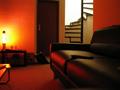
| 06/09/2003 11:59:59 PM | Home Mathmosby ewebComment: *Critique Club*
The sharpest focus that i'm seeing is the stair case. I think this would look better to me, had the couch area also been in focus.
I am assuming that is a remote sitting on the couch, however, since we don't get much detail out of it, and can't really see it well, I don't think that it works being in the photo.
I like the lighting from the lamp, but I think that is what effects the focus in the picture where the lighting is low.
The angle and framing/cropping are good. I like very much how you have the couch area, and then also show the stairs. This gives us something to look at, and also shows another interesting section of your house.
This definately fits the challenge. No questions asked, this is a home.
For low light shots, try using a tripod, or if you don't have one, you could try setting the camera down on something to steady the camera. Any camera shake at all in low lighting creates unwanted blurr. Also, if your camera has this option, you could use the timer as well as setting the camera on something, so that you don't have to touch the camera at all when the shutter opens. This will eliminate camera shake, and provide a much clearer shot when shooting in low light.
I like the orange glow, I think that is much more interesting that straight white light.
~Heather~ | | Photographer found comment helpful. |
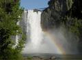
| 06/09/2003 11:21:58 PM | Seattle's beautiful backyardby KrozarComment: *Critique Club*
This is very beautiful. I really like the way you caught the rainbow in the shot as well.
I do wonder though, where the sharpest focus is located? The waterfall itself is blurry, and the rocks around the water look blurry as well. This could be due to mist, but I'm not really sure. The tree to the left look close, but still not as crisp as I'd like to see it. I think that the lack of a sharp focus is the only thing I see that could be improved upon.
When I see this, I do not automatically think of someone's home, but if this is what you think of when you think of HOME, then who am I to say differently.
The angle and framing/cropping is nice with the tree to the left, and the rainbow near center, but not dead center. It has nice balance. The colors are great. I think that such a nice day helped with this greatly.
The lighting looks to have been perfect for you. What luck! Great capture, and a beautiful scene. Had the focus been slightly crisper, this would be perfect.
Great job.
~Heather~ | | Photographer found comment helpful. |
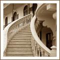
| 06/09/2003 06:32:03 PM | My old sweet home by pikytoComment: *Critique Club*
Well, believe it or not, I can find one thing that I would like to have seen differently.
I do not know if it is the actual way it's made, or if the lighting is washing it out, but I wish that the marbled look of the stairs and left hand rail were also on the right hand railing. The left one looks like it has a pattern on it, which looks like marbling, however, the right handrail is smoothe and plain white. Actually, the way it is, the left one almost just looks dirty, like it's got dusty fingerprints all over it.
Anyway, having said that, on to the praise...
The angle and framing/cropping is great. I like how you have cropped it as if we were walking up the stairs ourselves. You cropped a tiny piece of the pyrimid thing in the lower right corner, but it doesn't hurt the photo at all.
The focus and clarity are great as well. I like the detail in the steps, and also the detail we can see at the top of the steps. I don't think a blurred background would have worked very nicely here. Good choice.
Lighting looks very well. It's a nice full lighting, which almost gives the impression of natural light?? I think it really works to have this in sepia like tones. In combination with the warm lighting, I think it looks really great this way.
The border looks really great with the shot as well.
Not much more I can say, but excellent shot!
~Heather~ | | Photographer found comment helpful. |
|
Showing 1061 - 1070 of ~2785 |
Home -
Challenges -
Community -
League -
Photos -
Cameras -
Lenses -
Learn -
Help -
Terms of Use -
Privacy -
Top ^
DPChallenge, and website content and design, Copyright © 2001-2026 Challenging Technologies, LLC.
All digital photo copyrights belong to the photographers and may not be used without permission.
Current Server Time: 07/24/2026 01:04:32 AM EDT.
|