|
|
|
Showing 1051 - 1060 of ~2785 |
| Image |
Comment |
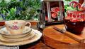
| 06/10/2003 07:40:44 PM | Comfortby clues56Comment: *Critique Club*
This has a lot of pretty elements, but I'm not quite sure they all go together very well.
I'll put it this way. You don't wear strawberry print pants, with a rose print shirt. A lot of elements in this photo clash very badly. I think there are just too many plants. Maybe take a few elements away. I think this would be nice with the toaster, and the jam, knife and cutting board. If you take out the lily, and the tea cup and 4 plates, then you have a much simpler composition that could possibly work nicer. Also, you could probaby get in a bit closer with fewer elements as mentioned.
I find that the detail on the jam is quite small, and trying to look 'closer' at it for more detail hurts my eyes. Your focus and clarity seem good, but that print is a little too small.
Lighting apears to be nice. There is a bit of a glare in the window from the cup and plates, but otherwise, no bad hot spots or annoying shadows.
Overall, pretty, but a bit too busy with too many patterns.
~Heather~ |  Photographer found comment helpful. Photographer found comment helpful. |
| 06/10/2003 04:30:42 PM | at home with momby DoorskidderComment: *Critique Club*
It looks like there might have been low lighting here, and you used flash to get better color and focus.
I know you probably don't want to disturb the cat and her kittens, but I would try moving them away from this wall a bit. See how there is a harsh shadow around the basket, and inside the holes in the back of the basket? If you used different lighting, and moved the basket away a bit, those distracting shadows would be lessened, or even totally gone.
The focus seems a bit soft to me. Especially on th little fuzz ball in front. The sharpest, most crisp focus seems to be on the tail of the mama kitty. I wish that her eyes showed that same sharpness as does her tail. We can see each individual hair on her tail, but we don't get that same detail on the mom's head, or on the kittens.
There is a black spot on the rigt edge of the basket, which is a little distracting, but not a huge deal.
I do think it's a great family photo though. Very adorable. i think I saw a pic of these guys when they were just a day or so old.
Fits the "Home" theme nicely in my opinion as well.
~Heather~ |
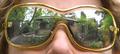
| 06/10/2003 04:04:03 PM | Reflecting on "home"by hughletherenComment: *Critique Club*
LOL. My favorite comment you got was "i suspect you cut out paper and put it on the lens! cool idea."
Wouldn't have that been so much simpler?! Now why don't we think of these things BEFORE we've spent the time doing it the hard way. Probably wouldn't have looked quite right though. The way we are seeing it here, there is some distortion from the curves of the glass, and I don't think it would look quite right without that.
I almost hate to say it, but the sky is really white, and is begining to engulf things. The top edge of the house, and some tree branches.
Your focus and clarity are good. This is definately creative.
I think that maybe a side angle on the glasses would look cool, but be quite difficult to get, and probably not show the house quite as well. so the head on shot was probably the best idea.
Overall, nice take on the challenge, and better than a lot I've seen.
~Heather~ | | Photographer found comment helpful. |
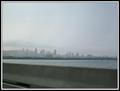
| 06/10/2003 03:36:02 PM | Montreal - My home sweet homeby RawkgurlComment: *Critique Club*
Seeing that you are new to DPC, I'll start by saying that take the comments you get into consideration, but don't take them personally.
Your results don't suck totally. You did get a few comments that can lead you toward improving things.
I think that the combination of the blurry guard railing and the way the light is coming through the sky at an agle, really does make this look like there is a window in the way. I realize that there isn't, but see how the sun strikes through the clouds at a southwest angle and then there are also light patches on the guard rail that are also going in a south west angle? Kind of makes it look that way.
Also, the blurred forground is a definate sign that this was taken out of a moving vehicle, which generally does give one the feeling that this was just a quick shot that you took.
I tried this. Crop it so that the guard rail is out of the picture. There isn't really a lot of water then, but at least the blurry rail is out of the picture.
I think it would have higher visual impact had it been different lighting conditions. This day looks to have been a bit overcast, and foggy. It kind of hides the detail in the buildings that are in front of the hill to the left.
I think that it would work with the crop as I mentioned. The sky creates some nice negative space, and while it's not the most exciting sky, it does go with the foggy, overcast theme you have going on the city.
An even more ideal solution would be if you could have gotten your camera up higher to take a shot. maybe even take a few 'blind' shots held way above the car. This might have gotten a bit more water and a bit less guard rail.
I think the city is neat looking though. I've never been there.
~Heather~ | | Photographer found comment helpful. |
| 06/10/2003 03:16:01 PM | Where they once stoodby soggy1Comment: *Critique Club*
Actually, without your title, I would never have even known what country this was even in, except maybe for the hint of an american flag in the far distance. So the picture doesn't really talk to me, the title does though.
I see you're fairly new to DPC and I'll mention first, that snapshotty photos don't generally do well here. As you probably already found out. Don't let that scare you off though. Grow a thick alligator skin, and take comments into consideration, but don't take them too seriously.
That being said...Here's what I think.
Taken through the car window is a bad idea. It definately looks like a snapshot, and doesn't look like you spent any time at all trying to achieve this photo. Drove around the corner, snap, and continued on your way.
To me, the tilt of the buildings is not quite enough to represent a dramatic angle. It looks like a mistake. A result of trying to get a shot in a short period of time with lots of things in your way.
The colors are really muted, and this is probably a result of the lighting conditions and being shot through glass.
Your sky is really blown out. Way too white. and while this may draw attention to this area of the photo, I think it over does it. See how the whiteness is engulfing the tops of the buildings in the background? Kind of washing away the detail in the buildings around the white area.
The focus in my opinion should be toward the back as well, if this is where you are trying to draw our attention. It's hard to tell, but the sharpest focus to me, looks like the white lines on the road in the bottom left hand corner of the photo. Not the most interesting thing in the pic to have been in sharpest focus.
i think that had you taken 15 minutes to find a place to park, and walk here to take this shot, it would have made a whole lot of difference. it takes time and patience to get great photos. However, It does happen that once in awhile you have an accident and it's the prettiest accident you've ever had with your camera. lol
Keep at it!
~Heather~ |
| 06/10/2003 02:49:12 PM | Italian cuisineby gceramiComment: *Critique Club*
The part that I'm seeing that is the most in focus is the front edge of the round part of the burner. That on it's own does not really say ANYTHING to me. It doesn't say home, and it doesn't say italian cooking. I see some blurry yellow mass in the back which looks like it could be food, but it is definately not appealing.
If this is suposed to be about the food, than maybe actually getting the food in the picture, and not hidden behind a burner arm might be a good idea.
Maybe even taking a photo of the actual food when it is served up. This could make for a nice, and delicious photo. I think maybe on plates, on your table in your dining room could create a better sense of "home".
The lighting is a bit dark. Seems that I want to see some more light to try to see this better, but I don't know if that would help cause one of the reasons its hard to see is that it's out of focus.
Maybe if you tried a wider angle on your stove. Backed up and took a photo of the whole stove, or the countertop.
The burner just isn't interesting to me. Sorry.
~Heather~ |
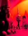
| 06/10/2003 02:15:05 PM | my houseby redhedComment: *Critique Club*
I'm tossed on the lighting here. On one hand, I think that it adds some dramatic effect, on the other though, I think it's quite too strong and ruins a lot of the detail we could have seen here.
I think my final decision is that it is negative to the photo.
You have chosen a nice angle to shoot these things. It's not too busy, and it does say something about yout home.
However, the red light takes away a lot of detail. It's too overpowering, and actually erases things out of the photo. See the 2 little objects at the feet of the monkey to the left? They are only litle blobs, we can't see through the powerful color to even get a shape out of them.
The focus looks like it's in the far back on the head wearing the pointy hat. This looks to be the sharpest focus. The monkey to the left is not well focused at all. And that also hurts any details we could get here.
Can you tell I'm a fan of detail? lol
Anyway, I think it fits the challenge nicely, and the colors work nicely on the background, however, not on the objects themselves.
~Heather~ | | Photographer found comment helpful. |
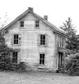
| 06/10/2003 02:06:05 PM | my dream homeby pookey83Comment: *Critique Club*
This house is leaning quite a bit to the right. If this was done intentionally, I don't think it's appealing at all. I think that it should be rotated back to the left and leveled. This isn't tilted enough to be considered "dramatic angle" or anything, it simply looks like an error.
I think that black and white works well for this old house, however, theres quite a bit too much white and not enough black. Maybe a midtone adjustment could help? Without making the whole shot look grey, just bump up the darkness, like in the windows and trees. Then again, it could just be the blaring white boring sky that is overwhelming this shot with white.
The house itself is interesting. Your focus and clarity of the house seems good. I like the detail in the siding and windows. I think you captured that aspect very well. I like how you used a older run down house for your image rather than a modern day, techno house.
~Heather~ | | Photographer found comment helpful. |
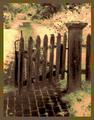
| 06/10/2003 01:49:13 PM | The Garden Gateby fleenkComment: *Critique Club*
By saying "Digitally colored black and white photo" this makes me think that this was illegally done. The site council voted to request proof, but I don't think the results of this proof was ever passed on to us SC members by the admin.
I can say that it does not appeal much to me at all. I don't like the pink/yellow/green mixture. I think had this stayed a black and white photo, and had the focus been much sharper, this would have looked a lot better in my opinion.
The fence is really blurry, and there is no detail at all in the trees and bushes.
weather this was legal or not, the coloring is aweful and combined with this lack of focus, really ruins it.
My suggestion? Try just the black and white, and use sharper focus.
The photo with the fence, brick walkway, and trees looks like it COULD have been appealing had a different technique been used. The angle and framing/cropping on the fence is good.
I'd like to how you achieved thie effect, and what steps were used.
~Heather~ |
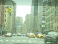
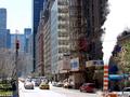
| 06/10/2003 11:28:23 AM | My Home--New York... America...by tolyanchikComment: *Critique Club*
I see your statement against eloise, and at the risk of beint "not useful" I have to agree with her in a way. There is a lot in this shot, and it's very cluttered and busy. I do realize that this is representative of where you live, however, it doesn't make for a pleasing photo.
You mention the scaffolding, however, there is a large tree in front of the scaffolding. This tree creates a different pattern over the scaffold making it all blend into one big mush.
You mention the flag, but it is only peeking out from behind a branch, and is not a subject in the photo that stands out to me as important at all becuse of it being hidden. It is not 'standing proud'. It's concealed.
You mention the traffic, but it's so far away and tiny, that we don't get much detail out of that either.
The sky is bright and appears a little bright as it's putting a foggy blue cast over the building. This could be smog, or smoke also, but whatever causes it, the sky looks a bit blown out.
Now, you also mention that smoke stack thingy. I think that this is the most interesting part of the photo. Because it's right there, out in the open, and large enough to get detail out of, and also what I see to be the sharpest focus, THIS is what my eye is drawn to. My only disapointment with this is that you cut it in half. You didn't include the rest of it, and cut the sign in half leaving me wonder "what the heck is 'raise' suposed to mean.
I've never been here, but I'm quite sure this represents the busy, crowded life of New York very well. It's just not really pleasing to the eye.
I wonder how this would have been had you put more emphasis on one thing. You wouldn't have gotten ALL things in the shot, but you could have put enough of a creative spin on it to really make it punch. This is almost snapshotty.
This is my true honest opinion, and I hope you don't take offense.
~Heather~ | | Photographer found comment helpful. |
|
Showing 1051 - 1060 of ~2785 |
Home -
Challenges -
Community -
League -
Photos -
Cameras -
Lenses -
Learn -
Help -
Terms of Use -
Privacy -
Top ^
DPChallenge, and website content and design, Copyright © 2001-2026 Challenging Technologies, LLC.
All digital photo copyrights belong to the photographers and may not be used without permission.
Current Server Time: 07/24/2026 05:02:25 AM EDT.
|