| Image |
Comment |
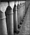
| 03/17/2005 02:48:16 PM |
Disjointedby LucidLotusComment: The BW conversion has done well here. There's good contrast.
I like the vanishing point composition, and the image does really well together with the title. |
 Photographer found comment helpful. Photographer found comment helpful. |
| 03/17/2005 02:44:46 PM |
|
| Photographer found comment helpful. |
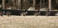
| 03/17/2005 02:42:59 PM |
Subtle Waysby PhotoRynoComment: Nice color, and very good contrast. The light is also very nice. The only think I can think of right here is that the sky could be bluer, but to get that out of the camera you'd need a polarizer. |
| Photographer found comment helpful. |
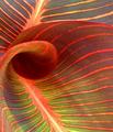
| 03/17/2005 02:41:49 PM |
Natural lines of Natureby trainComment: Good color. However, I think the crop is too tight, you can't really tell exactly what this is except from some kind of flower. I miss some room. |
| Photographer found comment helpful. |
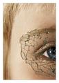
| 03/17/2005 02:40:20 PM |
Broken Realityby AmasonComment: Nice work. The color in the eye is great, and the glass in front adds up.
However, I'm not that much a fan of the framing, I think it steals from the shot. Good detail, and very good focus. One suggestion would be to capture it so that the eye and the shattered glass would both be in the focus field. The glass is sharp at the middle, but it gets a little disturbingly blurry further to the left. |
| Photographer found comment helpful. |
| 03/17/2005 02:38:19 PM |
Shadow Linesby abarnaComment: It's not entirely clear what you are trying to say in this image. Try to preemptively think what you want to say with an image - then capture. There are lines, sure, but I can't tell what they're supposed to do there. To me, simplicity and a meaning is important. The meaning can be deep, but I suspect that the depth of the meaning does not surpass me ;) |
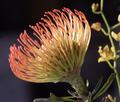
| 03/17/2005 02:35:17 PM |
Pincushion Proteaby CantiqueComment: Nice background, and the flower in the back adds up. However, I think the image could've had some more contrast and some work to make the flashy colors more interesting. |
| Photographer found comment helpful. |
| 03/17/2005 02:33:49 PM |
jello wiskby byoungComment: The image is a little messy to me, I think you could have turned away the side of the canister with the text on. Good color. |
| Photographer found comment helpful. |
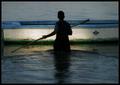
| 03/17/2005 01:54:36 PM |
Out at Seaby JeanComment: Hmm... This image's lines could be interpreted in many ways, and I'm not sure what you've been thinking of whenyou made it. However, the central part of the image is almost black, and not black enough to make a silhouette. It'll be interesting to see what you've thought of with this image. |
| Photographer found comment helpful. |
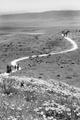
| 03/17/2005 01:52:02 PM |
The Path Away from Gloryby mirdonamyComment: I like the image, especially the crop that works very well, in cooperation with the pathway. Although the image could use some more contrast and you could maybe underexpose a little bit, so you get more shadow detail. |
| Photographer found comment helpful. |
Home -
Challenges -
Community -
League -
Photos -
Cameras -
Lenses -
Learn -
Help -
Terms of Use -
Privacy -
Top ^
DPChallenge, and website content and design, Copyright © 2001-2026 Challenging Technologies, LLC.
All digital photo copyrights belong to the photographers and may not be used without permission.
Current Server Time: 07/16/2026 10:37:40 AM EDT.