| Image |
Comment |
| 10/10/2005 01:29:00 AM |
The end is near...by stare_at_the_sunComment: 235 of 297. About what you expected, I guess Caleb? It's so sad that independent thought is so pitifully scarce at DPC that an image like this can be dismissed. Don't change what you do ... we already have too many Hallmark photographers here. There's some brilliant stuff in your portfolio (B&W & Water especially). Keep doing that! |
 Photographer found comment helpful. Photographer found comment helpful. |
| 10/10/2005 01:20:24 AM |
My Own Prisonby aznymComment: Hah! You again! And shamefully misunderstood again, too. I really don't know how you can keep cheerfully subjecting yourself to this nonsense, but I'm very glad that you do. Cheers. |
| Photographer found comment helpful. |
| 10/10/2005 01:15:03 AM |
Mountain View of Beach & Oceanby anthonyczajaComment: Well, Anthony ... 219 out of 297. If it wasn't so sad it would be hilarious. But look on the bright side; the fact that this image was apparently beyond the intellectual reach of most voters here is actually something of a compliment. |
| Photographer found comment helpful. |
| 10/09/2005 06:57:11 AM |
All Occasionby msdoubletroubleComment: Hi Sonya ... this is a greeting from the Critique Club.
On the positive side, there's something I like about photographs with a path, a road or a rail track leading from the near edge into the image. It always seems to make me want to step into the picture (maybe I've got an Alice in Wonderland fantasy problem?) Anyway, my problems aside, your shot does have a nice leading line effect with the path, and is effectively composed. The downside, I feel, is that your path doesn't lead me anywhere ... there just isn't enough of a point of interest to make the suggested journey appealing, even for Alice. Nor does the presence of the puddle near the path serve much purpose. It seems a little distracting and bewildering to me. The photograph itself is technically competent; sharp, level, well exposed & with realistic looking colours, although maybe a tiny bit more contrast would be worth a try. However, I can't really get past the fact that there seems to be no point to the image; no reason for you to have taken it, and none for a viewer to give it much attention. I've looked at your work on your profile page, and you have taken some interesting and appealing photographs, so I think you'll already know that this one isn't quite as successful as some of the others. I'll look forward to seeing your next challenge entry. Cheers,
Paul Martin |
| 10/07/2005 10:09:17 PM |
Transluscent Lakescapeby SimonjwComment: A striking and elegantly balanced landscape ... seldom does vertical crop really work in a landscape, but when it does, it can be terrific. And this one is. Beautifully composed, exposed and processed, it's really several interesting cameo studies in one (the rocks, the lake waters, the mountains/sky), yet they mesh harmoniously together to create a very satisfying whole. 8. |
| Photographer found comment helpful. |
| 10/07/2005 10:01:38 PM |
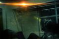
Transienceby ImagineerComment: A clever image. The person's gaze directed toward the reflected sign and the alien-looking light source creates a slightly unworldly, surrealist effect which is further heightened by the bizarre "X" cap he/she is wearing. I like it because it's original and because it challenges the viewer to participate rather than just spectate. Alas, the spectators will vote it down! 8. |
| Photographer found comment helpful. |
| 10/07/2005 09:54:24 PM |
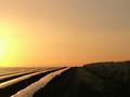
green green grass of homeby messerschmittComment: I don't understand the rows ... it looks like plastic covering over strawberries, or is it some kind of grass silage? Whatever, the effect is startling in your image, and your composition is most effective. I very much like the stark, minimalist look of it, and the subdued but elegant colours. Hope you'll explain just what it is! 8. |
| Photographer found comment helpful. |
| 10/07/2005 09:50:02 PM |
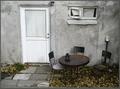
My Cozy Cornerby gsalComment: This slightly neglected looking corner actually has great charm. The impression created by your photograph is that perhaps it's not really neglect at all ... perhaps it's actually a case of contentment and satisfaction with the way things are ... and a desire to leave well enough alone. It's an appealing thought and an appealing image. 8. |
| Photographer found comment helpful. |
| 10/07/2005 09:44:21 PM |
My Own Prisonby aznymComment: This has got some odd and unsettling aspects to it ... there's one or two strange perspective shifts in there that result in an image that insists on some serious attention and thought from the viewer. It's hard to know exactly how all the elements fit together, or if indeed they DO fit together. The impression created is of disjointedness and opression which, given your title, is likely exactly the impact you were intending. It's a very fine and challenging image, and well worth a few minutes' analysis. Hope it gets it! 9. |
| Photographer found comment helpful. |
| 10/07/2005 09:30:55 PM |
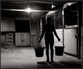
doing my night barn choresby dragonladyComment: Beautifully executed rich B&W ... actually I think it's a duotone? The composition is simple yet stylish, and the combination of shadows & highlights is almost theatrical (I mean that as a compliment). Love the details just visible in the stall on the right; the horse and the light on the bars above the door. The light source is nicely incorporated without overpowering the shot, and the multiple shadows in the lower right foreground are fascinating. Nice image. 9. |
| Photographer found comment helpful. |
Home -
Challenges -
Community -
League -
Photos -
Cameras -
Lenses -
Learn -
Help -
Terms of Use -
Privacy -
Top ^
DPChallenge, and website content and design, Copyright © 2001-2026 Challenging Technologies, LLC.
All digital photo copyrights belong to the photographers and may not be used without permission.
Current Server Time: 08/04/2026 09:56:31 PM EDT.