| Image |
Comment |
| 10/28/2005 09:27:40 AM |
Noisy Woodgrainby graphicfunkComment: I don't know if you've read the brilliant novel "Industry of Souls" by Martin Booth, but this powerful, disturbing image would make a perfect cover photograph. Such an original take on the concept of 'grain' too, and it's certainly no gimmick ... it's contextually totally credible. 9 |
 Photographer found comment helpful. Photographer found comment helpful. |
| 10/28/2005 09:19:02 AM |
Runinng Down the Middleby moviemanComment: This is a terrific football image. All of the explosive movement, the violent impact, and even the suggestion of the noise; it's all there! The fact that you have managed to reserve your focus only for the ball carrier is a stunning achievement ... I cannot imagine how you did that so convincingly (there must be some post-processing involved, but whatever you did, it's seamless). And of course you didn't overdo the grain - just enough for a 'documentary' impact. This photograph gets better the longer I look at it! One of my all-time favourite sports images. 10 |
| Photographer found comment helpful. |
| 10/28/2005 05:39:02 AM |
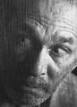
Stefanby bbrightComment: Very nice portrait of a terrific subject. I think the use of grain is particularly effective, because it creates a 'painterly' feel to the image which, combined with the simple woollen hat and tee shirt, somehow serves to accentuate the mesmerising eyes of the model. 7 |
| Photographer found comment helpful. |
| 10/28/2005 05:32:21 AM |
Missing Youby toddheadComment: This is an unusual and very appealing portrait. It's a 100% convincing depiction of the emotion expressed in the title. The composition, the crop, and the young man's bereft expression (especially as it's directed off-stage), all contribute to the success of the image, and so of course does the understated yet effective use of grain. 7 |
| Photographer found comment helpful. |
| 10/26/2005 06:32:46 AM |
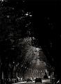
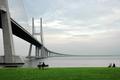
Boulevardby jjbeguinComment: Oh ... this is a wonderful photograph. It shows me what you mean by 'trained and enthusiastic eyes'. Alas, I suspect there's rather more to producing this than just training and enthusiasm. I tried to be a musician, many years ago ... I trained hard, and I was certainly enthusiastic, but my music was uninspired and mercifully I soon knew it and quit. This photograph, on the other hand, is sublime; the visual equivalent of Miles Davis. The inclusion of the towering gloom is bold and masterful - I'd probably have framed it half way down and made it just like my music. |
| Photographer found comment helpful. |
| 10/26/2005 05:59:58 AM |
Fallen Leaves by e301Comment: Originally posted by jjbeguin:
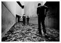
This is a realy fine picture both in form and content; I'm pleased and suprised to see it ranked so high. |
What he said. |
| Photographer found comment helpful. |
| 10/26/2005 05:33:01 AM |
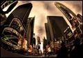
Times Square, 2005by pawdrixComment: So good to see you on the front page, Steve. One of the best 'real life' photographers on the site finally gets some recognition. I hope it will encourage some of the skimmers to have a closer look at your portfolio & see what documentary photography as art is about. |
| Photographer found comment helpful. |
| 10/24/2005 10:20:58 PM |
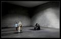
Contemplationby e301Comment: Did not vote, nor even look at the entries. This is sublime, subtle and stylish and so wins my S-S-Special Hindsight Blue Ribbon (a very rare & quite worthless award). Surely the man in the overcoat is Richard Harris? |
| Photographer found comment helpful. |
| 10/24/2005 10:08:51 PM |
Contemplationby NunoComment: Congratulations, Nuno. I am delighted to see your name on the ribbon page ... I have admired your stuff ever since your Long Exposure image, which was cruelly under-estimated by the voters. This one is very beautiful and also a little more DPC-friendly! I did not vote, or even look at the entries until now, but this image would have been in my top two choices. Bravo! |
| Photographer found comment helpful. |
| 10/18/2005 06:58:22 PM |
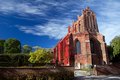
Fall in a medieval townby puzzledComment: I like it ... and you KNOW how I like pictures of churches! I thought it was a touch oversaturated at first glance, then I realised that's what the colours really were (except for a bit of intensifying via the polarizing filter). Moving closer might accentuate the 'lean' of the building even more, but I'd have done it anyway & so got rid of the fence. I feel the horizontal line of the fence is a little graceless, and is fighting with the beautiful verticals of the church. Also, it looks like there are some gravestones hidden behind that fence, and they'd add a lot more atmosphere to the image than the fence does. Adjusting verticals in PS is not too hard, as long as you remember to just reduce the 'lean', and not eradicate it altogether (which looks unnatural & makes the building appear squat). For truly expert advice on correcting perspective in architectural subjects, send a PM to bear_music. Cheers! P. |
| Photographer found comment helpful. |
Home -
Challenges -
Community -
League -
Photos -
Cameras -
Lenses -
Learn -
Help -
Terms of Use -
Privacy -
Top ^
DPChallenge, and website content and design, Copyright © 2001-2026 Challenging Technologies, LLC.
All digital photo copyrights belong to the photographers and may not be used without permission.
Current Server Time: 08/05/2026 03:24:31 AM EDT.