| Image |
Comment |
| 09/07/2006 01:52:45 PM |
two ideas for make you smile :)by gastonComment: This clown looks evil with that grin and a hint of red in the eyes. :)
The strong saturation of the colors suits the subject, the light is pretty good. It certainly grabs your attention. 8 |
 Photographer found comment helpful. Photographer found comment helpful. |
| 09/07/2006 01:49:09 PM |
The Kite Flyersby DemonLlamaComment: Great silhouette, nice tone in the sky and the light shining trough the kite just adds that little bit of depth to keep the image from being totally 2D. Nice one. |
| Photographer found comment helpful. |
| 09/07/2006 01:47:02 PM |
Contemplationby trnqltyComment: The way the vignetting and bg blur works to focus attention on the main subject is great. Also the repetition of the stands adds a lot of depth, that way focussing even more attention on the person in front. Really like the choice for b&w and the quality of the tone and contrast. Only very slight minus are the very light shadows on the right and behind the helmet.
Very cool.
|
| Photographer found comment helpful. |
| 09/07/2006 01:43:19 PM |
i-Dby jmogensenComment: What I like about this photo is the 'covered' look. Hidden behind arms and hair she gives you a sneaky in love look. Maybe I expect too much from such a look but that is what it feels like and what it makes so appealing. :)
Good tech, good tone, good compo, could look at it for a long time. 9 (only because the only one I gave a 10 to is on such a high level for me that no other pic in the challenge gets a 10). :) |
| Photographer found comment helpful. |
| 09/05/2006 04:01:54 PM |
Ansichtby ajschelComment: This looks so extremely familiar. :)
And better than any of mine... Great compo and I like the old look processing. |
| Photographer found comment helpful. |
| 09/01/2006 08:15:57 PM |
|
| Photographer found comment helpful. |
| 09/01/2006 08:13:53 PM |
The Captainby FalcComment: Great clos-up portrait with a nice pp style. Steve, is this your work? When you are not pawdrix, please take that as a compliment. I like Steve's work. |
| Photographer found comment helpful. |
| 09/01/2006 08:02:06 PM |
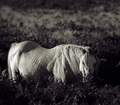
Lostby cheekymunkyComment: It loos famished and the tone adds a cool (as opposed to warm) deathly tone to it. That horse doesn't look healthy. Is that why he's 'Lost'? |
| Photographer found comment helpful. |
| 09/01/2006 07:59:53 PM |
The Bellsby heathenComment: I like the reflection and how the light shines on the distant mountain tops, the balance of the exposure.
What I don't like is that it looks very centered. |
| Photographer found comment helpful. |
| 09/01/2006 07:58:08 PM |
|
| Photographer found comment helpful. |
Home -
Challenges -
Community -
League -
Photos -
Cameras -
Lenses -
Learn -
Help -
Terms of Use -
Privacy -
Top ^
DPChallenge, and website content and design, Copyright © 2001-2026 Challenging Technologies, LLC.
All digital photo copyrights belong to the photographers and may not be used without permission.
Current Server Time: 06/18/2026 01:37:09 PM EDT.