DPChallenge: A Digital Photography Contest You are not logged in. (log in or register
 
Browse Settings
Currently viewing:
MemberAzrifel

Show comments:

Per page:

Order:

Comments:


Comments Made by Azrifel
Pages:   ... [264] [265] [266] [267] [268] [269] [270] ... [274]
Showing 2661 - 2670 of ~2734
Image Comment
Living On Faith
12/02/2002 02:00:00 PM
Living On Faith1st Place
by Shiiizzzam

Comment:
Hmmm, Sepia, yes. Stupid me.
Living On Faith
12/02/2002 11:16:00 AM
Living On Faith1st Place
by Shiiizzzam

Comment:
~~~~Critique Club Comment~~~~

*Composition (content)*
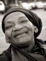
The composition is excellent. The frame is nicely filled, good balance between all the sides and corners. The diagonal portrayal of the lady not only makes room for the 'knitted cap' (that's as close as I can get in my native language), but also enhances the feeling that the lady shows satisfaction, happiness and pride.
The lines on the face of the woman are very interesting to look at, they tell a story (as does the clothing) and the reflection in the eyes is spot on, very pleasing in relation to the total picture.
As with most portraits, I think that the choice to use B&W was the right choice. Color might have made the background a bit distracting.

*Background*
Because of the wide aperture, the background is blurred away. Yet is still shows that the picture was taken on the street. The relation between the background and the main subject is clear, so the background enhances the subject. Choosing a blank or brick wall would not have been as nice.
The line on the road does not distract as it is supposed to be there (it is recognizable) and is almost parallel to the shoulders. In a way it even gives some depth to the picture.

*Camera Work (Technical)*
Again excellent. The focus is good, the depth of field (aperture) is excellent. All the important bits of the face are in focus. Sharpness is very good; all the lines on the face and a lot of other skin features are clearly visible and add to the story the picture tells. Softening it would have taken that away, so a good decision to do it as it is.
I don't know at which focal length this shot was taken and I don't know the portrayed lady, so I am not going to say anything about the relation between the focal length, zooming in and distortion of facial features. But it is important, so I'd advise all readers who don't know what I am talking about to read some tutorials on portraiture. This picture seems okay to me.

*Digital Processing (technical)*
Sharpening is very good (not too soft and no trace of oversharpening).
Balance between light and dark is good.
Compression is good (no jpeg artefacts)

*My opinion*
This is a very good portrait, with an interesting subject. The photo tells a story and shows emotion and as a bonus is technically very good. In this challenge there was only one that I liked more, but this picture deserved to win. Congratulations!
Living On Faith
11/25/2002 05:33:00 AM
Living On Faith1st Place
by Shiiizzzam

Comment:
Excellent portrait.
Flower
11/25/2002 06:01:00 AM
Flower
by Title9

Comment:
Come on! A waste of time!
Thanksgiving is his favorite holiday too!
11/25/2002 05:11:00 AM
Thanksgiving is his favorite holiday too!
by GolferDDS

Comment:
Overexposed, noisy and bad color rendition of whites in the shadows.
Protesters and Worker
11/25/2002 05:56:00 AM
Protesters and Worker
by komantam

Comment:
I don't know about your monitor, but on mine the view in the mirror is so dark that I cannot see what was ment to be seen.
Sunset
11/25/2002 05:15:00 AM
Sunset
by Lana

Comment:
Too much jpeg artifacts around the edges of the objects, save it at a higher quality. This pic is 42kb where 150 is allowed. The artifacts are very disturbing and it ruins the fluent transition of colors.
I wonder what it would look like if it was shot from a position somewhat more to the left.
In the Shadows
12/02/2002 01:40:00 PM
In the Shadows
by karmat

Comment:
~~~~Critique Club Comment~~~~

*Composition (content)*
The composition is not ideal. I suppose that the picture reflects the title, the life in the shadows. But the position of the man in relation to the sun is far from ideal in my personal opinion. The difference between the dark and bright area of the jacket is too big and detail is lost in the shadows. The shadow over the eyes takes some of the emotional aspects away.
I don't think that is was necessary to change the position, this might also have been overcome with a bit of fill flash. Keep most of the shadows, but brings also some detail back.
As already mentioned by someone else: Shoot from a slightly different angle or position the subject in a different place to get a better position in relation to the traffic lights and to get rid of the sign in the upper right corner (or include more of it).
The position of the subject in the frame is good.

*Background*
The background is not bad, but it also doesn't tell much about the subject.
You might also want to try a wider aperture (F4-F2.x) to blur the background, to focus the attention more on the man. It also blurs the trees that are not very interesting at this time of year.
The lines in the background provide good perspective/depth.

*Camera Work (Technical)*
Already mentioned: Try fill flash (and perhaps exposure compensation in combination with the fill flash or on the flash itself). Try to shoot with a wider aperture to get a narrower depth of field, blur the background.
Otherwise the exposure is good, focus good, perhaps a bit oversharpened (could also be the result of post processing).

*Digital Processing (technical)*
Perhaps a little less sharpening.
B&W is good.
Compression is good, no Jpeg artefacts.

*My opinion*
Interesting subject, but the background is a little bit boring. Can be improved technically.
There is no direct story and the subject expresses little emotion.
Photographer found comment helpful.
Killer Storm
11/25/2002 05:41:00 AM
Killer Storm
by mrguille

Comment:
Nice how the police line and fallen tree lead the way trough the picture. It looks a slight bit underexposed and it lacks sharpness.
Also, save your pic at the highest allowed quality (150kb), the compression destroys the detail and that is probably why this image lacks detail sharpness. It would be better for the asphalt too.
Have you tried a lower angle?
Memory Stick
11/18/2002 03:31:00 AM
Memory Stick
by jenarom

Comment:
Ha ha ha! Good one.
Pages:   ... [264] [265] [266] [267] [268] [269] [270] ... [274]
Showing 2661 - 2670 of ~2734


Home - Challenges - Community - League - Photos - Cameras - Lenses - Learn - Help - Terms of Use - Privacy - Top ^
DPChallenge, and website content and design, Copyright © 2001-2025 Challenging Technologies, LLC.
All digital photo copyrights belong to the photographers and may not be used without permission.
Current Server Time: 09/04/2025 03:54:05 PM EDT.