|
|
|
Showing 2501 - 2510 of ~2734 |
| Image |
Comment |
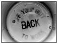
| 01/22/2003 05:49:35 PM | Had Milk....by connieComment: Somehow this looks so classic, so early twentieth century. Very cool.
Nice subtle angle of the text, I like it how the milk diffuses the upper and lower text to create a really strong "BACK".
This is something I would go and look at in a museum/gallery. Very nice. |
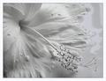
| 01/22/2003 05:46:21 PM | Milky Bathby JeanComment: Beautiful how the subtle tone differences work out.
Very nice composition. The droplets of milk on the flower seem to add something. When I imagine the image without them it seems more empty.
Not a straight line to be seen, very natural, nice.
|  Photographer found comment helpful. Photographer found comment helpful. |
| 01/22/2003 05:43:44 PM | | | Photographer found comment helpful. |
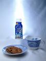
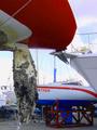
| 01/22/2003 05:42:15 PM | Heavenlyby TurbotechComment: Who's dpc's most famous vegetarian!? :)
Great work with the lighting of this. The bright beam towards and behind the packet is very cool, yet the exposure of the other items in the frame is very good. Excellent lighting.
I like how all the blue works. The combination of background, foreground subjects and background main subject is very pleasing to the eye.
Nice composition.
This is almost advertisement quality. The only negative is the somewhat sloppy background at the right. | | Photographer found comment helpful. |
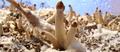
| 01/22/2003 05:22:55 PM | Psychedelic Valleyby av8orboyComment: ~~~~Critique Club Comment~~~~
Composition (content)
Cool subject.
Composition is basically ok. The main subject, the mushrooms in the middle, are centered. I think that putting them more to the left or right in the frame would make it even more appealing to the eye. Given that there is that strange fungi covered piece of straw (?) at the right, that would be a postioning more to the left. Another option is to change the angle of shooting and bring it more to the right. I don't say cropping, because I like the wide 'landscape' view over the background.
The balance between the foreground with all the mushrooms and the background (wet blue/grey) is very nice and I like the curvy horizon.
The way all the items in this photo work together is really nice, it looks just like a real landscape. The white fungi does a good job playing snow. :)
The way you cropped this for the centered mushroom is good. The subject doesn't need a lot of space under and above it.
Background
Nice background. Looks like alufoil covered insulation material to me. The color creates a good balance with the color and tones of the foreground. The water droplets are a nice touch.
The use of the wide aperture to get this narrow DOF works out great, the blur makes the mushrooms in the background look really far away. Their relative size in macro mode also creates a lot of depth.
Camera Work (Technical)
See background.
Focus, sharpness, exposure, color etc are all excellent. The lighting is also very good.
Digital Processing (technical)
Needs no work.
My opinion
Very cool, well executed, could perhaps be better with off-center subject positioning. Check the composition tutorial for example.
|
| 01/22/2003 05:01:58 PM | yachts at restby kenboComment: ~~~~Critique Club Comment~~~~
Composition (content)
The composition is one of the two main reasons why this image scored 217th out of 219 entries. The other one is the fact that this is not a landscape. To enter it was your choice, I don't mind.
The rudder is in an interesting place in the composition, a rule of thirds spot and it seems to work here. The keel of the boat also enters the frame in a nice way.
The other parts of the composition are messy. The keel of the red boat seems to transfer into the bow of the boat at the right. The rudder blocks the name of the boat in the back and the bow of the boat behind "...rtner" seems to drop out of nothing (and breaks the line into the rudder of the first boat). I think that a different shooting angle would iron out most of that. More to the right for example, to get the bow and name of the "...rtner" in view and to detach the keel of the red one from the bow of other. It would also improve the depth.
The colors of the boats are nice, but on the oversaturated side.
Background
See composition. Try different angles.
Camera Work (Technical)
I own a P1 and there is not much you can do with it. :)
The exposure seems good, depth of field is huge, but when the rudder is used as main subject, it would be better with a blurred background. Just hope that the camera does it. :)
Focus and sharpness are good.
Unfortunately the whitebalance cannot be set manual, because the balance seems to favour blue. My P1 does the same thing in any outdoor situation. Always a blue/purple cast. Autolevels or manual levels with the white/black eyedropper in photoshop does magic with that.
Digital Processing (technical)
See camera work.
The maximum filesize is 150kb, yours is 100kb. Using a higher quality setting could make the sky in the upper right look more natural and keeps jpeg artifacting around noise lower.
My opinion
Needs better composition. |
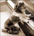
| 01/22/2003 04:23:23 PM | Virtuosityby RiderGalComment: ~~~~Critique Club Comment~~~~
Composition (content)
Good composition and cropping. The angle of the piano creates depth. Because the piano's edges in the frame end well before the frame's corners, you maintain a natural balance between the left and right side of the diagonal. Not only the key's area, but also upper right corner, the lines look realy nice there and are fare more interesting than the other corners. So it keeps the eye there, it draws the interest away from the empty left.
The dog's pose is excellent and very well captured with her face this way. She is in a nice position in the frame and the cropping around her has a nice balance in space to the edges of the frame. She also forms a cross diagonal with the piano, works really well.
The writing on the piano is a nice touch. The piano also looks like it is used very much, as if the nails of the dog have scratched it. :)
Personally I like the slippers, but the necklace is a bit too much. It looks unnatural over the head. Given the white hair in the neck area, a black necklace just around the neck would have been better in my personal and humble opionion.
The bench doesn't look that nice, perhaps more appealing with some textile over it (I wonder, as a Dutchmen, if the word drapery would be the right word).
Background
The balance of lighting is somewhat distracting. The foreground is exposed well, but the background is overexposed with a very bright spot on the keys (and the dog's head). Perhaps turning this situation around to get the light from that bright side could help the exposure. I wonder what it does to the background, would that underexpose? But it could be filled in with a second source of light.
The cable (electricity cable to a lamp?) in the background is out of place. It is not a big problem, it is just that it looks better without it.
Camera Work (Technical)
Interesting shutterspeed. Tough to use it for animals, perhaps that's why the head is a bit softer as the the body; a minor bit of motion blur.
And ISO1000? Difficult exposure indeed, where to gain that extra shutter without creating any more noise..... Maybe the switch the situation around suggestion could help. Nice result given the situation.
Focus, depth and sharpness are good.
Digital Processing (technical)
Excellent toning, I think it works really well with the color of the dog and the piano. Very good balance.
My opinion
I like it, except fot the necklace and left background.
|
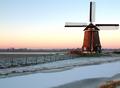
| 01/22/2003 01:49:41 PM | Battle of the elementsby AzrifelComment: The close crop to the windmill was because from this angle the ugly modern house next to it would get a wall in the frame. Didn't look nice. On photosig is another one like this, darker toning, other angle that contains more room on the right. But the focus of that one was more on the windmill itself instead of landscape. |
| 01/20/2003 05:40:12 PM | |
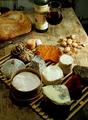
| 01/20/2003 05:09:01 PM | Then bring friends around it. by jjbeguinComment: Oh my god! I hit the previous vote button and bang, an explosion of taste, right in my face. Damnit, damnit, damnit, I was supposed to go easy on the cheese this year, somebody stop me!
Seriously, this makes my mouth water. Good wine, good bread and good cheese, preferably in a nice location. What more can one wish?
I like the composition, very good exposure, good choice of aperture for the depth. The background is nice, it looks like we are in a shed out on the country side, did some hard labour and are now going to enjoy a very good lunch. :)
Wish I was there! ;)
10, and favourite! |
|
Showing 2501 - 2510 of ~2734 |
Home -
Challenges -
Community -
League -
Photos -
Cameras -
Lenses -
Learn -
Help -
Terms of Use -
Privacy -
Top ^
DPChallenge, and website content and design, Copyright © 2001-2026 Challenging Technologies, LLC.
All digital photo copyrights belong to the photographers and may not be used without permission.
Current Server Time: 06/11/2026 04:51:05 PM EDT.
|