DPChallenge: A Digital Photography Contest You are not logged in. (log in or register
 
Browse Settings
Currently viewing:
MemberAzrifel

Show comments:

Per page:

Order:

Comments:


Comments Made by Azrifel
Pages:   ... [246] [247] [248] [249] [250] [251] [252] ... [274]
Showing 2481 - 2490 of ~2734
Image Comment
The Obvious!
02/01/2003 02:02:49 PM
The Obvious!
by Gracious

Comment:
~~~~Critique Club Comment~~~~

Composition (content)

This is a composition that makes you think and that is the strongest point of it. It is indeed obvious, but you need to look at it, it is not a click 'n go image. :)
I guess it is the ramp to the ferry.

Very good colors. Nice red, beautiful blue sky tones and a bluegreen sea.

I think that this is taken around 12.00, when the sun is at the highest point in the sky. The angle of the shadow is very steep and the exposure information hints a very bright situation.
Shooting this scene at that time of the day has probably caused the too bright concrete and blown out whites of the ship. No exposure compensation can prevent this, only shooting earlier in the moring or later in the afternoon. The result would be more shadow and warmer light that gives better contrasts. Around noon on a sunny day at the equator is the worst time for photography, but it is also the time when most people have their lunch break.
I think the ship as it is now, with those bright whites, is a bit distracting.

The angle at which you shot this and the position of the horizon is very nice.

Background
Blue. :)

Camera Work (Technical)
Sharpness, focus and exposure (given the time of day) are good. The soft water is caused by the relatively slow shutter, but that is just a note, not a problem.

Digital Processing (technical)
Sharpening is on the edge but good.

My opinion
Funny, but not special, I think that I would have liked to see more of the left and in better lighting.
Photographer found comment helpful.
Once Upon A Time
01/30/2003 02:33:42 PM
Once Upon A Time
by mariomel

Comment:
I love the compostion of this photo, with the wall running at one angle and the sunlight on the ground at an opposite angle. It creates a feeling of sadness, of time gone by. The lonely lamps on the wall enhance that feeling. It is a shame that there are some cars in the background, but the foreground is really great.
One of my favourites.
Photographer found comment helpful.
House in the Snow
01/30/2003 02:23:09 PM
House in the Snow
by nathaliedoo

Comment:
I think it adds depth, but the brown muddy road (it looks like that) hurts the presentation of it.
House in the Snow
01/30/2003 02:20:44 PM
House in the Snow
by nathaliedoo

Comment:
In addition to that comment I would like to mention something as well.

The choice of the white border isn't that good imho. The big blow out above the trees runs into the white border and that leads the eye out of the picture. Taking the view away from a well presented scene. Perhaps that black or a brown tone would do better, it would cut off the blowout and leave the eye in the frame.
Start Spreadin' the News
01/28/2003 01:50:30 PM
Start Spreadin' the News1st Place
by magnetic9999

Comment:
~~~~Critique Club Comment~~~~
Congratulations Kollin! Your best score ever you said in the chat, frustratingly enough with a point and shoot and no preparation at all. Turns out it is a winner. :)

You have a very good eye. ;)

Would be cool to critique it and guess what happened when I hit the button....... But what to say about it? It looks almost perfect, I had to think about it for 36 hours to figure out what to say about it. And I still don't know, those portraits of yours were easier (and confirm the good eye). :)

Composition (content)
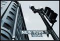
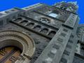
Good combination of subjects, they seem to strengthen each other. You have a corner sign and the corner of a building. Curves, circles and steps in/on both. The hoods on the lights could correspond with the pillars of the building.
The sign/lamppost is stylish and creates a timeless picture, like no time has passed since it was put there for all I know a century ago. The strenght of the building is that it doesn't break that spell. And it is further enhanced by your choice of toning, that reminds of old photo's and movies. Therefore it is very pleasing to look at.

The composition is very nice, because you show the cornersign, while the building creates the corner. The angle at which you shot both is great (also in combination with them entering the frame in the lower corners), it makes the angle of the lamppost meet the angle of the building somewhere, without looking distorted. The first thing you read is "New York" and then it leads you up up and away, hey I want to see more! :)

The building is nice too look at, in comparisson to other buildings, because it has a round corner. But the real strength of the round corner is the opposite shadows above every window, that is a very cool touch. Without that it would be a lot duller and perhaps even boring.

Background
I like it that the exposure of this hasn't blown out the sky completely. There is still a hint of clouds and tonal differences that are not created by filling in a blow out by using a blueish toning.

Camera Work (Technical)
Good job.

Digital Processing (technical)
Very cool toning, could you tell me what you did with it?
Good sharpness. Nice subtle frame.
Altough I can't see jpeg artifacts or quality degradation, there is still room for saving it at a higher quality.

My opinion
Favourite. :)

Message edited by author 2003-01-28 13:51:16.
Photographer found comment helpful.
Old
01/27/2003 04:19:19 PM
Old
by dadas115

Comment:
Very nice background, I have tried this for the Macro challenge with a Cyrix PR200MX, but couldn't find a nice background. This is.
Cool use of dof in combination with focus. Also blurs the background away in such a way that the attention stays in the front.
Nice toning. Good angle.
Subtle Square
01/27/2003 04:11:59 PM
Subtle Square
by BJ

Comment:
Too soft for my liking and the big white borders seem to pull each eye to their side.
Photographer found comment helpful.
Cottage
01/27/2003 12:21:42 PM
Cottage
by Gotcha

Comment:
Ha ha ha, I didn't know what I was seeing. Was it noise? Was it the sharpness? Was it bad focus? Noooooooooooooooo! It's all curled up. :)

Nice.
Photographer found comment helpful.
Stained Glass
01/27/2003 12:17:38 PM
Stained Glass
by Yomi

Comment:
This must be so beautiful at full res. Nice
Photographer found comment helpful.
Inspired
01/27/2003 12:16:11 PM
Inspired
by Ptman

Comment:
Interesting subject, but the blue of the sky is overdone. It is too unreal.
Photographer found comment helpful.
Pages:   ... [246] [247] [248] [249] [250] [251] [252] ... [274]
Showing 2481 - 2490 of ~2734


Home - Challenges - Community - League - Photos - Cameras - Lenses - Learn - Help - Terms of Use - Privacy - Top ^
DPChallenge, and website content and design, Copyright © 2001-2025 Challenging Technologies, LLC.
All digital photo copyrights belong to the photographers and may not be used without permission.
Current Server Time: 09/18/2025 01:02:08 PM EDT.