| Image |
Comment |
| 03/06/2003 04:05:33 PM |
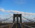
flag on brooklyn bridgeby tomzinhoComment: Altough the lines lead to the flag it is not clear that the flag is the main subject because of those lines. This image is more about the bridge itself, with an interesting play of lines. Doesn't mean I don't like it, because I do.
Have you considered another crop/frame, less sky, more of the centre of the image to get a better composition and to use the two middle lines better and get a better lead to the flag itself. The image doesn't need the two outher lines. I'd cut it off right inside the two safetygates on the outer lines, leave the bottom in and cut off some sky. |
 Photographer found comment helpful. Photographer found comment helpful. |
| 03/06/2003 03:59:32 PM |
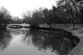
White Bridgeby DennisFComment: Nice landscape. I like it how the embankment carries me trough the frame and keeps my eye at the more interesting right side with its foliage. The crop on the right is a bit tight. The bridge finishes it off. |
| Photographer found comment helpful. |
| 03/03/2003 06:28:50 AM |
Out of the black and into the light.by kiwinessComment: Hmmm, that looks familiar.
I guess I am looking towards one of the buildings of the UvA. Used to go past this place a lot when I went to the Law faculty. Never knew you could get to this spot, it is nice point of view.
Nice toning, but I think that the background buildings are a bit too bright. Only way to succesfully correct this is by the use of the illegal-by-DPC blending routines in Photoshop. Check the tutorals at luminous landscapes to see what I mean. |
| Photographer found comment helpful. |
| 02/22/2003 07:37:36 PM |
Mariachi Rythmby JEMComment: Good composition, diagonals add a lot of depth.
The crop is too tight though. |
| Photographer found comment helpful. |
| 02/22/2003 07:35:44 PM |
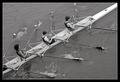
Stroke!by GordonComment: Good use of diagonals and the expression of motion is save by the water effects at the and of the rowing thingies. Good B&W. |
| 02/22/2003 07:33:52 PM |
|
| Photographer found comment helpful. |
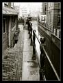
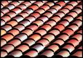
| 02/22/2003 07:27:59 PM |
chorusby falveyComment: Nice how the shadows work with the tiles and how there seem to be color patterns all over the place. The diagonal composition of the tiles provides good depth. Color, sharpness, aperture choice and exposure are excellent. |
| Photographer found comment helpful. |
| 02/22/2003 07:25:51 PM |
Melon Landscapeby lcamargoComment: The perspective, use of aperture and color of this shot are wonderful.
The background provides good contrast, but the lower right surface is pretty ugly. The white border doesn work very well.
Composition and color makes this a good photo. |
| Photographer found comment helpful. |
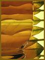
| 02/22/2003 07:21:00 PM |
Harmonyby JeanComment: Excellent composition. Wonderful how the leafes work out when refracted by the water. Wonderful flowing curves and great gradations of colors. This one is 200% better as the yellow entry. |
| Photographer found comment helpful. |
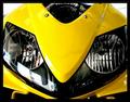
| 02/22/2003 07:08:24 PM |
CBR Nose Coneby EnzoComment: It's a bit full frontal and it has a nasty reflection on the left side but still a high impact because of the closeup and high image quality. Is this the old '02 serie or the new RC-211V styled version?
I'm about to get a new motorcycle, tough choice. R6 or CBR-RR? Or should I get another FZS and fit some WP suspension and a trick exhaust system? Or go green and bad with a ZX-6R? Hmmm, have to ride them. :)
This bike seems to show the face of it's little brother, the CB Hornet. Guess it can't compete without its big brother eh? ;)
|
| Photographer found comment helpful. |
Home -
Challenges -
Community -
League -
Photos -
Cameras -
Lenses -
Learn -
Help -
Terms of Use -
Privacy -
Top ^
DPChallenge, and website content and design, Copyright © 2001-2026 Challenging Technologies, LLC.
All digital photo copyrights belong to the photographers and may not be used without permission.
Current Server Time: 06/12/2026 07:27:05 AM EDT.