| Image |
Comment |
| 12/14/2004 04:26:03 PM |
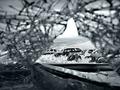
From Where I Sitby tgordonComment: Great use of the glass to get an interesting frame around the carwrecks-scene.
I like the choice for B&W and think that the tones are excellent. I also like the shadowy darker foreground vs the brighter view trough the glass frame. |
 Photographer found comment helpful. Photographer found comment helpful. |
| 12/14/2004 12:41:13 PM |
Cure for the Bluesby sherComment: The composition here is pretty strong and I like the effect of the shallow dof and except for that brigt spot on the vase the lighting is very good. However there seems to be a strong blue (cold) color cast over the image. A coldness that I would not expect from such flowers. Cure for the blues (at first I didn't notice the title)?
For me the cure was a grey point sample curve on the background. It resulted in this:
//www.pbase.com/image/37383216 On this edited version the yellow and green seems more natural and the flowers stand out a lot more. On the other hand my grey bg is a bit dull, so outside dpc I might blend in some of the original blue again for the background only.
My main interest: I love it how the flowers stand out dof-wise and the composition with such a classic simple but pretty vase. I hope you do well. |
| Photographer found comment helpful. |
| 12/13/2004 01:27:08 PM |
|
| Photographer found comment helpful. |
| 12/11/2004 07:35:26 AM |
Spires in the skyby redmonopoleComment: Greek Orthodox Church right? I wonder where it is, the architecture looks really good, but more Medditerenean than Russian.
I especially like it how the crosses light up so powerful with that striking sunlight. The position of the towers gives some depth to the scene, makes it look more dimensional than flat that one so often sees. |
| Photographer found comment helpful. |
| 12/10/2004 06:00:47 PM |
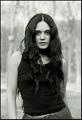
Black topby rscorpComment: What I like about this portrait is the contrast of greys (as in colors). Your model's hair and skintone is great. In this photo the hair matches the shirt and the skin tone comes close to the background tone. I don't know how, but it works. And then you've got those dark eyes. They match the hair tone. It pulls me in as a viewer, it makes me connect with the person portrayed = good.
Pose and look says: Strength, power.
DOF = good.
Bokeh = reasonable.
The only thing that I don't like is that there seems to be an aura around the head that often comes with sloppy dodging. |
| Photographer found comment helpful. |
| 12/09/2004 02:32:37 PM |
A Holy Shrineby RefocusedComment: Great contrast because of the clear 'golden' gold and good deep dark blue sky. I'd like to know how it was done, is this the effect from a polarizer filter or does it depend more on the time of day? The reflection is still very low so my guess is that it is early in the morning.
|
| Photographer found comment helpful. |
| 12/09/2004 02:25:45 PM |
Chameleon in Yellowby hlswilsonComment: It looks more like shades of orange and not yellow,
but despite that: what an awesome shot!
I also think that the person having the eyes closed makes the composition relaxed, the colors and the warmth of the light enhances that. The random structure of the blobs makes it all look very natural, classic and human as opposed to hard, tech and modern.
|
| Photographer found comment helpful. |
| 12/09/2004 02:20:28 PM |
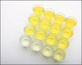
Specimensby EddyGComment: Cool all those shades of yellow. Technically very good. Because of the positioning at an angle and being off-centre it grabs the attention very well.
|
| Photographer found comment helpful. |
| 12/08/2004 04:53:24 PM |
...and then Daisy said, are we done yet?by plumber711Comment: The blue background is a bit oversaturated, that distracts from your main yellow subject.
I like it that it is not fresh anymore, gives a more interesting pic. The stem leads into the frame, which is good. |
| Photographer found comment helpful. |
| 12/08/2004 04:49:15 PM |
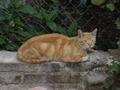
YELLOW CATby TiagoComment: No it is not. The cat is not yellow, its position is too centered, the background is poor and the cat's pose it not interesting. |
Home -
Challenges -
Community -
League -
Photos -
Cameras -
Lenses -
Learn -
Help -
Terms of Use -
Privacy -
Top ^
DPChallenge, and website content and design, Copyright © 2001-2026 Challenging Technologies, LLC.
All digital photo copyrights belong to the photographers and may not be used without permission.
Current Server Time: 06/18/2026 04:32:27 PM EDT.