| Image |
Comment |
| 02/22/2006 05:30:18 PM |
TEEN MODEby keithborgComment: Great balance of colors and tones. The presentation at an angle works well.
I hope that the border doesn't disqualify this for basic editing. That would be a shame, I hope I'm wrong. (to be clear: I have not recommended this for disqualifiction) |
 Photographer found comment helpful. Photographer found comment helpful. |
| 02/22/2006 05:27:13 PM |
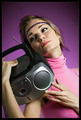
Like My Hat?by kdeleonComment: Would do well on a billboard with all that space on the left. Cool photo. |
| 02/22/2006 05:26:18 PM |
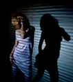
piazza sempioneby kiwinessComment: I'm pretty sure that this is the same girl as Peter photographed in the 80s challenge. :)
Pretty cool shot. I might have preffered a vertical shift to get the feet in the shot, in exchange for less of the wall at the top, but on the other hand that might also make it feel a bit crowded. Also a little light to fill the left side of the head and the shadow behind her wouldn't hurt. |
| Photographer found comment helpful. |
| 02/22/2006 03:04:32 PM |
|
| Photographer found comment helpful. |
| 02/22/2006 03:00:34 PM |
The kids in Americaby PhilosComment: She has a bit of a dolly dot look and that bit of lipstick on the cigarette: so typical. :) This is how all the (older) girls in my old 80's neighbourhood looked. And now I have that song in my head the whole evening.
Perhaps the balance of light is a bit out of balance on the face. Too dark at the right, maybe a reflector might have worked there.
Does she have a hat in her hand? It looks a bit out of place at the bottom right.
IMO this one is better as Gary's entry. :) |
| Photographer found comment helpful. |
| 02/22/2006 02:49:39 PM |
Into the grooveby HauxonComment: Good portrait, the radio doesn't look very eighties with that cd player, lcd and round forms but I don't care. 8 |
| Photographer found comment helpful. |
| 02/22/2006 02:28:59 PM |
GOSUB 1980by frogletComment: Isn't that basic? I learned Basic and next year Windows was launched. :(
Lines and lines and lines.... Arghhhhh. It was useful for thinking in loops. |
| Photographer found comment helpful. |
| 02/22/2006 02:27:25 PM |
|
| Photographer found comment helpful. |
| 02/22/2006 02:23:34 PM |
Rebel Yell by jaxedComment: Cool perspective and altough the chalk lines are not punk at all (as far as I know) they do enhance that punk feeling. 9
Sonifo? |
| Photographer found comment helpful. |
| 02/22/2006 02:14:36 PM |
9 1/2 Weeksby kiwinessComment: I like the idea and the way the light falls as a a spot with the lines and strong shadow on the background.
However to my liking there is too much bleu/magenta tone in this photo. It takes the pop out of the skin colors and especially the hand looks a bit weird that way. When I do a quick correction with a white levels sampler on one of the bright parts of the breasts section it looks a bit more natural. Also a slight pull upwards on the curves makes it pop a little more and some mild sharpening 80% .3px on the creases in the dress makes the contrast of the edges a little better there.
Posewise it looks like she is a bit shy. The arm in front of her body and the face looking away hidden by all that hair makes it look that way. It does make for a good shadow profile tough. The film poster is like that too, so it is not hones to critisize on that, altough Kim Basinger poses more toward the viewer. 7
I'm looking forward to the workshop Gary. :)
(Philos told me after I guessed his one right in one attempt and yours in one out of four) |
| Photographer found comment helpful. |
Home -
Challenges -
Community -
League -
Photos -
Cameras -
Lenses -
Learn -
Help -
Terms of Use -
Privacy -
Top ^
DPChallenge, and website content and design, Copyright © 2001-2026 Challenging Technologies, LLC.
All digital photo copyrights belong to the photographers and may not be used without permission.
Current Server Time: 06/19/2026 04:54:27 PM EDT.