| Image |
Comment |
| 02/26/2008 02:04:07 PM |
Drop 3.jpgby dssagent88Comment: It came out fairly decent for a first attempt I'd say. Usually when you see this kind of photo it's "perfect" in every sense; the drop, the lighting, controlled reflections, etc...
Here, the slight imperfectness adds to the charm IMO. Makes it seem "real" and not so staged at the same time. |
 Photographer found comment helpful. Photographer found comment helpful. |
| 02/26/2008 10:56:11 AM |
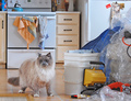
My kitchen! My powertools!by snafflesComment: Great pose and setting. Cat's are always so curious, I'm sure yours was quite interested in the new "stuff" in his/her domain. :)
I can understand this being a hand-held quick shot, and the composition works perfectly, but the image is blurred a little. Then it appears that some detail was lost in trying to recover with a combo of noise reduction and sharpening on the cat? All JMO of course. Good luck in the challenge. |
| Photographer found comment helpful. |
| 02/26/2008 10:54:38 AM |
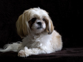
Lexieby BeckyTComment: Wonderful pose, and nice lighting to get catchlights in her eyes. Either Lexie has extremely soft fur, or some detail was washed out with noise reduction?
Well done! |
| Photographer found comment helpful. |
| 02/26/2008 10:10:50 AM |
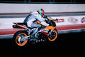
Feel The Speedby lolor275Comment: Greetings from the Critique Club
First Impression
Feels tight (like it was cropped too close, or composed that way), harsh (illuminated with a flash), and blurry (not smooth). While all or any of these first impressions may be incorrect, it's just what came to mind upon first seeing this photo.
Looking Deeper
For a panning shot I think you may want a little more blur to indicate motion and speed, especially with a subject like a racing motorcycle. A slower shutter speed (1/30 or 1/60) and a longer pan would accomplish this. The limited amount of background blur looks like a mistake and the motorcycle seems to be standing nearly still.
With a moving subject it's usually helpful to have some breathing room for the subject to move into. The subject here seems to have gotten past you some. Releasing the shutter while the motorcycle was roughly 10 feet more to left would have given you a better look at the rider and enabled you to leave more room to the right in the framing/composition.
Not sure what to make of the lighting. It does seem somewhat harsh from either flash or very strong arena lighting. The rider's suit appears to be reflective which isn't helping any either. Without knowing the details it's hard to address alternatives. On a positive note, better to have this amount of light rather than not enough. :-)
One other item to mention is the size of your challenge entry photo. It's not maximizing full potential. Your longest side is 600 (you can go to 640), and the file size is only 1/3 of the allowable of 150kb. A larger image with full detail will usually score a bit higher.
If you have any questions, or need clarification on a point, please feel free to send me a PM. Thanks.
|
| Photographer found comment helpful. |
| 02/25/2008 09:56:00 PM |
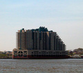
Waterfront Livingby NicNic101Comment: Hi Nicole,
I noticed your comment in the Pet scores thread about getting rude comments on a recent challenge entry...so being curious I had to take a look. :-)
First, in your own words (from the Photographer's Comments area): "I know it is not a very clear picture... I WILL get a lot of flack for that".
Of the 10 comments you received during the challenge, every one of them mentioned "grain, noise, fuzziness", etc...
To me this just confirms your own thoughts about this image; "it is not very clear". Granted, some of the comments could have been more in-depth, and only 1 borders on rude IMO (if you take "the h**l" part out, it becomes a legitimate question).
I agree with your observations that this is a unique building. Under different circumstances I'd bet this building could do well in an architecture challenge. Perhaps early or late in the day with maybe some still water and nice reflections? What does it look like at night? Is it lit up? A little closer in maybe where it fills the frame more and eliminate some of the side distractions?
Please also consider that of the 193 votes you received, the large majority scored this at 4 or under. Be grateful that of those, 10 chose to comment and to give you some indication of what held the score down. Many on this site beg for feedback - any feedback - on why their entry scored low.
Overall, I think you picked a good subject. Just some fine tuning and listening to your own instincts would have helped in making decisions to improve this photo before submitting it for public review.
All JMO of course. :-) |
| Photographer found comment helpful. |
| 02/25/2008 08:06:49 PM |
Lassieby zifengwComment: This is a nice profile and you've captured nice details in her fur. While the profile is nice, I'd like to know her better by seeing her face (the eyes can really sell a portrait).
The background, in many other situations would be exceptional. The bokeh is quite pleasing. Getting a conflict with the colorful background against her fur coat with competing colors.
All JMO of course. :) Best of luck to you in the challenge. |
| Photographer found comment helpful. |
| 02/25/2008 08:06:19 PM |
Stellaby Rino63Comment: Stella is too close to the camera! Show us more of her and by backing up you can increase the DOF so her nose isn't OOF. A little bit sloppy on the selection in post-processing as you can see a distinct line where the selection was made to wipe-out/darken the background. |
| Photographer found comment helpful. |
| 02/25/2008 08:05:45 PM |
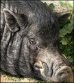
Fat Chanceby maxaz1Comment: Whoa! That's one speckly pig! Did you really push the sharpening on this to get that appearance? If not, a polarizing filter could have controlled some of those reflections perhaps? I like the way this is laid out with the head shot. AND - Your title is quite funny. :) Good luck! |
| Photographer found comment helpful. |
| 02/25/2008 08:05:03 PM |
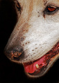
Kiskaby Bruce_the_RobertComment: The low POV works well with this and makes it unique from many in the challenge. It does feel a bit too close for comfortable viewing IMO and one of the key areas of a portrait (the eyes) is a little dark in this photo.
Just some observations. Good luck in the challenge. |
| Photographer found comment helpful. |
| 02/25/2008 02:58:48 PM |
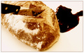
Time of Death : 7:00 AMby tormentorComment: Greetings from the Critique Club
First Impression
Not sure why, but at first I associated this with a religious theme. Breaking of the bread, etc... Perhaps I could have been influenced by another photo (or photos) immediately preceeding seeing this while voting in the challenge?
The second thing that came to mind is blood, knive, gore, violence...
I'm sorry to say that I totally failed to see the humorous aspect of this until now, the second time I've looked at this photo. Quite honestly, reviewing the comments you received during the challenge helped me see the humor.
Looking Deeper
From a technical standpoint you've put this image together quite well. The composition flows (no pun intended) quite naturally and the photo is easy (not awkward) to view. I want to say the exposure could be brought up a little but then you would probably blowout the white flour.
BTW, I do like the way you've created the border. Any other way and the handle of the knive would have blended in or been left to hang there (if no border at all).
Considering the wide-open nature of the 'Bread' challenge I can see now that your entry was quite creative given the subject matter.
If you have any questions, or need clarification of a point, please feel free to send me a PM. Thanks! |
Home -
Challenges -
Community -
League -
Photos -
Cameras -
Lenses -
Learn -
Help -
Terms of Use -
Privacy -
Top ^
DPChallenge, and website content and design, Copyright © 2001-2026 Challenging Technologies, LLC.
All digital photo copyrights belong to the photographers and may not be used without permission.
Current Server Time: 05/18/2026 11:58:35 PM EDT.