| Image |
Comment |
| 03/11/2009 09:48:04 AM |
|
 Photographer found comment helpful. Photographer found comment helpful. |
| 03/11/2009 09:47:41 AM |
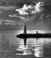
The Old Man And The Seaby zaflaboutComment: This is a very nice image. Nice tonal range and a great candidate for B/W. Subject seems a bit too centered IMO. Seeing some halos around the lighthouse and man in chair that take away somewhat. |
| Photographer found comment helpful. |
| 03/11/2009 09:45:22 AM |
Sunsetby StrykforceComment: Man! So close...I really like this. The colors are fantastic and the subject and comp are a good fit. See a tilted horizon is frustrating when it's so easy to fix. |
| 03/11/2009 09:42:29 AM |
Douro River, Portugalby wheeleddComment: I like the symmetry of the bridge and reflection. I gave this a 6, but would have gone 7 or 8 if the lower left boat part had been addressed. Did you consider cropping this (bringing the bottom up)? The symmetry could have been perfected by balancing the blue above and below the bridge. Just some observations. Good luck in the challenge. |
| Photographer found comment helpful. |
| 03/11/2009 09:23:54 AM |
|
| 03/11/2009 09:14:20 AM |
Crazy Geekby dtremainComment: You rec'd some fun feedback on this, and you beat your running average. Gotta like that! :-) |
| Photographer found comment helpful. |
| 03/11/2009 09:12:17 AM |
Beauty in Adversityby JessiComment: Looks like you connected with a good number of viewers/voters. Beat your running average also. That's cool, yes? :-) |
| Photographer found comment helpful. |
| 03/11/2009 09:10:17 AM |
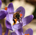
Busy as a Beeby brens29Comment: Hey, you beat your average and you picked up a Fav! That's cool, eh? :-) |
| 03/11/2009 09:07:14 AM |
|
| 03/11/2009 08:42:13 AM |
Sadnessby bobnospumComment: I like the color tone choice. Good time of day to capture this also - the lighting is just right. |
| Photographer found comment helpful. |
Home -
Challenges -
Community -
League -
Photos -
Cameras -
Lenses -
Learn -
Help -
Terms of Use -
Privacy -
Top ^
DPChallenge, and website content and design, Copyright © 2001-2026 Challenging Technologies, LLC.
All digital photo copyrights belong to the photographers and may not be used without permission.
Current Server Time: 05/20/2026 02:42:19 AM EDT.