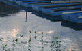
| Image |
Comment |
| 03/11/2009 02:46:24 PM |
|
 Photographer found comment helpful. Photographer found comment helpful. |
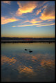
| 03/11/2009 02:42:47 PM |
Rarotonga Sunsetby wsargenComment: This has nice color but doesn't really have any subject matter to latch onto as a viewer. |
| Photographer found comment helpful. |
| 03/11/2009 02:29:36 PM |
Waiting for a Trainby klkitchensComment: Should've used a quarter! Just kidding. This made me smile. Nice use of DOF and vanishing point. Good luck in the challenge. |
| Photographer found comment helpful. |
| 03/11/2009 12:48:40 PM |
Rememberlin'by swaroskjiComment: I love the patterns in this. Do wish that the person was sharply focused. |
| Photographer found comment helpful. |
| 03/11/2009 12:21:36 PM |
Winter Idyllby BeeCeeComment: Thank you for sharing this. This is a beautiful piece of work...with one minor exception...tone down those blues, they're a bit oversaturated IMO. Love the processing overall. |
| Photographer found comment helpful. |
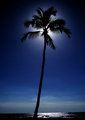
| 03/11/2009 12:17:32 PM |
Moonglowby CuttoothComment: Dang! This is a sweet shot. Well exposed, nice subject, etc... Do wish you'd have taken a few seconds to straighten the horizon. :-/ Overall, still a nice photo. Good luck. |
| Photographer found comment helpful. |
| 03/11/2009 11:26:47 AM |
Too Many Mistresses...by NikonJebComment: Originally posted by snaffles:
OK a Nikon guy who likes cars and tinkering with them; the middle photo looks to be from 70s...could be  NikonJeb... NikonJeb... |
He-he. Straddling the fence, eh? Are you really, really sure this is Jeb's photo?
Oh, wait. The challenge is over now... :-D |
| Photographer found comment helpful. |
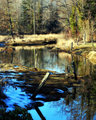
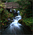
| 03/11/2009 09:56:07 AM |
Wahkeena Fallsby tfarrell23Comment: I like this falls shot better than many. The footbridge gives some context to size, and I like that the colors are natural (you've left some blue cast in the water). Nicely seen and captured. |
| Photographer found comment helpful. |
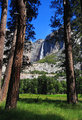
| 03/11/2009 09:52:47 AM |
Yosemite Fallsby JaimeVinasComment: I like your POV of this well-documented subject. Nice color - shows that you don't always have to be on site at sunrise/sunset to capture a keeper! |
| Photographer found comment helpful. |
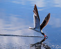
| 03/11/2009 09:49:51 AM |
Black Skimmerby Shadowfax23Comment: Such precision! Look at the front part of that beak - just a fraction of an inch above the surface. Very cool capture. Some slight loss of detail, likely from motion panning, but a great photo nonetheless. Good luck! |
| Photographer found comment helpful. |
Home -
Challenges -
Community -
League -
Photos -
Cameras -
Lenses -
Learn -
Help -
Terms of Use -
Privacy -
Top ^
DPChallenge, and website content and design, Copyright © 2001-2026 Challenging Technologies, LLC.
All digital photo copyrights belong to the photographers and may not be used without permission.
Current Server Time: 05/20/2026 02:42:07 AM EDT.