| Image |
Comment |
| 05/20/2009 11:29:45 AM |
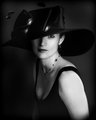
Hello Boysby LutchenkoComment: A nice shot overall. Attractive model, fun pose, good lighting... Not sure why, but it seems like her eyes are getting lost a little. Could be the lipstick color, combined with her brilliant teeth, are stealing the show somewhat. I hope that makes sense... Anyway, good luck in the challenge. |
 Photographer found comment helpful. Photographer found comment helpful. |
| 05/20/2009 11:25:06 AM |
Back in the dayby Yo_SpiffComment: Nice work with the model, costume, and getting a well focused image. The background is WAY too busy and doesn't add anything to this at all IMO. If anything it takes away from the presentation. Just my opinion. Good luck. |
| Photographer found comment helpful. |
| 05/20/2009 11:22:26 AM |
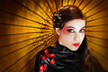
Oriental Glam by librodoComment: A top-notch effort and worthy of making the front page for sure. Comp is right on the mark, interesting to look at, lighting, focus, costume, etc...it all works. Congrats! |
| Photographer found comment helpful. |
| 05/20/2009 11:21:12 AM |
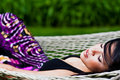
Sleeping Beautyby magnusComment: Nice pose and layout for a glamour shot. Very well executed from a technical standpoint (focus, lighting, etc...). One semi-major nit I have is the skirt. Those colors are so vivid it really competes with the primary subject for attention. All JMO of course. Good luck. |
| Photographer found comment helpful. |
| 05/20/2009 11:19:16 AM |
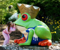
My Ticket to Glamour!by hjlComment: This is cute and fun. Not exactly what I'd think of when the word "glamour" is mentioned as a challenge theme. Nonetheless, you've done a nice job of capturing this moment photographically from a technical standpoint. Good luck in the challenge. |
| 05/20/2009 11:17:49 AM |
|
| 05/20/2009 11:08:06 AM |
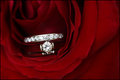
Sparkleby paperpagesComment: Hmmm. This could work well for a jewelry ad I guess. Not that comfortable classifying it as "glamour". I like the comp. You positioned the bud of the rose and the ring strategically. Lighting is a bit flat and one dimensional. All JMO of course. Good luck. |
| Photographer found comment helpful. |
| 05/20/2009 11:05:41 AM |
Natashaby Blind_squirrelComment: Yes! I love this. Wonderful pose, clever attire, and processed with skill. Only minor nit is the shoulder may be a little hot, but you've controlled it in post pretty well. Good luck in the challenge. One of my top picks for sure. |
| Photographer found comment helpful. |
| 05/20/2009 11:03:58 AM |
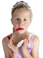
Lipstick Glamourby scruffComment: Nice studio shot that is quite funny. I'm not sure, but I think most in this challenge will be looking for a more serious "glamour" shot. Good luck. |
| Photographer found comment helpful. |
| 05/20/2009 11:02:41 AM |
Alluringby BrianRComment: I like the earrings! :-)
Seriously, not sure what happened here, but there's a ton of noise in the hair (underexposed and brought up in post maybe?) and the eyes/mouth (lower lip) seem to be selectively sharpened a bit too much.
Regarding the composition...I can't really get comfortable with the angle/lean. |
| Photographer found comment helpful. |
Home -
Challenges -
Community -
League -
Photos -
Cameras -
Lenses -
Learn -
Help -
Terms of Use -
Privacy -
Top ^
DPChallenge, and website content and design, Copyright © 2001-2026 Challenging Technologies, LLC.
All digital photo copyrights belong to the photographers and may not be used without permission.
Current Server Time: 05/20/2026 07:09:13 AM EDT.