| Image |
Comment |
| 10/05/2009 07:51:26 PM |
Bike lights!by acg83Comment: If the whole comp could have looked like the top and middle-back areas this would really jump out for me. I'm not really liking the large areas of blurred light. JMO of course. Good luck in the challenge. |
 Photographer found comment helpful. Photographer found comment helpful. |
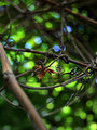
| 10/05/2009 07:49:09 PM |
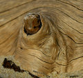
Dappledby UrfaKComment: Wow. I'm glad I'm coming back around for a second look while commenting. I think I scored this too low the first time around (5). Lovely circles of light and the detail in the vine is great. The one and only thing keeping this from reaching the very top of the scoring scale is the POV you took that included the larger piece of vine/wood on the left. Maybe you couldn't have moved (I hate when someone tells me I should have moved. He-he) - but I sure as heck would have tried to find a view that isolated what you have in the center. Anyway...nice eye to see this. Good luck in the challenge - I hope the score bump helps. |
| Photographer found comment helpful. |
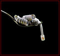
| 10/05/2009 07:44:10 PM |
A Twist on Pastaby jomernerComment: Clear, clever, and ready for the stock portfolio. Giving this a nudge on this second pass thru. Good luck! |
| Photographer found comment helpful. |
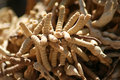
| 10/05/2009 07:44:05 PM |
Tucson Weedsby leesaComment: Heh! They look like worms! Very unique for sure. As a photo for the challenge it fits fine, although the comp is somewhat centered and busy. This would be a great subject for some closeup work. |
| Photographer found comment helpful. |
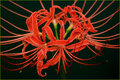
| 10/05/2009 07:42:17 PM |
The Spider Lilyby Pug-HComment: Beautiful flower. You've captured it in a manner that shows it well. Somewhat static; I think the centered comp is contributing to that. |
| Photographer found comment helpful. |
| 10/05/2009 07:39:47 PM |
...and rustedby androgeusComment: Nice complimentary colors. I have to say the blue is a bit of a shock...don't know why exactly. Guess I associate rusty barbed wire with more earthy tones. Does make this unique. :-) Good luck in the challenge. |
| Photographer found comment helpful. |
| 10/05/2009 07:35:55 PM |
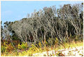
wild thingsby skewsmeComment: I like the wild brushy trees, pretty cool. Not sure if they have enough impact to lift your score above the average mark in this challenge. Lighting seems a bit on the harsh side (like mid-day sun) and I'm seeing some purple fringing in the bare tree tops. |
| 10/05/2009 03:51:28 PM |
Smoke Twistby Brent_SComment: If you're going to do smoke like this it has to be perfect to score well here anymore. That's because, like waterdrops, it's been done over and over again. I can see where you were headed with this photo and it makes sense overall for this challenge. However, a good portion of the smoke is (or seems to be for me) a little OOF. The sharpest area of the smoke is the lower-left. The upper-right is losing that crispness. Really need to 'freeze' the action to keep it all sharp. Good luck. |
| Photographer found comment helpful. |
| 10/05/2009 03:48:30 PM |
Driftwoodby scooter88Comment: I like the swirly lines for sure. Not sure about what the sand is bringing to this - I understand that sand and driftwood come together, just that the sand...oh heck, nevermind about the sand. I'm nitpicking. :-) I think what is holding this back for me overall is the lighting. Seems a bit flat. Good luck in the challenge. |
| Photographer found comment helpful. |
| 10/05/2009 03:45:21 PM |
On The Fenceby biancabergerComment: It's funny, at first I wouldn't have considered this fence as 'Twisted' or curved, but that's pretty much the way it's made. :-) Did you consider rotating this 180 to the left? Then you'd have the lines of the fence going more naturally from left to right. The busy bg isn't helping the presentation here either IMO. A shallower DOF could have been your friend here. Anyway...good luck in the challenge. |
Home -
Challenges -
Community -
League -
Photos -
Cameras -
Lenses -
Learn -
Help -
Terms of Use -
Privacy -
Top ^
DPChallenge, and website content and design, Copyright © 2001-2026 Challenging Technologies, LLC.
All digital photo copyrights belong to the photographers and may not be used without permission.
Current Server Time: 05/20/2026 06:44:32 PM EDT.