| Image |
Comment |
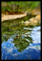
| 11/06/2009 10:39:54 AM |
Calm Before the Fallsby cryanComment: :-) I tried a shot similar to this the other day, and didn't get nearly as nice a result as you did on this one. Good eye to see this and capture it well! |
 Photographer found comment helpful. Photographer found comment helpful. |
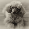
| 11/06/2009 09:30:54 AM |
Raffby datcatComment: Adorable! I like your choice of colortoning on this. |
| Photographer found comment helpful. |
| 11/05/2009 10:41:07 PM |
BabyElla-8294-1-1-700.jpgby idnicComment: Originally posted by idnic:
Originally posted by glad2badad:
This looks nice. I'm not familiar with Corel Painter, but couldn't you get a similar result using various photoshop filters? Not trying to be disrespectful...just curious. |
Not that I know of. Painter allows you to actually paint an image using the color information from the photograph, all of the textures and details are actually painted in digitally much the same way one would paint on canvas.
I know there are some filters in PS that give a painterly look, but I have never seen anything from them that didn't look automated (canned). |
I have a new tablet around here that I've yet to open...I'm pretty sure it has some version of the Painter software with it. Guess I'll have to plug it in and check it out. :-) |
| Photographer found comment helpful. |
| 11/05/2009 09:36:08 PM |
BabyElla-8294-1-1-700.jpgby idnicComment: This looks nice. I'm not familiar with Corel Painter, but couldn't you get a similar result using various photoshop filters? Not trying to be disrespectful...just curious. |
| Photographer found comment helpful. |
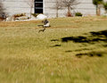
| 11/05/2009 10:35:50 AM |
hawkby poserComment: Great instinctive shot! Can only do this when you're comfortable with your equipment, especially with bending the LB around. I'm jealous! :-) |
| Photographer found comment helpful. |
| 11/05/2009 09:23:22 AM |
IMG_4854PSD.jpgby beneeComment: Great placement of the sweetspot. I like the detail in the center of the image. It's like a frame within a frame. Nicely seen and captured! |
| Photographer found comment helpful. |
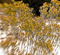
| 11/05/2009 09:08:26 AM |
rabbit-bushby poserComment: Is that really called a "rabbit bush"? That's a fun name...never heard of it before. We have plenty of rabbits, but they don't have their own bush. :-P
The high contrast on this photo works well for interest. I like how the sweet spot hits the dip in the bush and brings the dark area to front. Pretty sharp details - look at the dust floating in the bg.
Next time, try and find the rabbit to put in your shot. :-D |
| Photographer found comment helpful. |
| 11/05/2009 09:04:57 AM |
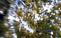
lensbabytreeby poserComment: This shot really shows how the LB bends the light. You can see two distinct areas that have been altered from reality. Kinda cool! |
| Photographer found comment helpful. |
| 11/05/2009 09:02:45 AM |
pond reedsby krnodilComment: I have to admit, the thumbnail drew me in, but now that I'm here it's even better. :-) Many photographers would be trying to tone down the highlights on the reeds (myself included), however the way you've let them run up really adds to the contrast and gives this photo life on a potentially mundane subject. Nicely done! |
| Photographer found comment helpful. |
| 11/04/2009 11:32:45 AM |
Suspensionby LeoComment: I really like this photo. The suspended leaf is cool, and the bg bokeh is wonderful. Had I not known this was shot with a LB I'd have no idea seeing it otherwise. That is something fun to think about. :-) |
| Photographer found comment helpful. |
Home -
Challenges -
Community -
League -
Photos -
Cameras -
Lenses -
Learn -
Help -
Terms of Use -
Privacy -
Top ^
DPChallenge, and website content and design, Copyright © 2001-2026 Challenging Technologies, LLC.
All digital photo copyrights belong to the photographers and may not be used without permission.
Current Server Time: 05/20/2026 09:11:50 PM EDT.