| Image |
Comment |
| 11/30/2009 01:00:06 PM |
Nov 28 - Tulipsby hajekaComment: A soft, inviting photo. Content is a descriptive word that comes to mind when viewing this. |
 Photographer found comment helpful. Photographer found comment helpful. |
| 11/30/2009 12:57:14 PM |
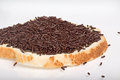
Food 48 - Sprinklesby hajekaComment: :-) From the thumbnail view those specks on glass almost appeared to be ants! Speaking of glass...the way you've used glass as a bg element the fallen sprinkles seem to be levitating. :-D
BTW - How many calories are in that snack anyway?! |
| Photographer found comment helpful. |
| 11/30/2009 12:52:14 PM |
emptyby RetroesqueComment: Shapes, lines, reflections and shadows. Great eye to see this. I really like the graphical feel of it. |
| Photographer found comment helpful. |
| 11/30/2009 12:49:17 PM |
songby krnodilComment: Wow. I'd have never known a overlay was used without reading your notes. At first I was thinking to myself that I've taken some shots similar to this, but never really fell in love with any of them. This photo is quite appealing and easy on the eyes - so simple really. Nice! |
| Photographer found comment helpful. |
| 11/30/2009 12:47:09 PM |
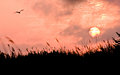
Heislerville Sunriseby krnodilComment: What a wonderful place to be at that moment, eh? The gull in the frame is just icing on the cake. I like how the lifting fog is forming a loose circle around the sun. |
| Photographer found comment helpful. |
| 11/30/2009 12:39:34 PM |
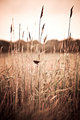
- - - -by krnodilComment: This is such a cool shot! It's certainly not your "typical" photography - but it works GREAT as a piece of art. The tantalizing tease of grass blades against the familiar shapes in the background is a real treat. Well done! |
| Photographer found comment helpful. |
| 11/30/2009 12:23:12 PM |
Chocolate Chip by prperoldComment: Holy crud! I just learned something new. I didn't realize that we could combine multiple shots of the same scene. Thought that was for Expert editing only. I'm SO glad I read your notes on this photo (regarding the two shutter actuations/exposures) and proceeded to review the Advanced rules. I just added a new tool to the toolbox!!!
The combo you used worked very well here. Congrats! Message edited by author 2009-11-30 12:27:18. |
| Photographer found comment helpful. |
| 11/30/2009 11:33:41 AM |
|
| Photographer found comment helpful. |
| 11/30/2009 11:31:57 AM |
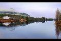
Red Barnby davidwComment: This is a storybook scene! I really enjoyed viewing this when voting. I bet they have a nice healthy breakfast there. Mmmmm...I can smell it now. :-) |
| Photographer found comment helpful. |
| 11/30/2009 11:27:22 AM |
Light Hydrangeaby datcatComment: Something about this seems quite surreal. Like you're on the edge of reality and the bright light is coming to get you. :-P Hmmm...maybe I need more coffee. :-D |
| Photographer found comment helpful. |
Home -
Challenges -
Community -
League -
Photos -
Cameras -
Lenses -
Learn -
Help -
Terms of Use -
Privacy -
Top ^
DPChallenge, and website content and design, Copyright © 2001-2026 Challenging Technologies, LLC.
All digital photo copyrights belong to the photographers and may not be used without permission.
Current Server Time: 05/21/2026 07:32:06 AM EDT.