| Image |
Comment |
| 01/11/2010 02:44:56 PM |
|
 Photographer found comment helpful. Photographer found comment helpful. |
| 01/11/2010 02:44:46 PM |
|
| Photographer found comment helpful. |
| 01/11/2010 02:44:25 PM |
Sunsetby DeenComment: Sorry, but this is WAY overprocessed for my taste. |
| Photographer found comment helpful. |
| 01/11/2010 02:44:02 PM |
I didn't do it...honest!by JudiComment: Like anyone would think she did? Well, if sexy is worth anything you'll most likely do ok with this entry. |
| Photographer found comment helpful. |
| 01/11/2010 02:41:56 PM |
Marriageby KelliComment: This one should get the clich'e award for the challenge. |
| Photographer found comment helpful. |
| 01/11/2010 09:08:01 AM |
|
| Photographer found comment helpful. |
| 01/08/2010 09:01:57 AM |
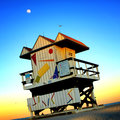
Solitude in Stiltsvilleby yakatmeComment: Responding to thread request...
I gave it a 6. Thought it was "ok" overall and hovered between the 5 & 6 button on this one.
Couple of things for me that held this back:
1) Aspect ratio and the composition. It seemed like you were trying to tell two stories here; the lighthouse and the water structure. End result was an awkwardly balanced comp. The letterbox border was the right choice, given the comp, but I would have really beefed up the top and bottom black borders by another 30-40 pixels at least to offset the wide presentation.
2) Something about the colors. Looks like a levels adjustment is needed. The colors seem a tad forced and the lighting a little flat.
Those are some quick observations. Hope they're somewhat helpful. |
| Photographer found comment helpful. |
| 01/06/2010 09:42:24 AM |
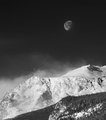
Blue Moon Over The Mat-Su by akauroraComment: This is a very nice photo and one of my top scoring images. Primarily based on the size and placement of the moon. If the comp on this was a little stronger (less centered) it would score a little higher for me. |
| 01/06/2010 09:40:33 AM |
|
| 01/06/2010 09:39:57 AM |
Above the Tempest by hahn23Comment: I predict Red Ribbon for this shot. Pretty easy prediction actually. :-) I love the scene overall. The comp is great. Only thing that's keeping this a 9 instead of a 10 is the tonal range. I'd like to see more coverage on the lower end in the blacks. Great shot overall! Congrats. |
| Photographer found comment helpful. |
Home -
Challenges -
Community -
League -
Photos -
Cameras -
Lenses -
Learn -
Help -
Terms of Use -
Privacy -
Top ^
DPChallenge, and website content and design, Copyright © 2001-2026 Challenging Technologies, LLC.
All digital photo copyrights belong to the photographers and may not be used without permission.
Current Server Time: 08/23/2026 05:35:05 PM EDT.