| Image |
Comment |
| 01/31/2010 12:20:57 AM |
Pears and Friendsby pwm6Comment: Ok comp - maybe a bit crowded. Lighting is fine, although the white balance seems to be on the warm side. |
 Photographer found comment helpful. Photographer found comment helpful. |
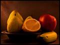
| 01/31/2010 12:19:44 AM |
Frutti Tropicaliby unbreakableComment: Ok layout. There's just no sparkle or wow to the fruit. Something either in the lighting or in post-processing really flattened this out. Just making some observations. :-) Good luck. |
| Photographer found comment helpful. |
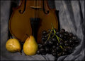
| 01/31/2010 12:18:34 AM |
The old Masterby DanDareComment: The comp is "ok". Lighting overall is good. Something doesn't quite feel right as to balance. The violin seems like it was just stuck in the back and is a little out of place. JMO of course. :-) Good luck in the challenge. |
| Photographer found comment helpful. |
| 01/31/2010 12:16:48 AM |
|
| Photographer found comment helpful. |
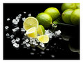
| 01/31/2010 12:16:11 AM |
Fresh And Juicyby h2Comment: I really like the thought behind this idea. Probably could have zeroed in a little tighter...a deeper aperture to maximize DOF would help a little also. Good luck in the challenge. |
| Photographer found comment helpful. |
| 01/31/2010 12:14:46 AM |
Gnarly Headby patchesComment: Ok props and arrangement. Photo seems to be tilting to the right? |
| Photographer found comment helpful. |
| 01/31/2010 12:13:57 AM |
|
| Photographer found comment helpful. |
| 01/31/2010 12:13:11 AM |
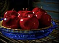
Slightly Undercooked Apple Pieby dahlinComment: Cute. :-) Dang, those apples look very smooth and waxy. Did you give this a healthy shot of noise reduction, or are those apples just that clean and shiny? BTW - fun title. |
| Photographer found comment helpful. |
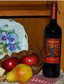
| 01/31/2010 12:11:54 AM |
Fruit of Lifeby AmmieComment: The metal object is overbearing in comparison to the fruit. White balance is on the warm side. Fruit could be better focused, and a levels adjustment would help some also. Just some quick observations, and obviously just one person's opinion. :-) Good luck in the challenge. |
| Photographer found comment helpful. |
| 01/31/2010 12:07:49 AM |
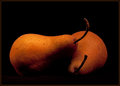
Pearsby davidbedardComment: Nice texture and lighting. Simple, yet not boring. Good luck! |
| Photographer found comment helpful. |
Home -
Challenges -
Community -
League -
Photos -
Cameras -
Lenses -
Learn -
Help -
Terms of Use -
Privacy -
Top ^
DPChallenge, and website content and design, Copyright © 2001-2026 Challenging Technologies, LLC.
All digital photo copyrights belong to the photographers and may not be used without permission.
Current Server Time: 05/21/2026 03:06:09 PM EDT.