| Image |
Comment |
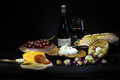
| 01/31/2010 12:38:22 AM |
Classic Wine and Cheeseby The EskimoComment: Smidgen busy...losing impact you could get with detail because the area of coverage is so wide. Look to be tilting to the left somewhat also. |
 Photographer found comment helpful. Photographer found comment helpful. |
| 01/31/2010 12:37:30 AM |
|
| 01/31/2010 12:37:00 AM |
|
| Photographer found comment helpful. |
| 01/31/2010 12:35:56 AM |
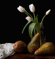
Still Life with Pearsby bcrantsComment: Little bit busy with all of the stuff in your composition. Lighting seems flat (little highlights and shadows to create interest and "pop"). |
| Photographer found comment helpful. |
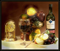
| 01/31/2010 12:34:42 AM |
Fruit Dreamby J-MeComment: Nice presentation with the various props (I like the clock). I can understand taking the soft dreamy approach. Looks a bit noisy however. Big blowout and loss of detail in front of the lower right dish. |
| Photographer found comment helpful. |
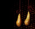
| 01/31/2010 12:33:01 AM |
Pears with Red Wool Suspensionby PaulComment: The colors work well, and the idea is fun and unique. May have been stronger with a different bg. Lighting is on the edge of being too strong...not quite (on this monitor) for me, but others with different monitors??? Just a couple observations. Good luck in the challenge. |
| Photographer found comment helpful. |
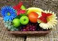
| 01/31/2010 12:31:05 AM |
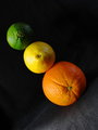
a balance of vitamin Cby kellmak10Comment: I like the angle. That adds some dynamic to this...wouldn't have worked as well vertically. Your bg material choice is taking a little away from the overall presentation IMO. |
| Photographer found comment helpful. |
| 01/31/2010 12:27:21 AM |
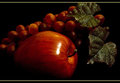
Appleby FocusPointComment: Nice simple presentation. However, everything looks to be plastic. Is it? |
| Photographer found comment helpful. |
| 01/31/2010 12:26:38 AM |
Yo!rangeby macwilyumComment: Different. Kinda fun and unique for sure. I'm seeing some shadows and edging in this with a distinct rectangle around the orange area...like some canvas was added perhaps? |
| Photographer found comment helpful. |
| 01/31/2010 12:22:24 AM |
Spring Tableby dswannComment: Classy and elegant layout with good use of props. Lighting, focus, and exposure are all in good shape. Overall quite nice (you know you can clone out those specks in advanced editing right?). Good luck in the challenge. |
| Photographer found comment helpful. |
Home -
Challenges -
Community -
League -
Photos -
Cameras -
Lenses -
Learn -
Help -
Terms of Use -
Privacy -
Top ^
DPChallenge, and website content and design, Copyright © 2001-2026 Challenging Technologies, LLC.
All digital photo copyrights belong to the photographers and may not be used without permission.
Current Server Time: 05/21/2026 04:00:32 PM EDT.