| Image |
Comment |
| 04/07/2010 09:03:50 AM |
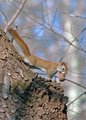
Mr. Redby usinkitComment: Not quite as sharp as it could be (not terrible - it's close). Colors are a little neutral. |
 Photographer found comment helpful. Photographer found comment helpful. |
| 04/07/2010 09:01:17 AM |
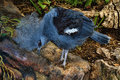
Freekey Bird!by KimmymacComment: That is a cool bird for sure. The photo is quite busy (hard to pull out the subject). |
| Photographer found comment helpful. |
| 04/07/2010 09:00:20 AM |
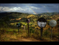
Bishops Viewby StagoleeComment: What a fun looking location. Great timing to catch the rainbow and lovely lighting. Good use of post to enhance, but not hurt, the end result. Good luck in the challenge. |
| Photographer found comment helpful. |
| 04/07/2010 08:58:57 AM |
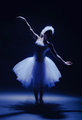
Elegant in Blueby bcrantsComment: Nice lighting effect at first glance. Upon closer inspection it looks like a substantial amount of detail has been lost, especially in the arms, neck, and headwear. Also getting some compression in the lower blues. |
| Photographer found comment helpful. |
| 04/07/2010 08:56:36 AM |
Clockworkby wyverndragonComment: Looks like you had fun with this. An interesting novelty shot. Good luck. |
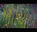
| 04/07/2010 08:55:48 AM |
Morning Dewby fisheyeComment: Oooohhh...fun bokeh! :-) Amazing what you can get with a simple subject sometimes, eh? Well done. |
| Photographer found comment helpful. |
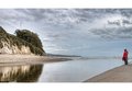
| 04/07/2010 08:54:44 AM |
Behold the Antenna!by MelethiaComment: Cute. Good detail and I like the tension created with the people just off the edge. Nice use of diagonals and triangulation. Just some observations. Good luck. |
| Photographer found comment helpful. |
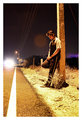
| 04/07/2010 08:52:59 AM |
The Hitchhikerby amateurboiComment: Self portrait? :-) Interesting how that area of purple shows up behind you (lens flare result?). |
| Photographer found comment helpful. |
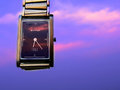
| 04/07/2010 08:51:34 AM |
Titan...take an EDGE over others by prashant_168Comment: Product shot approach needs to be clean. There's substantial evidence of post processing around the watch. Also some grain and the sky looks purple. Just some observations. Good luck. |
| Photographer found comment helpful. |
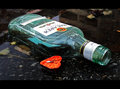
| 04/06/2010 11:40:48 PM |
Aftermath of a rejected heartby redpandaComment: I notice you didn't waste the chocolate by keeping it upside down, it won't get wet inside. Don't blame you. :-) Actually, in all seriousness, this is an emotive shot that tells a story, and is well executed technically. Best of luck to you in the challenge. |
| Photographer found comment helpful. |
Home -
Challenges -
Community -
League -
Photos -
Cameras -
Lenses -
Learn -
Help -
Terms of Use -
Privacy -
Top ^
DPChallenge, and website content and design, Copyright © 2001-2026 Challenging Technologies, LLC.
All digital photo copyrights belong to the photographers and may not be used without permission.
Current Server Time: 05/22/2026 03:23:24 AM EDT.