| Image |
Comment |
| 04/30/2010 12:20:29 PM |
|
 Photographer found comment helpful. Photographer found comment helpful. |
| 04/28/2010 09:28:46 AM |
Sweet Cindyby novaComment: I love her pose! Ended up with more votes over 5 than under...that's a positive, yes?
Good to see some of your photography again Ray. |
| Photographer found comment helpful. |
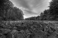
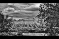
| 04/26/2010 03:32:28 PM |
River of rocksby redpandaComment: The Topaz or Tonemapping wiped out the tonal range and made most of this an even middletone grey. |
| Photographer found comment helpful. |
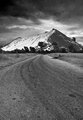
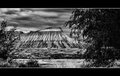
| 04/26/2010 10:13:12 AM |
Mogale Peakby TygerrComment: Sky looks really strange (there's a grid in it), like a texture bg was used or something? |
| Photographer found comment helpful. |
| 04/23/2010 09:04:15 PM |
MT-G7by JokersSoulComment: I like the composition of G6 better and the processing of G7.
Honestly, I'm starting to get confused on what I like and don't like anymore. :-} Hopefully you're getting some feedback that makes sense from everyone else. |
| Photographer found comment helpful. |
| 04/23/2010 07:26:11 PM |
MT-G5by JokersSoulComment: Ummm...I hate to be the naysayer here, but what happened to all of the detail that I liked in the last copy you posted? This looks very overprocessed IMO, especially the sides of the mountain (looks like a watercolor painting now) and the sky is all smoothed out. The foreground looks fine, it's just the background. ??? |
| Photographer found comment helpful. |
| 04/20/2010 10:33:37 PM |
DSC_2136_edited-8by Ja-9Comment: I like edit 6 better. When comparing the two, the stem on 6 is softer...on this one there appears to be evidence of post work. Splotchy and too sharp. There is a defined line with the light (nearly lime) green that stands out too much. I'd rather see a hint of blue than this quite honestly. Shadows will have a hint of blue in daylight anyway...that's natural.
I do like the slightly smaller black borders. |
| Photographer found comment helpful. |
| 04/19/2010 02:49:53 PM |
Bouquetby dtremainComment: Simple, fun. Little bit noisy in the dark colors. |
| Photographer found comment helpful. |
| 04/19/2010 02:49:42 PM |
Freeby freakin_hilariousComment: I like the POV. A polarizer would have make the colors pop a bit more, but still quite nice. Good luck! |
| Photographer found comment helpful. |
| 04/19/2010 02:38:36 PM |
|
| Photographer found comment helpful. |
Home -
Challenges -
Community -
League -
Photos -
Cameras -
Lenses -
Learn -
Help -
Terms of Use -
Privacy -
Top ^
DPChallenge, and website content and design, Copyright © 2001-2026 Challenging Technologies, LLC.
All digital photo copyrights belong to the photographers and may not be used without permission.
Current Server Time: 05/22/2026 07:16:49 AM EDT.