| Image |
Comment |
| 10/07/2019 05:34:55 PM |
|
 Photographer found comment helpful. Photographer found comment helpful. |
| 09/30/2019 09:07:52 AM |
Circles of waterby NeatComment: I thought this was an Awesome shot for this challenge. Love the color, the subject matter, and the composition. In retrospect I should have scored this higher. As it was I gave it an 8 and was tied for my Top Pick. Well seen, and as always, well captured. |
| Photographer found comment helpful. |
| 09/30/2019 09:05:48 AM |
echoes of a worldby krnodilComment: I really enjoyed this image. The B&W choice was perfect. Very pleasing image. Well done. Tied for my Top Pick (had two that I scored an 8). |
| Photographer found comment helpful. |
| 09/30/2019 09:03:36 AM |
|
| Photographer found comment helpful. |
| 09/29/2019 10:33:01 PM |
Cheese by MargaretNetComment: I really want to like this (I do actually) but the face having some motion blur is a bummer. Almost a top choice. |
| Photographer found comment helpful. |
| 09/29/2019 10:25:38 PM |
|
| Photographer found comment helpful. |
| 09/23/2019 06:20:53 AM |
Aftermathby grahamgatorComment: In my Top 3. Nicely seen and well captured. I thought that you took a challenging scene and really found an interesting perspective on it. The processing approach works well too. |
| Photographer found comment helpful. |
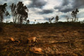
| 09/23/2019 06:18:04 AM |
Aftermathby mefnjComment: My top pick. Loved the comp and the processing. The 'Aftermath' here is very evident and this is truly an artistic representation of the subject / topic. Well done. Just sorry to see it didn't make the Top 3. |
| 09/16/2019 04:27:44 PM |
Light and Shadeby GinaRothfelsComment: This was in my Top 3 - gave it an 8. The shadows with the B&W presentation sold it for me. Just enough left out of the frame to keep it edgy. Well done. |
| Photographer found comment helpful. |
| 09/16/2019 04:25:57 PM |
Statueby DistantColoursComment: FWIW - Had this tied for my top pick (I gave out two 9's). I really this abstract image, and have tilted my head both ways to see if it played any better with a different perspective - nope, it plays just fine this way! Great detail and just enough side light. Only nit that could have held it back some is it gets a bit softer near the bottom edge. A square crop perhaps to lose that? Bah. Just speculating. It is what it is, and I liked it. Well done. |
| Photographer found comment helpful. |
Home -
Challenges -
Community -
League -
Photos -
Cameras -
Lenses -
Learn -
Help -
Terms of Use -
Privacy -
Top ^
DPChallenge, and website content and design, Copyright © 2001-2026 Challenging Technologies, LLC.
All digital photo copyrights belong to the photographers and may not be used without permission.
Current Server Time: 05/12/2026 02:51:23 PM EDT.