| Image |
Comment |
| 07/15/2005 06:47:31 PM |
The Sport of the Hunt...by mtbriderComment: Nice shot. Maybe just a little more contrast would be better. Never wanted to experience hunting from the point of view of prey, myself. :) |
| 07/15/2005 06:45:02 PM |
Fútbolby Keith ManiacComment: I think I would rather the guy facing the camera be in focus. |
 Photographer found comment helpful. Photographer found comment helpful. |
| 07/14/2005 11:03:49 PM |
Tour de Kamloopsby gppacecarComment: I like this. A sparcer part of the pack would have let me see that the background is sharp sooner but then again we appreciate something more if we have to work for it. 6 at least. |
| Photographer found comment helpful. |
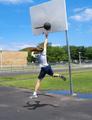
| 07/14/2005 09:37:50 PM |
My sport: basketballby yomanComment: You really got an action shot here! I really like the stop motion with just a little motion blur. Just between you and me, did you anticipate the wonderful shadows? Good work. 7 |
| Photographer found comment helpful. |
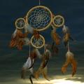
| 07/09/2005 07:15:30 PM |
My dreancatcherby RUEDISCHMUTZComment: I just love the lighting and the background. And I like that you have met the challenge with a picture that speaks to me in another way. I take from you picture an illustration of the dream catcher standing between me (the viewer) and the unknow darkness. Best I've seen so far. |
| Photographer found comment helpful. |
| 06/25/2005 09:46:46 AM |
|
| 06/23/2005 10:00:46 PM |
|
| Photographer found comment helpful. |
| 06/22/2005 11:08:55 PM |
Captured In Timeby popdeepopComment: Good try at this location. I have tried several times and been frustrated by the back drops.
I like the way you picked out this one horse and rider. Maybe a more narrow depth of field would help the statue stand out. Just narrow enough to slightly blur the wall and the trees. |
| Photographer found comment helpful. |
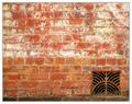
| 04/27/2005 07:35:30 AM |
House of the Rising Sunby sherComment: I really like your eye. I like this whole package. By that I mean the title fits the image, the image fits the challenge without feeling contrived and I don't see anything I would change. Well, maybe the last course of bricks at the bottom seems to be in shadow, but then that just adds interest. I don't rate many 10's when I first see a photo but this is a 10. |
| Photographer found comment helpful. |
| 04/23/2005 08:54:17 AM |
hands onby dj2118283288Comment: I really like the warm tones. I think the next thing I might do is to try to get the lighting to be more even. Paper is maybe just a bit over exposed and the others are edging into under exposure near the edges. A second or third light source might help that. The yellowish reflection just over the rock is distracting. I gave it a 6. |
| Photographer found comment helpful. |
Home -
Challenges -
Community -
League -
Photos -
Cameras -
Lenses -
Learn -
Help -
Terms of Use -
Privacy -
Top ^
DPChallenge, and website content and design, Copyright © 2001-2026 Challenging Technologies, LLC.
All digital photo copyrights belong to the photographers and may not be used without permission.
Current Server Time: 07/17/2026 03:45:06 PM EDT.