| Image |
Comment |
| 06/29/2005 10:34:06 AM |
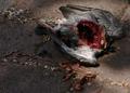
The Gory End of a Feral Pigeonby benhurComment: Lighting could have been better on this one. The shade would be good to accentuate death, but the streaks of sunlight spoil the image. Not sure about meeting the challenge, though. Yes, title indicates usefulness but who read the title with a such powerful image? 5 |
 Photographer found comment helpful. Photographer found comment helpful. |
| 06/29/2005 10:31:54 AM |
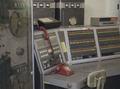
"Analogue"by briphotoComment: I actually like the grainness in this photo - it may not do very well in general, but it seems perfect choice for this challenge.
Composition is good, as everything in this image is obsolete. However, the total effect is of lacking focal point, main object. That's where you could have done better. 7. |
| Photographer found comment helpful. |
| 06/28/2005 06:06:43 PM |
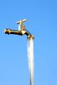
I wish this was Beer!by aKiwiComment: My pick for a blue! The only imperfection that caused a 9 instead of 10 was the blown reflection off the faucet. There is also something unreal about the water coming out that I could not put my finger on, probably there is a tube that is feeding the faucet with the water and the amount of water is not sufficient to cover it.
Also, there is a halo around the faucet from oversharpening. All this and still a 9 - that's how strong effect this had on me. Good luck! |
| Photographer found comment helpful. |
| 06/28/2005 05:58:49 PM |
|
| Photographer found comment helpful. |
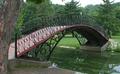
| 06/28/2005 05:57:47 PM |
Green Water Bridgeby holdingtimeComment: That tree trunk on the left removes from the image appeal, but still it is a 7 from me with high hopes for a top 10% finish. |
| Photographer found comment helpful. |
| 06/28/2005 04:57:15 PM |
New Glassesby LadeeMComment: reflection is distracting. Polarizer might have alleviated that effect some. |
| Photographer found comment helpful. |
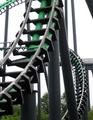
| 06/28/2005 04:56:18 PM |
Twisted Metalby BigMoComment: For some reason, the green colour distracts me. I like this photo very much, but I'd love to see it in b/w after the challenge. Also, the top left corner could have been cropped out - it is also a destracting element that does not add to the photo. |
| Photographer found comment helpful. |
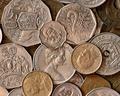
| 06/28/2005 04:40:27 PM |
Money, Money, Moneyby AlanBesComment: technically well executed, nailed the challenge, but it just does not stand out as interesting subject. Nice collection of coins, though. 5. |
| Photographer found comment helpful. |
| 06/28/2005 04:39:18 PM |
|
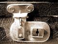
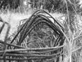
| 06/28/2005 04:37:54 PM |
Iron Grassby JesusfreakHBCComment: Please make sure you get as close as 640 pixels next time as this does a disservice to your photo. It is way too small to get the detail out of it and to judge it.
I know that most comments will be on this topic, and I would like to point out other details for improvement, but it is just not possible on an image this small.
Sorry. |
Home -
Challenges -
Community -
League -
Photos -
Cameras -
Lenses -
Learn -
Help -
Terms of Use -
Privacy -
Top ^
DPChallenge, and website content and design, Copyright © 2001-2026 Challenging Technologies, LLC.
All digital photo copyrights belong to the photographers and may not be used without permission.
Current Server Time: 07/17/2026 02:46:24 PM EDT.