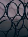
DPChallenge: A Digital Photography Contest You are not logged in. (log in or register
 
Browse Settings
Currently viewing:
Membersrdanz

Show comments:

Per page:

Order:

Comments:


Comments Made by srdanz
Pages:   ... [69] [70] [71] [72] [73] [74] [75] ... [101]
Showing 711 - 720 of ~1004
Image Comment
1984 at 1MHz
08/17/2005 12:29:43 AM
1984 at 1MHz
by RinkRat

Comment:
PRINT CHR$(147)
READY.
SYS 64738
READY.

fantastic - good choice of topic, but a little weak for the challenges here.
The PC-style keyboard on top throws the picture off a bit. But, you needed something to avoid the disqualification based on taking a photo of an existing artwork without putting it in some kind of context.
Good luck in the future...

edit to add: it existed in '84, I remember...

Message edited by author 2005-08-17 00:30:26.
Photographer found comment helpful.
WQ6O5134.jpg
08/16/2005 11:39:09 AM
WQ6O5134.jpg
by Gil P

Comment:
similarly to the , but not as drastic, the amount of light on the left arm is just a tad strong. It gives more attention to the left arm than it seems to deserve. It all depends on what the target audience for the photo is, and what topic does it go under in general. But taken out of context, I'd prefer to see the arm's intensity of light burned just a bit.
Photographer found comment helpful.
WQ6O5127.jpg
08/16/2005 11:32:48 AM
WQ6O5127.jpg
by Gil P

Comment:
The lighting seems off on this one - let me rephrase - I do not seem to be fond of this lighting. My attention is drawn to Christine's left arm as it is the most lighted object on the photo.

The one place where lighting worked for me is her face - it is in the shadow, but as the face is normally the first thing I try to look at (at least when the model is dressed), I find your choice to leave the facial lines recognizeable and not completely dark intriguing.

I hope this makes some sense...
WQ6O5201.jpg
08/16/2005 11:23:14 AM
WQ6O5201.jpg
by Gil P

Comment:
My favourite of the series. I just love how you used wide-open aperture to enhance the eye and the face... I can almost see the whole face through the blurred fingers.
Summer Milky Way
08/09/2005 01:45:27 PM
Summer Milky Way
by strangeghost

Comment:
Amazing shot (and amazingly clean sensor for that matter!) I know that the trees add to the image, but it seems like they take the space away from the sky - leaves me hungry for more though.

Did you use a barn-door mechanism to follow the rotation? I'd be curious to learn more about how you took this shot.
Photographer found comment helpful.
car for beauty
08/08/2005 12:38:35 AM
car for beauty
by bluephoto

Comment:
Why the mirror image? It takes away from the image IMO.
Being Rich in the 50s
08/08/2005 12:36:04 AM
Being Rich in the 50s
by Balko

Comment:
Is this an IR filter? Very cool effect. Love the reflection!
Photographer found comment helpful.
Corporate America - Bastion of Wealth & Power
08/03/2005 01:42:25 AM
Corporate America - Bastion of Wealth & Power
by HornOUBet

Comment:
Not lucky with the weather - the clouds over Frost tower take away from the supposed message of affluence, they are more of an indication of instability in the global economy.. or at least I see it that way.

Another little thing that is distracting is the perspective and the distortion of edges caused by the angle of the shoot. Being farther away would have alleviated this issue.

Still a powerful shot, and in the upper half of the challenge for now.
Photographer found comment helpful.
Wine Rack.jpg
07/12/2005 05:45:57 PM
Wine Rack.jpg
by Brooklynsbridge

Comment:
I like the idea, but I don;t think that I would have scored it very high in the challenge. Some are general remarks, and some are specific to DPC moment in time.
- it is too dark, and too soft
- the shadow on the wall behind te rack is distracting a bit
- the crop of the top circle is not appealing, either leave the whole circle in, or crop more of it. This looks like you accidentally missed framing it right.
- couing out of the Macro voting, I can live for a while without looking at a closeup photo of anything.

Suggestions for improvement:
- try with a different light source/direction. Maybe backlighted from below while shooting from the same, slightly elevated position.
- try a wider crop, at least to get more of the rack.
- put a bottle of wine on the lower row, and combine with some interesting lighting. Make sure that the bottle is not your main subject, but just something to make the photo more interesting.

4 overall, I'm sorry.
Photographer found comment helpful.
Close view
07/10/2005 12:18:38 AM
Close view
by Structor

Comment:
Beautiful photo/I wish I thought of this! Original, Macro, and landscape at the same time. Genius! I am not bothered by the shadow in the lower right, although it draws the attention to it. 1 pt deduction for that. 9.
Photographer found comment helpful.
Pages:   ... [69] [70] [71] [72] [73] [74] [75] ... [101]
Showing 711 - 720 of ~1004


Home - Challenges - Community - League - Photos - Cameras - Lenses - Learn - Help - Terms of Use - Privacy - Top ^
DPChallenge, and website content and design, Copyright © 2001-2025 Challenging Technologies, LLC.
All digital photo copyrights belong to the photographers and may not be used without permission.
Current Server Time: 09/14/2025 05:58:50 PM EDT.