|
|
|
Showing 321 - 330 of ~1004 |
| Image |
Comment |
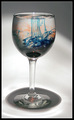
| 06/11/2006 04:59:10 PM | Magic Potionby javamooseComment: Greetings from the Critique Club!
First impression: Interesting shot, but not the greatest. Where does the light come from?Oh, yes, from above. That creates nice concentric circles at the bottom.
But... what's up with the shade on top? Not symmetrical, and its off-center position does not improve the composition. Also, the orange and blue look more like a smudge (especially orange) then like a something that makes this image interesting. What would have helped here?
-composition: have it centered horizontally, but have more negative space above the glass.
-lighting: if you attempted to create more shade in the background, so that there is higher contrast between the glass and the background. This way the lighter portions of the background mull the glass that was supposed to be the main object.
-setup: since this was a set up shot, you could have come up with a more interesting swirling colors in the glass. Since the whole scene is grayish, some warmer colors could have been a better choice (orange is OK, but blue is too cool.)
I hope this helps. 5.7 is a reasonable score for this shot. If you have any questions about this comment, please feel free to PM me. Best of luck in the future challenges here at DPC!
-Serge |  Photographer found comment helpful. Photographer found comment helpful. |
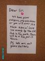
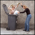
| 06/11/2006 09:00:01 AM | Ransom noteby CSDragonComment: Why the date!? It is so annoying to have the bright datestamp there that I can't evaluate the rest of the photo - my eyes keep getting drawn there constantly. |
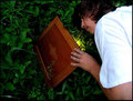
| 06/11/2006 06:02:35 AM | Finding Worldsby SebiComment: Good idea, but would have been much better if you waited for some more darkness outside to produce a better effect of light from underneath illuminating your face. This is not a terribly good execution of a brilliant idea. Good luck! | | Photographer found comment helpful. |
| 06/11/2006 06:00:48 AM | | | Photographer found comment helpful. |
| 06/10/2006 09:10:34 AM | | | Photographer found comment helpful. |
| 06/07/2006 05:13:26 PM | | | Photographer found comment helpful. |
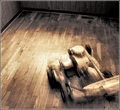
| 06/07/2006 12:46:55 AM | Wild Potby MaybeNextTimeComment: A little USM *unsharp mask* before submitting would have helped here, and perhaps a slight curves adjustment to bring out colors some more. Idea is great, and the find is great, so the only thing pulling you down is the hazy photo and FBI. |
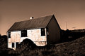
| 06/06/2006 04:56:22 PM | Forgotten Old Homeby biggisComment: Greetings from the Critique Club!
First impression: The photo looks washed out. The lighting is too harsh, and it does not appear that the time of the day and/or your position were conducive to producing a good shot.
After looking over the details and other comments etc:
This scored lower than I would expect it to score. I would have expected this to be slightly above 5. However, why didn't it fare better? First of, in this challenge you should have known that there will be 90% of buildings, and this one is just that - a building. From your own comment, this must have a special place with you, as it is obviously something that you would capture, DPC or no DPC. However, the DPC voters do not know that, and our subjective views usually get trashed by DPC vote, if we were lulled into believing that others will see it the same way.
Hope this helps!
-Serge | | Photographer found comment helpful. |
| 06/06/2006 04:40:20 PM | reflections of the pastby RikkiComment: Greetings from the Critique Club!
First impression (before reading anything about it): Very nice! Actually, excellent! Except for... the lost details of what appears to be blown out part of the rotunda where there are some indiscernible creatures. I wish I could see what those were! Oh well, one of the DPC limitations, so I won't take away from the image because of it. There is a plenty of other details to enjoy here in this photo.
Now, after reading your comments and seeing the details - I appreciate your efforts to take a good shot. The compression artefacts are visible, but I'm so used to them that I do not ever score a photo down for them (unless something that could obviously have been fixed).
What I like about it even more is the fact that you did not post-process it to death, but that this is your great find! Congratulations on the 5th place!
Feel free to PM me with any questions - I'm just being honest.
-Serge | | Photographer found comment helpful. |
| 06/06/2006 04:28:40 PM | French Chaletsby TejComment: Greetings from the Critique Club!
First impression: nice colors, but are they real?
The sky is gray, almost too gray to produce such red color. It may not be true, and I won't go into the game of guessing how did you do it, I'll just comment on the impact the photo makes on me. It almost looks like a drawing. The more I look at it, the more it draws my attention. And that is positive in this case. My eyes are exploring the details, but fail to find something to catch on. The details on the roof are lost in places, and that ruins the photo for me a bit.
Then I read your comments for a second observation. You used grunge effect on it! Weird choice for an architecture shot:-)
The details I mentioned above were probably lost because of the extensive postprocessing, including NeatImage. To score better here at DPC (and I think that you scored right where I would expect this image to score, in lower 5s), you need to have a wow-factor. In the architecture challenge, you should have known that 90% of the submissions are going to be buildings. So, you needed to figure out the way to make yours stand out. You picked a standard, centered composition, without a lot of space around the building. Then you applied draganizer action, and that is another polarizing technique - some people love it and some hate it. I like it applied on people, but have a hard time finding a good landscape or architecture application for it. In the end, after going through 100s of entries, this one will not be remembered, and will receive scarce bumps.
I hope this helps, and good luck in the future challenges.
If you have any questions regarding this critique, please feel free to PM me.
-Serge
|
|
Showing 321 - 330 of ~1004 |
Home -
Challenges -
Community -
League -
Photos -
Cameras -
Lenses -
Learn -
Help -
Terms of Use -
Privacy -
Top ^
DPChallenge, and website content and design, Copyright © 2001-2026 Challenging Technologies, LLC.
All digital photo copyrights belong to the photographers and may not be used without permission.
Current Server Time: 07/18/2026 07:50:33 AM EDT.
|