| Image |
Comment |
| 11/22/2004 07:07:55 AM |
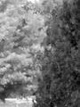
Seasons of Changeby MomofjoyComment: I see blurred leaves in multiple layers lit differently. Without sharpness there's not enough form for me to consider. Maybe I'm too technically inclined to like this at all. |
| 11/22/2004 07:06:37 AM |
Let There be Lightby umbrisComment: The image is not straight, but exposure is perfect. It's hard to say what's the subject, but immense clarity in detail gives too much to do to concentrate on that problem. Nice one. |
 Photographer found comment helpful. Photographer found comment helpful. |
| 11/22/2004 07:05:17 AM |
SHADES OF GREYby medinfo2000Comment: Light is very nice. Background is too dull, but emphasizes the main subject well. Tones are a bit middle centered, as deeper shadows seem quite full. |
| Photographer found comment helpful. |
| 11/22/2004 07:03:24 AM |
Alien Shadowby wetlandComment: Very interesting object with an amazing shadow! Aperture could have been higher to enable complete sharpness everywhere. Light is very sharp on the main object, which makes the shadow better but causes the object to have too deep contrast. |
| Photographer found comment helpful. |
| 11/22/2004 07:01:11 AM |
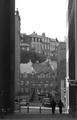
Downtownby pagarneauComment: Perspective gives feeling of depth, but tones don't highlight that. There're odd contrast areas, like a lamp or something on right at the end of some lever, producing silhouette on white area on wall. Main target seems to be missing. People don't seem to add interest, as they're partly blurred to the background in their repeating tones and partly because they are like out of place of function. |
| Photographer found comment helpful. |
| 11/22/2004 06:58:25 AM |
The Lion Kingby yashmanComment: Hard to say what's the subject, and how name relates to it. It looks like some "upper portion" of the building has been the target, but name refers to the highest detail of it. Main subject lacks tones, probably due to harsh light. |
| 11/22/2004 06:57:02 AM |
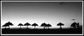
lonely shelterby petrakkaComment: Nice silhouette. Form is there. Upper cloud on sky could make this better image, but is left out too much, and lacks contrast. So it feels not all tones are in right places. |
| Photographer found comment helpful. |
| 11/22/2004 06:55:53 AM |
Friendsby jazperComment: Direct flash doesn't work well here. Skin tones are ok, nice looks but background is nonexistent, shadows from chins make "negative halo" for faces. |
| 11/22/2004 06:51:04 AM |
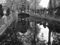
Hayden Fallsby xtabintunComment: Deep contrast, but not too many tones in shadows or highlights. Maybe less contrasty version on middle tones would work better. |
| Photographer found comment helpful. |
| 11/22/2004 06:49:11 AM |
|
Home -
Challenges -
Community -
League -
Photos -
Cameras -
Lenses -
Learn -
Help -
Terms of Use -
Privacy -
Top ^
DPChallenge, and website content and design, Copyright © 2001-2026 Challenging Technologies, LLC.
All digital photo copyrights belong to the photographers and may not be used without permission.
Current Server Time: 04/02/2026 06:48:38 AM EDT.