| Image |
Comment |
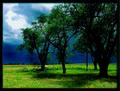
| 01/29/2005 04:40:28 AM |
Storm a Brewinby BrooklynsbridgeComment: Overly saturated and way too candy colored. I know the style is appealing for few, but here I don't feel it works for the benefit of the image. Also the sky doesn't look good with the blown part, but the darker tones support the image. It's beyond me where's the three, and it feels ilke the "boat" behind the leftmost of the close trees would do better being out of sight. |
 Photographer found comment helpful. Photographer found comment helpful. |
| 01/29/2005 04:37:48 AM |
Counting The Edgesby SirBiggsALotComment: Very nice idea with nice execution. I'd bring the light closer to the camera, the main block needs it. Also the background isn't straight but is close enough to give feeling it's meant to be straight. Maybe a bit more distance would do good in bokeh for the background. I like also the fact the background isn't white, supports the image better. |
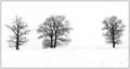
| 01/29/2005 04:34:48 AM |
Winter treesby RUEDISCHMUTZComment: Looks like there're four trees in this, but that doesn't matter at all. Graphical feeling works marvellously. The disparity in placing would be annoying but the fact the leftmost has "suffered" by the presence of better living bigger tree gives some needed tension. The image is positioned perhaps a bit too high, but still works well. |
| Photographer found comment helpful. |
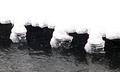
| 01/29/2005 04:32:11 AM |
Gap-Toothedby amsmythComment: I'm not sure I like the overblown areas even though that makes the image all the way more graphical. The reason is that the idea of the image is not graphical by nature, so now the image is being teared up, to two dimensions of graphical boundaries and detail which hold the real interest. The shot has been well seen, but some reconsideration for composition might make it even more effective. Now the overall curves seem to arch semirandomly. |
| 01/29/2005 04:26:00 AM |
The Primary Colorsby Pug-HComment: These primary colors are way oversaturated, they've lost majority of detail and the background looks like it's artificially blurred. So I feel like a good idea is destroyed. Also, on retake I might reconsider compostion, as the red seems to be leaving the scene. |
| Photographer found comment helpful. |
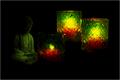
| 01/29/2005 04:24:14 AM |
Letting Go of Three Candlesby whagerbaumerComment: I'm completely baffled by the figure on left. It's too dim to be sure what's that, but even if it's a painting of a man I'm not sure how it contributes to the image. Or the candles steal too big role. One is a lot smaller than the others and by special arrangement seems to have some special role, but the tale of this image is beyond me. |
| Photographer found comment helpful. |
| 01/29/2005 04:22:02 AM |
...up to threeby jonrComment: In the available light this image had too wide dynamic range to be captured. The stairs need badly more detail, while the closer walls start to fade into white. The composition is also a bit off, the number is bit tilted and I'm not sure the image benefits of having slight slide of background world showing from the right of the letter. The idea works well, however, so with retake this might be wonderful on it's own right. |
| Photographer found comment helpful. |
| 01/29/2005 04:15:40 AM |
Red Yellow Greenby WinterbergComment: As a thumbnail one couldn't see the writing, but now it's obvious. Green doesn't have the intensity of the others and red is a bit dimmer as well, but idea is great and execution, while not perfect, supports it well. I especially like the caustics on the light and the fact you didn't use just simple paper. |
| Photographer found comment helpful. |
| 01/29/2005 04:13:22 AM |
Glassesby KiwiChrisComment: Five glasses out of three. The first one is not quite on level with the others. Minor detail though, the power is on the whole. Still this feels a bit boring. |
| Photographer found comment helpful. |
| 01/29/2005 04:09:26 AM |
Happy 3 DPC!by mrorange002Comment: Lousy name, almost like votes fishing, but the idea for the image is nice and execution is marvellous. I could take a tiny bit more of lips into the frame even though the cropping highlights the fire blown away. Unaffected third flame builds some unbalance into the image. |
| Photographer found comment helpful. |
Home -
Challenges -
Community -
League -
Photos -
Cameras -
Lenses -
Learn -
Help -
Terms of Use -
Privacy -
Top ^
DPChallenge, and website content and design, Copyright © 2001-2026 Challenging Technologies, LLC.
All digital photo copyrights belong to the photographers and may not be used without permission.
Current Server Time: 04/02/2026 12:59:45 AM EDT.