| Image |
Comment |
| 04/25/2005 11:31:43 AM |
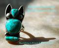
Southwesternby vtruanComment: Nice lighting and shadow. I think the turquoise is a little over saturated and the font you chose is too complex (hard to read). |
 Photographer found comment helpful. Photographer found comment helpful. |
| 04/25/2005 11:29:14 AM |
|
| Photographer found comment helpful. |
| 04/25/2005 08:40:05 AM |
|
| Photographer found comment helpful. |
| 04/25/2005 08:38:20 AM |
|
| Photographer found comment helpful. |
| 04/25/2005 08:37:00 AM |
|
| 04/25/2005 08:35:42 AM |
Rockby theSajComment: I don't really like the angle you chose for this shot ..... |
| Photographer found comment helpful. |
| 04/25/2005 08:34:05 AM |
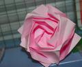
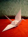
Paper Craneby joangingComment: You could have done much better if you chose a different background. Those 2 different colors and different textures are pretty distracting. |
| 04/25/2005 08:31:33 AM |
|
| Photographer found comment helpful. |
| 04/25/2005 08:21:23 AM |
Rock Bottomby manuraoComment: Not bad, but there is a little white balance issue .... You could have removed that yellow cast in photoshop with the Automatic color function .... |
| Photographer found comment helpful. |
| 04/25/2005 08:17:14 AM |
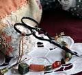
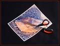
Scissors Wins!!by javamooseComment: I had a similar idea for this challenge, but I didn't use it. I like it. Good luck ! |
| Photographer found comment helpful. |
Home -
Challenges -
Community -
League -
Photos -
Cameras -
Lenses -
Learn -
Help -
Terms of Use -
Privacy -
Top ^
DPChallenge, and website content and design, Copyright © 2001-2026 Challenging Technologies, LLC.
All digital photo copyrights belong to the photographers and may not be used without permission.
Current Server Time: 07/16/2026 07:44:08 PM EDT.