| Image |
Comment |
| 01/12/2007 10:48:23 AM |
|
 Photographer found comment helpful. Photographer found comment helpful. |
| 01/12/2007 10:47:05 AM |
Singing for Changeby jrtoddComment: High levels of funkyness were found in this picture. I would have gotten my dirty little fingers in there and brought up the blue in his eyes... and I would have messed it up probably.
Good balance. |
| Photographer found comment helpful. |
| 01/12/2007 10:43:38 AM |
Heading Homeby TimComment: I really like how you did this. I'm not sure if the mist is all natural, but it certainly feels like there is some processing at work here. A bit of extra dodging on that path would really give this a magical zing. |
| Photographer found comment helpful. |
| 01/12/2007 10:42:24 AM |
End of the Seasonby salmiakkiComment: Everything leads to the primary subject - the lock - which is not in focus. The impact of the photo is lacking as a results. Things that might help could include a bit of a contrast boost in that area... |
| Photographer found comment helpful. |
| 01/12/2007 10:40:13 AM |
Dauntingby baco99Comment: Nice light vs dark there. Too bad the center is off-center... the bottom seems straight, so not much you can do about it. Architectural shots are tricky. Also, watch for blown highlights in the clouds. Maybe a bit of HDR type layering with a tiny bit of burn might have helped a bit in the early stages of processing. |
| Photographer found comment helpful. |
| 01/12/2007 10:35:58 AM |
Vulture 1by UnRed DaveComment: Cool shot. Could probably use just a smidgen off the right and bottom. I would have gone typical thirds with this one with the boarder on the right third and the carve on the left third. the negative space isn't really adding much imho. It looks tack sharp and I bet that the pic would indeed look better with those elements enlarged via the cropping of excess. |
| Photographer found comment helpful. |
| 01/12/2007 10:31:45 AM |
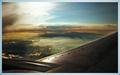
Heavenby GueDesignsComment: Pretty cool. Personally I would have cropped a bit higher to slice off some of the engine... probably would have brought the width in a bit too just to get the height back up there too... Maybe just to where the line of rivets end. The border color is less thanideal imho. neat how it has its own gradients though. |
| Photographer found comment helpful. |
| 01/12/2007 10:28:39 AM |
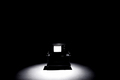
Dead Airwavesby UbersteinyComment: Striking and very well pulled off. I like that the light is slightly off-center. |
| Photographer found comment helpful. |
| 01/10/2007 05:22:19 AM |
|
| Photographer found comment helpful. |
| 01/10/2007 05:20:04 AM |
|
| Photographer found comment helpful. |
Home -
Challenges -
Community -
League -
Photos -
Cameras -
Lenses -
Learn -
Help -
Terms of Use -
Privacy -
Top ^
DPChallenge, and website content and design, Copyright © 2001-2026 Challenging Technologies, LLC.
All digital photo copyrights belong to the photographers and may not be used without permission.
Current Server Time: 07/23/2026 06:37:12 PM EDT.