| Image |
Comment |
| 11/02/2007 04:26:45 AM |
|
| 10/23/2007 07:28:16 AM |
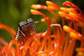
Nature, Red in Tooth and Claw by DrAchooComment: First thing I thought of when I saw the pic was the fantastic BG of the sky behind the red-orange poppy. Heh. I was fooled and I'm OK with that!
helluva shot doc! |
 Photographer found comment helpful. Photographer found comment helpful. |
| 10/11/2007 09:42:31 PM |
Death & Loveby dewedComment: easily one of the top five most potent pics on the site as far as emotion is concerned. |
| 10/10/2007 09:58:36 AM |
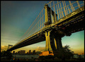
Civil Engineering by APComment: I'm really digging the tones you use in your skies in many of the images in your portfolio. |
| Photographer found comment helpful. |
| 10/10/2007 09:57:43 AM |
What you looking at!!! by muz64Comment: very nicely controlled reds in a difficult situation with low contrast, high saturation color.
To my eye, I'm seeing a fair bit of oversharpening artifacts where the red meets the green.
My best guess is that these were introduced as a part of the resizing for web procedure. May I suggest using a bit of a mask on your sharpening layer, specifically on BG/bokeh areas and high contrast edges. |
| Photographer found comment helpful. |
| 10/10/2007 03:47:20 AM |
The Calm After The Storm !by judojoeComment: The powerlines are definitely distracting here.
I'm looking at the colors and lines and I've decided that I'm satisfied with the basic subject and its placement.
I'm having trouble with the distant BG though, so I'd offer the suggestion of moving one step left and one foot up. That would probably change the composition to place slightly more emphasis on the boat, the break in the back and the contrast from the busy grass to the calm water. I'd crop down to a little above the high waterline on the opposite shore.
At that point, I'd probably have a go with obscuring the reflection of the single remaining powerline tower from the water.
The saturation of the image is fairly low, so loses a lot of visual impact because of this. Possible solutions could be the addition of an unexpected color or increasing contrast outright, going to a very low saturation, monotone or duotone.
that's the best I can do for now! Hope it's useful somewhat. Message edited by author 2007-10-10 03:48:30. |
| Photographer found comment helpful. |
| 10/10/2007 12:49:25 AM |
Last Supperby De SousaComment: brilliant! I love the contrast from the tattooed apostles and the (relatively) unmarked 'Jesus'.
I also like the simplicity in their attire which generally consists of whites, blacks and denim blues. Very much in keeping with a working class group. The shirtless aspect is quite suitable for the customs of the place and time. Fantastic choice for Peter.
Do you use the Sigma 500 with the IR trigger or the optical slave with your Canon flashes? |
| Photographer found comment helpful. |
| 10/03/2007 12:39:59 AM |
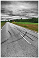
Trough The Stormby luddeComment: Wow. the strong complete desaturation in the sky and the road are excellent complements. The grain gives excellent effect as well, heightening the contrast between the surrealistic B&W elements and the idyllic colored elements which have a gentle touch of editing.
Very strong sense of depth. Good stuff! |
| Photographer found comment helpful. |
| 10/03/2007 12:32:59 AM |
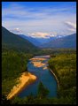
Skagit Riverby AgaricusComment: gorgeous capture. The blues in this really stand out although I initially was drawn to the image by the lighting.
The 2nd border is very subtle and appears a bit more subtle on the right and bottom and additionally appears a bit uneven... I would not mind at all if it were only affecting the top and left edges. Message edited by author 2007-10-03 00:34:38. |
| Photographer found comment helpful. |
| 10/03/2007 12:15:50 AM |
|
| Photographer found comment helpful. |
Home -
Challenges -
Community -
League -
Photos -
Cameras -
Lenses -
Learn -
Help -
Terms of Use -
Privacy -
Top ^
DPChallenge, and website content and design, Copyright © 2001-2026 Challenging Technologies, LLC.
All digital photo copyrights belong to the photographers and may not be used without permission.
Current Server Time: 07/21/2026 02:12:41 PM EDT.