| Image |
Comment |
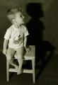
| 01/17/2005 05:01:30 PM |
Harry Potterby novaComment: Some bad noise on the pot and on "Harry"'s forehead. The window is distracting. Good idea, fits the challenge well. 6. |
 Photographer found comment helpful. Photographer found comment helpful. |
| 01/17/2005 05:00:27 PM |
Treasure of nationby paha_lComment: Nice shot, but you should have chosen a different title. I'll check again after the challenge to see your explanation for your choice. 7. |
| 01/17/2005 04:58:51 PM |
Phantom of the Operaby BeetleComment: Awesome lighting. You should have used a real rose instead of a fake one to give the picture the last finish. Nice composition, perfect crop. Cool smoke. I don't like the mask's nostrils, you might have covered them from within. 10. |
| Photographer found comment helpful. |
| 01/17/2005 04:57:13 PM |
|
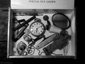
| 01/17/2005 04:56:09 PM |
To Kill A Mockingbirdby fotodudeComment: You forgot the chewing gum and the wool ;) Needs some contrast and brightness. The perspective is too straight, direct, 4. |
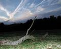
| 01/17/2005 04:54:43 PM |
Field of Dreamsby eqqmanComment: The tilt doesn't do very much for me. The flash also looks weird, unnatural. 3. |
| 01/17/2005 04:53:14 PM |
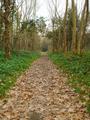
Road to Predictionby FinfsComment: Isn't it called 'Road to Perdition'? I couldn't find your version :(
Nice vanishing pint, I like the many different textures and the perspective. The leading lines are cool, but they are broken up a bit too much by the trees. 7. |
| Photographer found comment helpful. |
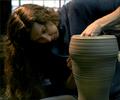
| 01/17/2005 04:51:05 PM |
Harry Potterby photomayhemComment: ROFL! This is one of the best pictures that really stick to the challenge description so far :) I like the handprints on the shirt and the white background. I don't know about the finished cup and the gloves. I think dirty hands and a work-in-progress cup would have given it the last touch. 9. |
| Photographer found comment helpful. |
| 01/17/2005 04:46:56 PM |
The Ringby Bran-O-RamaComment: Nice orange/blue contrast. You could have pushed it a little in HSL. I'll have to revisit this after voting as I really don't understand how this could possibly have been realized within the basic rules, but hey, it seems you found a creative way to do so. It looks really weird :) 5. |
| Photographer found comment helpful. |
| 01/17/2005 04:43:25 PM |
P( 3,14) darren arnofskyby akyrosComment: So you've been to Rome ;) Too much contrast, the oval border is really strange as it cuts many of your picture's curves. 2. |
Home -
Challenges -
Community -
League -
Photos -
Cameras -
Lenses -
Learn -
Help -
Terms of Use -
Privacy -
Top ^
DPChallenge, and website content and design, Copyright © 2001-2026 Challenging Technologies, LLC.
All digital photo copyrights belong to the photographers and may not be used without permission.
Current Server Time: 07/21/2026 04:15:53 PM EDT.