| Image |
Comment |
| 01/28/2005 04:41:53 PM |
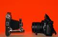
Lens to Lensby HeavyComment: Intersting idea, but the background should be red all the way down. There's some kind of scratch between the cams in the background. Or I'm just seeing things (time to go to bed ;)
Perhaps a less direct perspective would have been nice. Like, taking a shot over the shoulder of someone photographing the old camera...if you understand what I mean, it's hard to explain what I have in mind. 5. |
 Photographer found comment helpful. Photographer found comment helpful. |
| 01/28/2005 04:39:19 PM |
Toysby shuchiComment: So, which one's new and which one's old? I know you're referring to the three men as old, but the difference isn't clear enough. Also, you cropped off the dog's right foot. Your lighting is good thouh. The shadows are just right. 4. |
| Photographer found comment helpful. |
| 01/28/2005 04:37:13 PM |
|
| Photographer found comment helpful. |
| 01/28/2005 04:36:12 PM |
|
| 01/27/2005 12:14:35 PM |
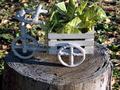
In Timeby tolovemoonComment: You've got some bad JPEG artifacts in there. Set the camera to take pictures at a hivher quality or set a lower compression rate when saving it after editing.
I can't see a distinguishable difference between the elements that would show me what is old and what is new. The plant is cut off at the top, and the front wheel is in the shadow (it should be lit). 4. |
| 01/27/2005 12:12:33 PM |
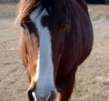
Mr.Innocentby CoopersCowgirlComment: This doesn't fit the challenge for me. Also, it's not sharp enough, the head is cut off both on top and at the bottom. 3. |
| 01/27/2005 12:11:31 PM |
|
| Photographer found comment helpful. |
| 01/27/2005 12:09:40 PM |
Juxtapositionby neehaiComment: I'm sorry but I see only new things. Nothing old. Are you referring to the bench in the lower right? Doesn't look that old... Nice panorama, nonetheless. Interesting bridge. 5. |
| 01/27/2005 12:07:55 PM |
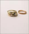
Modern Advantageby bruskiComment: Great composition and lighting. Good choice of subject. Where did you get those? I also like the crop. 10. |
| Photographer found comment helpful. |
| 01/27/2005 12:06:59 PM |
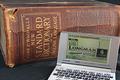
1927 vs 2003by kenboComment: Cool book. I hope there's something inside :). Good idea, neat and sharp. There should be less dust on the black surface. 7. |
| Photographer found comment helpful. |
Home -
Challenges -
Community -
League -
Photos -
Cameras -
Lenses -
Learn -
Help -
Terms of Use -
Privacy -
Top ^
DPChallenge, and website content and design, Copyright © 2001-2026 Challenging Technologies, LLC.
All digital photo copyrights belong to the photographers and may not be used without permission.
Current Server Time: 07/22/2026 12:53:57 PM EDT.