| Image |
Comment |
| 02/20/2005 10:59:37 AM |
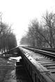
Straight and Narrowby hdogg4uComment: Nice vanishing point. It*s too centered though. You might have cropped away some of the sky. 7. |
 Photographer found comment helpful. Photographer found comment helpful. |
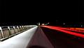
| 02/20/2005 10:58:29 AM |
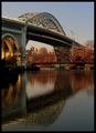
Morning on the Riverby bobdaveantComment: I like the red tones and the reflection. The only distracting elements are the green road signs on the bridge. Maybe you could have turned them orange or so with HSL? 8. |
| Photographer found comment helpful. |
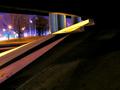
| 02/20/2005 10:57:09 AM |
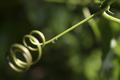
The Spiral Aqueductby euskadiComment: Nice bokeh, and good interpretation of the challenge, even though I needed the title to get it. 8. |
| Photographer found comment helpful. |
| 02/19/2005 07:00:09 AM |
Self Portraitby glodaComment: Originally posted by lbWhaples:
If euskadi gave you a 10, where did it go? |
My guess is he either didn't vote on 20% of the pictures or the robots found his voting to be inconsistent. Too bad...
You're right, the light source was pretty close to my left shoulder, but moving it farther away would have created softer shadows than I wished for. I tried higher exposures, but as you said, it would have blown out my shoulder (graphically ;). I might try that, though: the image is too dark.
Uhm, baby oil? No thanks :) srbrubaker said the acting seems unconvincing. Well, my neck hurt for 5 days because I contracted the muscles too much! |
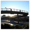
| 02/16/2005 05:02:12 PM |
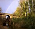
A bridge within a bridge within a bridgeby sidpixelComment: Cool! I think the bridges are a bit too far off-center, and the wood on the right doesn't seem to interesting to me. But you did a great job seeing and showing bridges. Your title helps a bit with the interpretation, yet sounds good. 7. |
| Photographer found comment helpful. |
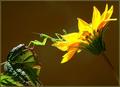
| 02/16/2005 05:00:44 PM |
Bridging the gapby trainComment: You took full profit of the extended interpretation of this challenge. I like your idea. The lighting is very interesting, it creates that golden lone on top of the plants and the insect. I also think that your picture has a very strong and striking composition. The eye is led from the bright yellow sunflower, which catches the attention, over to the left. 10. |
| Photographer found comment helpful. |
| 02/16/2005 04:58:12 PM |
|
| 02/16/2005 04:56:34 PM |
Snake Walkby knuteComment: I like the silhouette of the person against the rising sun. The border is a little too large for me, 2 thirds of it would have been great. 7. |
| Photographer found comment helpful. |
| 02/16/2005 04:55:14 PM |
Self-Righteous mastication on the 31st Parallel of thoughtby mrmojoComment: This picture looks too over-edited, as if you messed the curves up or pushed the saturation too far up. Use photoshop with moderation. For the rest, I don't understand your title (even though I'm sure it fits the challenge...somehow) and I find the large dark grey/brown area ugly and uninteresting. 3. |
| 02/16/2005 12:44:26 PM |
|
Home -
Challenges -
Community -
League -
Photos -
Cameras -
Lenses -
Learn -
Help -
Terms of Use -
Privacy -
Top ^
DPChallenge, and website content and design, Copyright © 2001-2026 Challenging Technologies, LLC.
All digital photo copyrights belong to the photographers and may not be used without permission.
Current Server Time: 07/22/2026 08:05:17 PM EDT.