| Image |
Comment |
| 04/07/2005 07:03:50 AM |
|
 Photographer found comment helpful. Photographer found comment helpful. |
| 04/07/2005 07:02:14 AM |
Why??by SteveJComment: The negative image looks good here, kinda alien without bein too obvious. Your DOF should be larger. 7. |
| Photographer found comment helpful. |
| 04/07/2005 07:01:15 AM |
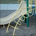
the L and Uby gtp1164Comment: I guess I'm blind, because I can't see the L. Are you referring to the slope, which would have to be mirrored then. I like the many 'U's. B&W would have been good here. 6. |
| 04/07/2005 06:58:59 AM |
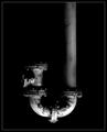
Flexureby crabappl3Comment: Excellent shot. I love the lighting. Nice detail and textures. The borders works well. 10. |
| Photographer found comment helpful. |
| 04/07/2005 06:58:17 AM |
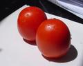
Minha Hortaby Toinho0645Comment: Hm, I don't know what your title means. What letter is this? 'B' or 'oo' ? Your composition is messed up, the papers in the upper right are distracting and the light is too harsh. 3, since I can't really find the letter. |
| Photographer found comment helpful. |
| 04/07/2005 06:55:53 AM |
Eby ergoComment: Nice idea, but I don't like the rotation. You should rather have used it as a 'w'. 4. |
| Photographer found comment helpful. |
| 04/07/2005 06:55:03 AM |
|
| 04/07/2005 06:54:13 AM |
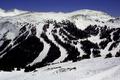
T-for Trinityby AJFIComment: Your shot needs contrast and sharpening. Some clouds would have been good. 5. |
| Photographer found comment helpful. |
| 04/07/2005 06:53:44 AM |
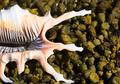
Sea Shell MEby StagoleeComment: Hey, this is cool. I'd not have recognized it without the title though. Nice crop. 6. |
| Photographer found comment helpful. |
| 04/07/2005 06:52:24 AM |
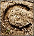
C - Horseshoe at Kirkton Manorby exbionicComment: You have a good eye! This meets the challenge well. The only thing I don't like is the colour, I think a duotone would have been better. Some sharpening would have been good, too. 8. |
Home -
Challenges -
Community -
League -
Photos -
Cameras -
Lenses -
Learn -
Help -
Terms of Use -
Privacy -
Top ^
DPChallenge, and website content and design, Copyright © 2001-2026 Challenging Technologies, LLC.
All digital photo copyrights belong to the photographers and may not be used without permission.
Current Server Time: 07/21/2026 07:56:42 PM EDT.