| Image |
Comment |
| 04/11/2005 02:29:40 PM |
H is for Honeybeeby gwendyComment: Your H is hard to find. Maybe(e) a macro of the bee's back would have shown it better. 5. |
 Photographer found comment helpful. Photographer found comment helpful. |
| 04/11/2005 02:27:36 PM |
|
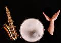
| 04/11/2005 02:26:36 PM |
The "Joy" of the set-upby graphicfunkComment: Cool, very nice. The only problem I have with this picture is the hands. They look too set up. It reminds of a dancing pose (flamenco or so) but it's too obvious they were formed to make a Y. Technically perfect, the crop is a little too tight at the bottom though. 10. |
| Photographer found comment helpful. |
| 04/11/2005 02:23:37 PM |
|
| Photographer found comment helpful. |
| 04/11/2005 02:21:45 PM |
Built in Signs of Loveby heroofhteday2441Comment: Why does your model look asleep? Was shooting that boring or is this an unfortunate snaoshot? Anyways, this is not what I understand as accidental. It looks as if your model hekd your hand like that with the purpose to form an L, and for that purpose only. Thus, your letter is (or at least looks) not accidental. Technically, your model is too important an element to be out of focus. 3. |
| 04/10/2005 04:19:08 PM |
M... is for Mountain.by babymaderoComment: I see a W. Your picture is very small, try to submit as close as possible to 640px. Your composition does not lead the eye to the letter. 3. Keep them coming. |
| 04/10/2005 04:17:44 PM |
The Moonby lebowskiComment: Nice panorama. The crop is much too tight on the right though, the man is touching the border (which is, btw too large). Good composition. A bit more beach perhaps. Your red C comes out very well against the blue sky. 9. |
| 04/10/2005 04:16:28 PM |
Y? Y notby JEFFJSBComment: Very hard to see. No composition, no structure. The leafs give the eye no possibility to focus. Your colours look weak, a b/w or sepia would have done better. 3. |
| 04/10/2005 04:15:16 PM |
symbiotic Aby whiteroomComment: Nice glow effect. Was that done with USM? The green duotone looks good, I'll have to try that some time. The composition is excellent. Your A might be clearer. 9. |
| Photographer found comment helpful. |
| 04/10/2005 04:13:57 PM |
|
| Photographer found comment helpful. |
Home -
Challenges -
Community -
League -
Photos -
Cameras -
Lenses -
Learn -
Help -
Terms of Use -
Privacy -
Top ^
DPChallenge, and website content and design, Copyright © 2001-2026 Challenging Technologies, LLC.
All digital photo copyrights belong to the photographers and may not be used without permission.
Current Server Time: 07/21/2026 05:11:54 PM EDT.