| Image |
Comment |
| 05/04/2005 09:36:47 AM |
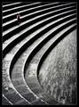
Repetition with variations for small childby e301Comment: This is so cool! I like the almost floating, surreal feeling about your image. I've seldom seen lines that string in any image. The various textures and patterns along with a great tonal range make this an absolute favourite. Congrats on your green ribbon, I think it should have been a blue one. |
 Photographer found comment helpful. Photographer found comment helpful. |
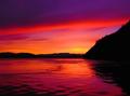
| 05/04/2005 01:00:13 AM |
Skiff at Sunset — Stage Harbor by Bear_MusicComment: Wow, finally you've been rewarded for all the efforts you put into our community. A gorgeous picture, you deserve your ribbon well! Congrats, Robert. |
| Photographer found comment helpful. |
| 04/26/2005 01:18:34 PM |
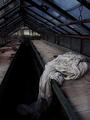
The Shroudby jjbeguinComment: I like the dramatic leading lines and the strong image tilt. The moodyness immediately catches one's eye, and the little sparkle of yellow the flowers bring in gives it an interesting touch. I enjoy looking at this a lot, and I'm trying to learn from you. |
| Photographer found comment helpful. |
| 04/25/2005 03:51:32 PM |
|
| 04/25/2005 03:49:39 PM |
Tranquil Rocksby twm122Comment: Lol. This is funny because of tranquil.dpchallenge.com . Is the hommage intended? |
| Photographer found comment helpful. |
| 04/25/2005 03:43:40 PM |
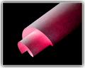
Glowing Paperby TomH1000Comment: I think I've seen a picture with a similar technique here already. You did a good job, the different brightness levels come out well. For me, the composition is too based on the diagonals, too symmetric, but on the other hand, that fits the more or less regular spiral. Your border is interesting because it goes into the same direction as your main idea for the photo. It would look much nicer without the thin black line every picture has on DPC, for example on a pure white background.
Well done, creative, good execution, not overedited. 10. |
| 04/25/2005 03:40:08 PM |
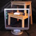
Worktableby paha_lComment: I saw a discussion about this technique in a recent forum thread. This one came out neat, but I'm a bit disappointed about how you 'abused'paper and scissors to make it fit the challenge. Um, is the Pentium-thing supposed to be the rock? Why's that?
Two other things that bother me and that you can easily fix after the challenge in photoshop are the slight colour difference between the lower left corner and the background, and also the cables.
Anyway, an interesting picture. 9. |
| 04/24/2005 03:23:03 PM |
IMG_0564-Edit.jpgby GeocideComment: I enjoy this photograph. It's creepy how that one cloak facing the viewer is looking straight into the camera, even though you cannot see a face, or maybe just because of that. I feel the ground should be either completely clean or plain dirty and rough. A filthy, uneven ground would have fit the group best, but I guess you couldn't chose the location. Very interesting. |
| Photographer found comment helpful. |
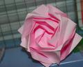
| 04/22/2005 11:06:25 AM |
Ceci n’est pas une roseby NordlysComment: I think you didn't understand Magrittes thoughts behind his image 'Ceci n'est pas une pipe'. It shouldn't have been used for this picture. Nice origami though, if you had chosen a decent background and softer lighting this image would have come out really well. 5. |
| Photographer found comment helpful. |
| 04/22/2005 11:04:46 AM |
Rock Silhouetteby The_WedgeComment: I think this is stretching the challenge a bit too far, mainly because it's hard to even see the rock. Okay, I know it's there and it's a really good picture, but this should have gone to free study. 8. |
Home -
Challenges -
Community -
League -
Photos -
Cameras -
Lenses -
Learn -
Help -
Terms of Use -
Privacy -
Top ^
DPChallenge, and website content and design, Copyright © 2001-2026 Challenging Technologies, LLC.
All digital photo copyrights belong to the photographers and may not be used without permission.
Current Server Time: 07/19/2026 01:02:03 PM EDT.