| Image |
Comment |
| 09/03/2005 03:52:44 PM |
A nice fitby dogzComment: Good idea, but it lacks the final technical perfection. I guess you got tired after too many tries :) 7. |
 Photographer found comment helpful. Photographer found comment helpful. |
| 09/03/2005 01:43:07 PM |
Complicatedby idnicComment: Yeah, that is a problem :) The darks should be darker. The highlights are good, the light is soft. The high-heel should be a bit darker. Mabe you could change that during b/w conversion in the channel mixer? 7. |
| Photographer found comment helpful. |
| 09/03/2005 01:41:14 PM |
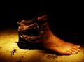
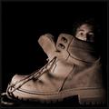
Shiney New Shoesby RistyzComment: Showing a hobnailed horsefoot is a good idea, but the light from the flash is much too harsh and ruins the athmosphere. Also, a wider angle showing the man's head would have been good. 4. |
| Photographer found comment helpful. |
| 09/03/2005 01:39:23 PM |
|
| Photographer found comment helpful. |
| 09/03/2005 01:38:13 PM |
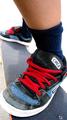
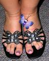
butterfly shoesby petspicsComment: The lighting is too harsh - try not to use your on-camera flash for close-ups. 3. |
| 09/03/2005 01:37:21 PM |
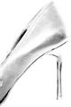
vertigoby danica22Comment: Interesting over-exposure. I'd have preferred a tighter crop at the top, just above the heel. 7. |
| Photographer found comment helpful. |
| 09/03/2005 01:36:17 PM |
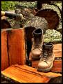
Inhabitantby SimonkasprzakComment: I like the tonality. Showing a bit more of the head would have been nice. Kudos for the idea and execution. 9. |
| Photographer found comment helpful. |
| 09/03/2005 01:34:41 PM |
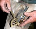
Hard Workingby glad2badadComment: Lovely colour tones and textures, great composition and ambient light. I'd have preferred a plain black border. The colour you chose fits the image only in some parts, it feels irregular to the eye. 10. |
| Photographer found comment helpful. |
| 09/03/2005 01:32:03 PM |
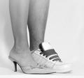
Leading Linesby duncesComment: A sideview of the model would have improved this shot a lot. Also, the choice of the couch was a bad idea - it has almost the same colour tone as the girl's skin. 5. |
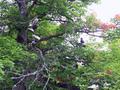
| 09/03/2005 01:29:51 PM |
The Shoe Treeby PugPopComment: Good idea, but the many branches don't give the shoes of standing out - the eyes can't focus anywhere, there is no composition. 4. |
Home -
Challenges -
Community -
League -
Photos -
Cameras -
Lenses -
Learn -
Help -
Terms of Use -
Privacy -
Top ^
DPChallenge, and website content and design, Copyright © 2001-2026 Challenging Technologies, LLC.
All digital photo copyrights belong to the photographers and may not be used without permission.
Current Server Time: 07/17/2026 08:17:48 PM EDT.