| Image |
Comment |
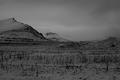
| 11/17/2004 11:14:06 AM |
Winterby kremkexComment: Much too dark. It might use some contrast, too. |
 Photographer found comment helpful. Photographer found comment helpful. |
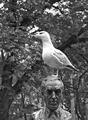
| 11/17/2004 11:12:35 AM |
poo-phobiaby funkaruckComment: Hey, something new for the psychiatrists ;)
The white sign on pooh's back is distracting. I donnu whose it is, but you might have cut it off. |
| 11/17/2004 11:09:04 AM |
Flyby lebowskiComment: Too much disorder, confusing, the eye doesn't know what to focus on. Use the sky instead of trees, or any other more homogeneous background. |
| 11/17/2004 09:33:39 AM |
Time's Winged Chariotby glodaComment: Originally posted by K-Rob:
Why hold the watch upside down? Or why flip the image? |
I wanted the pointers to be in the upper part of the image. I guess I should have thought about that while doing the setup... |
| 11/17/2004 09:23:05 AM |
Celestial Flow by BradComment: I hoped you'd make the first place, but third is good, too. Congratulations! |
| Photographer found comment helpful. |
| 11/16/2004 03:48:07 PM |
The Dentistby grigrigirlComment: *shiver* I can feel the pain... I think I have to go and brush my teeth now. Else I'll get nightmares! |
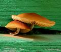
| 11/16/2004 01:08:10 PM |
Toadstoolsby sailracer_98Comment: Aw, I hoped you'd get a ribbon. I love it more everytime I have a look at it... |
| Photographer found comment helpful. |
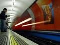
| 11/15/2004 02:33:10 PM |
Arrivalby ImagineerComment: This instantly reminded me of 'Back to the future', when the Delorian has jumped time and all that's left are the burning lines it's tires left on the street. Perhaps this is Doc's next invention, after the locomotive time machine :)
I've even got a name for it: Time Tube. |
| Photographer found comment helpful. |
| 11/14/2004 03:18:42 PM |
|
| Photographer found comment helpful. |
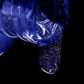
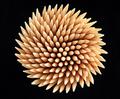
| 11/14/2004 03:13:42 PM |
Illusionby joaobaComment: Looka at that! This seems known to me! Now I'll have to decide whether yours or the one with the white background works better...
Edit: I found the other one. It's called just simply 'Toothpicks'. And the white background with the blue shadow is more appealing than a solid black. Thats why I gave one more point to that one. Hey, I give you a 7, after all. |
| Photographer found comment helpful. |
Home -
Challenges -
Community -
League -
Photos -
Cameras -
Lenses -
Learn -
Help -
Terms of Use -
Privacy -
Top ^
DPChallenge, and website content and design, Copyright © 2001-2026 Challenging Technologies, LLC.
All digital photo copyrights belong to the photographers and may not be used without permission.
Current Server Time: 07/17/2026 12:20:54 AM EDT.