| Image |
Comment |
| 01/12/2005 10:57:23 AM |
|
 Photographer found comment helpful. Photographer found comment helpful. |
| 01/11/2005 10:58:33 AM |
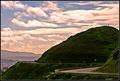
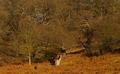
Waldo's Peakby ankurlahotiComment: Wow. Looks great. Is Waldo a statue? He looks quite big compared to the hill.
I love those clouds, and the detail in the hills, and the curves in the street, and the view on the village, and the triangular composition, and the DOF, and the sharpness, and the ribbon right next to the file name ;) 10.
Edit: I just noticed that there are people on the street...strange, now I'm not so sure where Waldo actually is. I still think you'r referring to the figure on the hilltop. |
| 01/11/2005 10:49:02 AM |
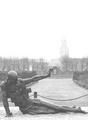
When Dali meets Waldo ...by PatochComment: The large white sky should have been cropped away. For the rest: good composition, interesting point opf view. The picture is a bit overexposed and needs some contrast and darkening. DOF is fine, b&w was a good choice. 6. |
| Photographer found comment helpful. |
| 01/11/2005 10:47:21 AM |
Roots of Lifeby gevorgComment: Cool picture, but I don't think it meets the challenge. There's nobody hidden in it, is there?
You should also have submitted a larger image if your camera allow you to. Always chose the largest width or height possible, which is 640 pixel. 4. (Which is a lot for a small picture that doesn't meet the challenge.) |
| Photographer found comment helpful. |
| 01/11/2005 10:44:18 AM |
Lost in the world of fictionby samtrundleComment: Really colourful. I don't like the way you hide your person though, and the main impact from your picture comes from the painted wall, which is actually a piece of art in itself. I feel that you didn't do to much to the merit of this shot. Well, I give you a 7 nonetheless. |
| Photographer found comment helpful. |
| 01/11/2005 10:38:03 AM |
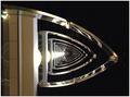
P by PanoComment: WOW! This looks awesome. The best thing about his picture is it's immediate impact on the viever. It has got a clear, defined structure which stands out firmly against the dark areas. It took me a minute to figure out what this was. I used the same idea for my submission, but yours turned out way better! The DOF is great, the picture is perfectly sharo all the way to the top. The eye is irrevocably drawn to the picture's center, and passes Waldo on it's way. Your person is well placed. It breaks up the symmetry of the floor repetitions, but doesn't stand out too much, it doesn't destroy the symmetry, but actually adds interest to it.
I also like the reflections of the light on the fence (good exposure by the way, nothings blown out, and the black is pure black).
I give you a ten and add you to my favourites. Good luck! |
| Photographer found comment helpful. |
| 01/11/2005 10:23:01 AM |
Underscrewblankethiddenmanby dusanmullerComment: Your title is very confusing and so is your picture, but I think that's it's best feature. I commented in some other pictures that they need more structure. This one has no structure at all, but works well nonetheless. I don't know how you did that. Your Waldo has found an intersting hiding place, but he should have been in focus nonetheless. 7. |
| 01/11/2005 10:20:48 AM |
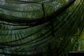
Jane of the Jungleby crgdavisComment: I like the guiding lines and the strong green colour. Your person is well hidden, but can still be found. You did a good setup and lighting. 9. |
| Photographer found comment helpful. |
| 01/11/2005 10:19:18 AM |
A Walk in the Woodsby JibberJimComment: Nice colour. Your person is well hidden, but the picture need more structure. The trees blend with each other and melt with the ground. 5. |
| Photographer found comment helpful. |
| 01/11/2005 10:18:12 AM |
Where's the Monk?by digitaldaveComment: Cool. I like the blue colour cast, the repetition of the windows and the lines they imply along with the ceiling bows and the rows in the ground. The reflection in the floor gives it a modern touch. You chose an interesting perspective. 9. |
| Photographer found comment helpful. |
Home -
Challenges -
Community -
League -
Photos -
Cameras -
Lenses -
Learn -
Help -
Terms of Use -
Privacy -
Top ^
DPChallenge, and website content and design, Copyright © 2001-2026 Challenging Technologies, LLC.
All digital photo copyrights belong to the photographers and may not be used without permission.
Current Server Time: 07/19/2026 08:15:42 AM EDT.