|
|
|
Showing 371 - 380 of ~4090 |
| Image |
Comment |
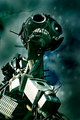
| 06/27/2006 02:13:40 PM | Robotby KonadorComment: It's the "WEEE Man" and it's currently on tour around the UK. I took the photo when it was in Bristol :) |
| 06/14/2006 06:03:16 AM | My Favorite Bookmarkby Morry32Comment: This is a really good photo, however I find it a little distracting that the filter gets lost against the black background. |  Photographer found comment helpful. Photographer found comment helpful. |
| 06/10/2006 12:47:19 PM | | | Photographer found comment helpful. |
| 06/10/2006 12:46:38 PM | | | Photographer found comment helpful. |
| 06/10/2006 12:46:04 PM | | | Photographer found comment helpful. |
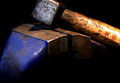
| 06/09/2006 08:50:59 AM | Hammer & G-Clampby carlomuscatComment: Hello from The Critique Club! :)
The lighting in the photo created a good 3D-ness to the whole photo, so I think the angle you chose to light from was effective. I think that the over-exposed area on the wooden part of the hammer is distracting though, and being an Advanced Editing challenge, it would have been worthwhile cloning it out in my opinion, or not lighting it so harshly in the first place. The lighting on the rest of the imager however is spot on. The way the background is blacked out and the bottom fades to black both look very effective, especially with the vibrant colours you've captures.
Compositionally, I feel I have to agree with your comment from e301. The fact that the top of the hammer is cut off seems very awkward, however I do think that the rest of the composition is good. It just needs that little bit extra at the top. The negative space in the bottom created a nice shape and flow to the photo that I think would be lost of you cropped that space out.
The post-processing is well done, with the sharpness being suitably subtle in application, without any tell-tale halos. The colours have been brought out perfectly, and the contrast, although a little high on the handle of the hammer, seems good throughout the rest of the photo. I don't see any noise, but I'm curious as to why you used ISO 400 when you had everything set up on a tripod for a long shutter speed anyway. Using a lower ISO could have helped in reducing the bright area on the handle.
Overall, a well done photo with just a couple of small technical flaws. I hope you find this critique helpful :)
-Ben |
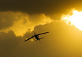
| 06/09/2006 08:41:23 AM | Barrel rollby nikmaticComment: Hello from The Critique Club! :)
This is a very dramatic shot that definately uses a single light source, however the challenge did require an artifical one, which the sun unfortunately is not. I think that mainly explains your low score, however I will focus on the technical aspects in this critique.
Compositionally, I feel this is slightly awkward. I feel this way because the plane is almost centered, but not quite. It's not centered enough to look like it is supposed to be, yet it is not far enough from the centre to be using the compositional rule of thirds. Either would be effective it its own way, but this "in between" feeling just feels a bit umbalanced. I think the very bright area on the right unbalances it further. I think moving the crop to the right so that both the plane and bright area were following the rule of thirds would greatly improve this photo.
I like the colour of the photo, the yellow definately giving it an added sense of drama, and making it more attractive in general. I'm not sure how much is natural or how much you altered it in the raw conversion, but its effective either way.
I think the final thing that lets this photo down a bit is the sharpening. You didn't mention it in your Photographer's comments, but I can see that you've done it because there is a white halo outlining the whole plane, which I feel is distracting. If you used Unsharp Mask, I think that you should have used a thinner radius. If you didn't use Unsharp Mask, I think you should have done :) I have a free video tutorial that covers Unsharp Mask in detail on my website at //www.konador.com/pp should you want to avoid the helo outlining in the future.
Overall, this is a good dramatic photo, which was unfortunately let down by not following the challenge description. I hope you found this critique useful :)
-Ben | | Photographer found comment helpful. |
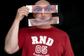
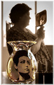
| 06/09/2006 08:29:38 AM | Wearing the face that she keeps in a jar by the doorby Breeee123Comment: Hello from The Critique Club! :)
This is a very clever concept for a shot, which you pulled off pretty well!
Compositionally, its well done, with the important elements clearly placed within the frame of the photo. I feel that perhaps the two lipsticks in the foreground, whilst adding interest and added context and depth, could be better positioned. The way they are right up against the corner of the photo seems awkward to me, and I feel there should be some empty space surrounding them rather than them touching the edge, more like you've done towards the left of the jar.
I like the way you have the face in the jar, it looks very effective! I think having used a polarizer filter would have improved it however, since this would have reduced the bright and distracting reflections off of the glass. It may have also gone some way to reducing the glare from the window.
The overexposure in the background I find quite distracting. Perhaps waiting for a different time of day when it wasn't so bright outside would have been useful, or choosing a different location. I like the contrast it creates, but at the same time I don't like how it overpowers the subject of the photo.
The DoF you used is effective at leading the viewers eye through the photo and placing the correct emphasis on the main focal points. I feel however, that the DoF could have gotten away with being perhaps a bit shallower, as the edges are currently still quite sharp, whereas the details are soft. I find this "in between" kind of feeling a bit niggling, but it's not too much of a problem in the grand scheme of things :)
As far as post processing goes, I think the sepia works quite well, giving the photo an old fashioned nostalgic feeling, which matches the style of the person in the jar, and the Beatles in general. I don't like the border though. Firstly, it doesn't seem even, with it being thicker on the left and at the top, and secondly I think the feathering looks a bit tacky. I would have preferred no border at all, or a thn single colour one.
Overall, a well thought out concept and a photo which definately does it justice, with just a few little technical things which could be improved. I hope you found this critique helpful! :)
-Ben Message edited by author 2006-06-09 08:31:17. | | Photographer found comment helpful. |
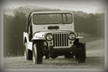
| 05/14/2006 08:43:36 AM | Brunel at His Bestby ArtanComment: I had the idea to come up and do a shot like this! I never got around to it though. Taken on the way up to Clifton Observatory, right? Really nice shot with a spot on exposure and sharpness. | | Photographer found comment helpful. |
| 05/03/2006 11:16:37 AM | | | Photographer found comment helpful. |
|
Showing 371 - 380 of ~4090 |
Home -
Challenges -
Community -
League -
Photos -
Cameras -
Lenses -
Learn -
Help -
Terms of Use -
Privacy -
Top ^
DPChallenge, and website content and design, Copyright © 2001-2026 Challenging Technologies, LLC.
All digital photo copyrights belong to the photographers and may not be used without permission.
Current Server Time: 07/17/2026 06:19:27 AM EDT.
|