| Image |
Comment |
| 02/14/2003 02:46:48 AM |
Round by albright1Comment: I like this shot. The composition placement seems very good, and the curve of the ground leads the eye well. I think however it could do with a sharpen in a graphics editing program, because to me it looks a bit blurred. Also, the columns seem to be tilting to the left which is a little distracting. 7 |
 Photographer found comment helpful. Photographer found comment helpful. |
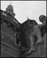
| 02/14/2003 02:44:39 AM |
Shipmates of Bontekoeby AzrifelComment: I like the perspective here but I really think it needs some contrast added in your editing program to really bring out the shadows nicely. 8. |
| Photographer found comment helpful. |
| 02/14/2003 02:43:53 AM |
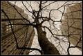
"hey!, my cousin the Redwood is taller than you, guys!" by Pep VentosaComment: I really like this angle. It's not the best to show the actual height of the buildings against the tree but it is unique and interesting. I like this photo a lot.
Just as an end note, I think the fact that the inside border is almost the same colour as the sky is a bit distracting, because it makes the branches of the tree appear to just cut off.
I gave this photo a 9. |
| Photographer found comment helpful. |
| 02/14/2003 02:41:30 AM |
Where Valor Proudly Sleepsby MiekaComment: Very nicely composed. The tree on the right adds some nice framing, and the nice bright colours look very nice. It is a shame about the shadow of the tree over the front headstones, but the pattern that they all create looks nice and it shows perspective well. 9 |
| Photographer found comment helpful. |
| 02/14/2003 02:39:30 AM |
tumbling dominoesby MajorChaosComment: This is great... Must have taken a long time to set up! I like the way you put other dominos around the place to add some interest elsewhere in the photo. They also help to show that distance of the perspective, which is great. 9 |
| Photographer found comment helpful. |
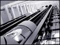
| 02/14/2003 02:38:07 AM |
Going UPby kosmikkreeperComment: I really like this. Good perspective. I like all the angles leading into one point, it looks very effective within the good composition. The one thing that would get this photo from a 9 to a 10 in my opinion, would maybe be to move to a slightly different vantage point, so those circular reflections in the bottom right werent visible, because I think they take away from the nice angular photo. 9 |
| Photographer found comment helpful. |
| 02/14/2003 02:36:18 AM |
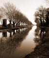
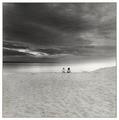
A calm winter afternoon by jjbeguinComment: Great perspective shot. I like the leading lines, and the sharpness of the photo is great. I like the choice of sepia too. It's unfortunate that the sky was overcast that day, but still a 10 |
| 02/14/2003 02:35:05 AM |
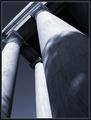
Twilight of Idolsby magnetic9999Comment: Nice perspective here, it makes the columns looks very intimidating. Nice and sharp, and the blue colouring works really well. If only you could spot-edit out that chip on the leftmost column this would be even better. 10 |
| 02/14/2003 02:33:35 AM |
Specks and the Universeby greenem2Comment: This is an excellent photo. Because it is so good, the only things i'll say in this comment are small nit-picky things.
I think the children should be centred. I think this would help the composition more than them being slightly to the right. I'm also not so keen on the washed out white area on the right.
I think overall this needs just a little more contrast throughout the photo, to add to the high dramatic feeling this photo already gives.
Changing these small things would get you an 11 if such a thing were available, but have a 10 for now. |
| Photographer found comment helpful. |
| 02/08/2003 05:57:18 AM |
Petal Graceby shedonistComment: I really like this. The focusing is great, as it gets blurrier as it reaches the outside of the frame. I really like the details and the colours. 10 |
| Photographer found comment helpful. |
Home -
Challenges -
Community -
League -
Photos -
Cameras -
Lenses -
Learn -
Help -
Terms of Use -
Privacy -
Top ^
DPChallenge, and website content and design, Copyright © 2001-2026 Challenging Technologies, LLC.
All digital photo copyrights belong to the photographers and may not be used without permission.
Current Server Time: 07/18/2026 04:59:57 AM EDT.