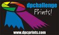
| Image |
Comment |
| 05/01/2003 11:22:33 AM |
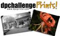
DPCprints stick projectby MariComment: I like the blue that goes throughout this design. I's very eyepleasing. I think the 'Prints!' should be a little bolder, but thats just my opinion. I'm also not too keen on the bevel of the URL. The bevel on the logo looks good though. |
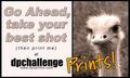
| 05/01/2003 11:20:21 AM |
Go ahead, take your best shot ... by TarbiniComment: Nice choice of colour on the font, which goes well with the sepia photo. That really makes the 'Prints!' stand out nicely. I like the (then print me) but I think that you could do without the word 'at'. I think it kinda spoils the flow of the text. I also think that because you have included a comma in the slogan, you should alsp punctuate it at the end with a ! |
 Photographer found comment helpful. Photographer found comment helpful. |
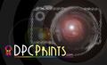
| 05/01/2003 11:17:48 AM |
.by dsidwellComment: I'm not sure about the choice of font. I don't think the R is very clear. I like the rest of the design tho, except that the dotted camera may look a little too busy. |
| Photographer found comment helpful. |
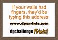
| 05/01/2003 11:16:27 AM |
If your walls had fingers...by alanfreedComment: I like the slogan. I think there are too many different fonts used tho which makes it seem too busy. If you had done the URL in the same font as the slogan I think this would look better. |
| Photographer found comment helpful. |
| 05/01/2003 11:14:41 AM |
Stick oneby pikytoComment: I think there are too many colours in this, which looks kinda confusing, but the design is bold and simple, which looks good overall. |
| 05/01/2003 11:12:15 AM |
Sticker by lumbardhComment: I like this design, with colour on the right and b&w on the left. I do think that the images are slightly too close to the edge tho. The overall simple design works well. |
| Photographer found comment helpful. |
| 05/01/2003 11:10:57 AM |
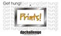
Get Hung!by crabappl3Comment: Excellent. My highest rated prints sticker. Its simple, to the point, and eye catching with that one bit of yellow too. The Get Hung! catchphrase works well too :)
I would suggest moving or resizing the frame slightly to make sure the little part of the 't' doesnt keep coming on the right of it tho, as this looks a bit distracting. |
| Photographer found comment helpful. |
| 05/01/2003 02:17:08 AM |
|
| 04/22/2003 03:51:01 AM |
|
| Photographer found comment helpful. |
| 04/21/2003 06:27:52 AM |
|
| Photographer found comment helpful. |
Home -
Challenges -
Community -
League -
Photos -
Cameras -
Lenses -
Learn -
Help -
Terms of Use -
Privacy -
Top ^
DPChallenge, and website content and design, Copyright © 2001-2026 Challenging Technologies, LLC.
All digital photo copyrights belong to the photographers and may not be used without permission.
Current Server Time: 07/19/2026 11:02:14 AM EDT.