| Image |
Comment |
| 05/01/2003 11:44:42 AM |
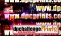
dpcprints.com stickerby nathaliedooComment: Wow! Colour overload! My initial reaction here is:
"What on Earth is going on?!"
I also don't like the fact that all the large URLs are cut off at the end. |
| 05/01/2003 11:43:12 AM |
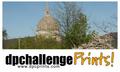
Prints with a Viewby OneSweetSinComment: I dont really see the relevance of the photo you used. Also it doesnt look in focus, and I can see some smudging in the bottom left :( |
| 05/01/2003 11:42:13 AM |
dpcprints.com stickerby loz1Comment: To me this looks like it should all be centered, but they are all slightly off in different directions. I like the simpleness of it but I think it needs a little something else to give it more impact. |
 Photographer found comment helpful. Photographer found comment helpful. |
| 05/01/2003 11:41:09 AM |
simply beautifulby imagesloyolaComment: Nice flowing design but unfortunatly the wrong size for the challenge.
Also you wrote dpcchallenge. (one too many c's) |
| 05/01/2003 11:39:29 AM |
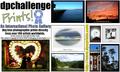
Buy Direct!by GeneralEComment: I think this is too busy. My eyes don't know where to look. Altho it shows a nice variety of photographs, I just think it looks too cluttered, especially with all the copyright stuff in there too, which imo is un-neccessary and just makes it even more confusing.
Also, the URL is unclear to me. The // part is not really needed (and to a lesser extent nor is the www) and the direction that it goes in, from bottom to top, seems unnatural. |
| Photographer found comment helpful. |
| 05/01/2003 11:36:42 AM |
DPCPrints on Brickby orussellComment: If the wall was a more natural colour i think I would like it more, but it seems to have a blue cast over it. Also, I'm not too keen on the bevelling, but thats just my opinion.
A nice simple design idea, but the bevel and busy background makes it look cluttered and hard to read easily. |
| Photographer found comment helpful. |
| 05/01/2003 11:34:05 AM |
Sticker DPCPby jimsappComment: The first thing that hits me when looking at this is that the images aren't centered. The second thing is the colouring in the 'dpchallenge'. I've never been a fan of mixing yellow and blue, which is just a personal preference. I think the bevel on the 'Prints!' looks pretty good, but on dpchallenge it just doesnt work as well. I think for bevel to look good it needs the right font. |
| 05/01/2003 11:31:52 AM |
|
| 05/01/2003 11:31:24 AM |
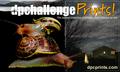
stickerby jjbeguinComment: I think the white of the 'dpchallenge' mixes in too much with that background that it is over. Perhaps a black outline around the text would improve this. I also feel that tehre are too many different parts of this photo, and I think getting rid of the snails and having some blank space there would help a lot.
Also I'm not sure that dpcprints IS actually the largest collection of printed photo artwork on line (yet!) so this would be illegal under false advertising. (Maybe I'm wrong) |
| Photographer found comment helpful. |
| 05/01/2003 11:26:54 AM |
DPCPrints.comby Ricky CleaveComment: Maybe it's just me, but I dont associate the 'dpc' as part of the URL. If I was to see this I would think it was advertising //www.prints.com |
Home -
Challenges -
Community -
League -
Photos -
Cameras -
Lenses -
Learn -
Help -
Terms of Use -
Privacy -
Top ^
DPChallenge, and website content and design, Copyright © 2001-2026 Challenging Technologies, LLC.
All digital photo copyrights belong to the photographers and may not be used without permission.
Current Server Time: 07/20/2026 08:46:30 AM EDT.