| Image |
Comment |
| 08/02/2003 07:06:30 AM |
|
 Photographer found comment helpful. Photographer found comment helpful. |
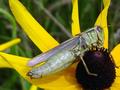
| 08/02/2003 07:06:15 AM |
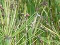
voraciousby amsmythComment: the colours on this seem a bit flat to me, and the composition seems awkward and unbalanced. |
| Photographer found comment helpful. |
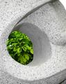
| 08/02/2003 07:04:02 AM |
Camouflageby LindaEComment: its a good photo but i think a splash of another colour in there would make it more interesting, like if it was a red apple. i also think you should have removed that bit of dead leaf from the apple as its a bit distracting |
| Photographer found comment helpful. |
| 08/02/2003 07:03:10 AM |
|
| Photographer found comment helpful. |
| 08/02/2003 07:02:20 AM |
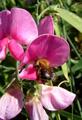
wanna-beeby taraholenmyheartComment: nice sharp macro. that flower has seen better days though! that makes the photo something a little different, which is good. 9 |
| Photographer found comment helpful. |
| 08/02/2003 07:01:31 AM |
|
| Photographer found comment helpful. |
| 08/02/2003 07:00:58 AM |
Wind Chimesby spillerComment: good use of DOF, and the composition is very nice, but i think the wind chime looks a little bit too close to the left edge of the frame. 7 |
| Photographer found comment helpful. |
| 08/02/2003 07:00:04 AM |
Garden Picnicby Lee31Comment: the composition looks too centred for my taste, also i think a shallower DOF would have helped blur out the quite distracting background |
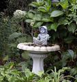
| 08/02/2003 06:59:13 AM |
The Potting Shedby sherComment: Very nice photo. the toning looks good, and there is a lot to look at in the photo, yet it doesnt compete for attention with the main subject, which i assume is the statue of the man. 9 |
| Photographer found comment helpful. |
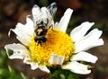
| 08/02/2003 06:56:42 AM |
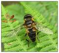
Ready for Takeoffby PaulMdxComment: i think maybe the bee is a bit too centred in the frame, but it;s a nice macro anyway, 8 |
| Photographer found comment helpful. |
Home -
Challenges -
Community -
League -
Photos -
Cameras -
Lenses -
Learn -
Help -
Terms of Use -
Privacy -
Top ^
DPChallenge, and website content and design, Copyright © 2001-2026 Challenging Technologies, LLC.
All digital photo copyrights belong to the photographers and may not be used without permission.
Current Server Time: 07/22/2026 04:31:49 PM EDT.