| Image |
Comment |
| 08/02/2003 07:55:32 PM |
|
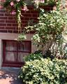
| 08/02/2003 07:55:13 PM |
Windowby ClubJuggleComment: i think the window is a little too close to the edge of the frame but other than that the composition is good. I think the muted colours work well |
 Photographer found comment helpful. Photographer found comment helpful. |
| 08/02/2003 04:47:18 PM |
|
| Photographer found comment helpful. |
| 08/02/2003 04:44:57 PM |
At Holden Arboretunby STEINRComment: I like the symmetry in this shot, but it looks lightly too over-sharpened and the sky is blown out. 6 |
| Photographer found comment helpful. |
| 08/02/2003 04:43:32 PM |
Dessert on the grassby LorhComment: this looks over exposed, out of focus, and its not really a very interesting view of a not very interesting subject. |
| 08/02/2003 04:41:21 PM |
|
| 08/02/2003 04:40:22 PM |
feelin' hot?by miss parkerComment: Excellent toning and contrast in this one. I really like the composition too, 10 |
| Photographer found comment helpful. |
| 08/02/2003 04:39:55 PM |
Looks Like Rainby justineComment: looks a bit washed out to me, try increasing the contrast some, to get darker darks. |
| 08/02/2003 04:39:30 PM |
|
| Photographer found comment helpful. |
| 08/02/2003 04:38:56 PM |
City Garden.by catpixelComment: A faster shutter speed would have stoppe dthe sky being washed out, and also stopped the motion blue on the cyclist |
Home -
Challenges -
Community -
League -
Photos -
Cameras -
Lenses -
Learn -
Help -
Terms of Use -
Privacy -
Top ^
DPChallenge, and website content and design, Copyright © 2001-2026 Challenging Technologies, LLC.
All digital photo copyrights belong to the photographers and may not be used without permission.
Current Server Time: 07/25/2026 03:38:43 AM EDT.